Origin:https://99designs.com/blog/trends/duotone-design/
“Duotone design” is a fun word to say. There’s an inherent musicality to its many vowels, its rolling pitch and its short syllables. But it’s also a word that tends to be synonymous with “trendy,” a word that is sometimes paired with an eyeroll.
While duotones are a modern trend, the duotone effect has a long history in design. And despite its limited color scheme, it can have hundreds of incarnations, from the understated to the eclectic, and has unlimited creative potential to offer designers and their projects.
With all that riding on a two color scheme, we’re going to walk you through doing duotone design right.
Drawtify, make design easier. Drawtify is an online graphic design software with vector drawing, layout, photo editing, and typography. It works on all platforms. And it’s free.
—
What is duotone design?
Duotone design refers to creations that are made up of two contrasting colors. Much like what it describes, the word “duotone” has two parts: “duo,” meaning double, and “tone,” meaning color. In photography, toning is the process of recoloring grayscale images, and duo-toning describes doing so with two colors—replacing the darks with one and the lights with another.
The history of duotones
Duotones have existed for as long as there have been cameras.
In the nineteenth century, the most common incarnation of the duotone effect was the sepia photograph, where various shades of brown coloring were used partially as a preservative and partially to warm up the severe appearance of the grayscale humans of the Industrial Age (who, as photographic evidence suggests, were incapable of smiles).
Sepia tones were so common that these days designers use them primarily to give photos a vintage look.
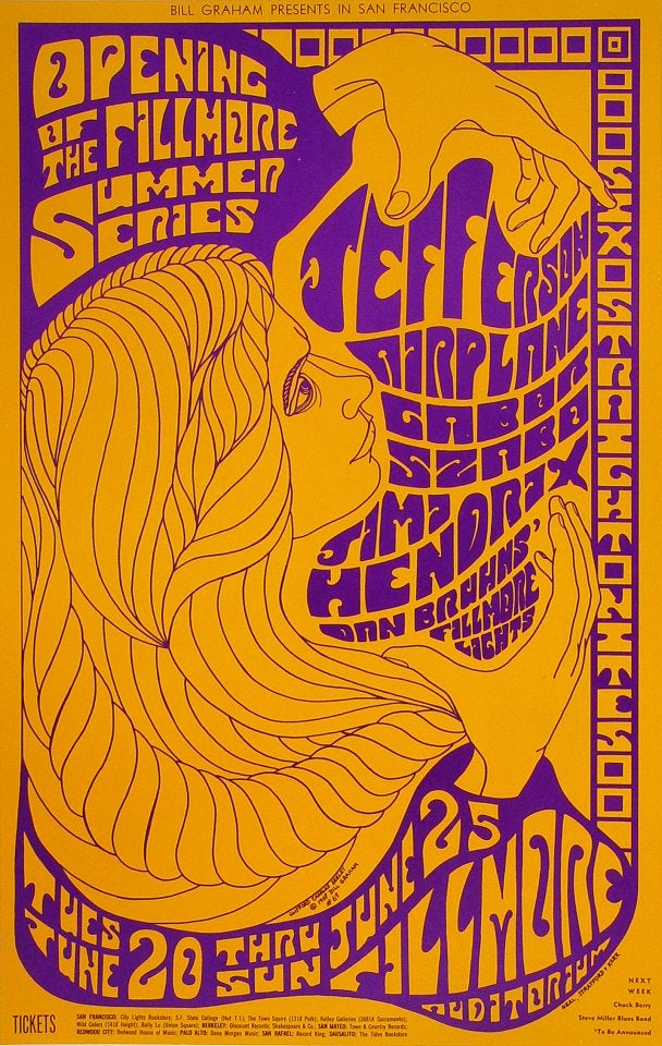
In the later years of colorized printing, duotones were largely introduced as a cost-cutting method. Instead of resorting to the full CMYK range—that is, four tones—duotones allowed artists to print high quantities of materials at a cheap price. Often, concert poster designers of the 60s and 70s would use this to their advantage, choosing outlandish, high contrasting duotones to heighten the psychedelic effect.
The duotone trend in the digital age
Recently, duotones have seen a resurgence in popularity in ways that have less to do with cost-cutting measures and more to do with aesthetic boldness.
There are a lot of reasons for why this is. Many credit Spotify’s promotional campaigns for bringing the trend back into the mainstream, and no doubt that played a pivotal role.
But most likely, the idea goes back even further. Think of how we have been taught to quickly tone photos by Instagram and Facebook—that is, the rise of the almighty photo filter. And while the rest of us were using filters to erase our crow’s feet and give our selfies some fast-and-easy studio lighting, designers were coming up with more extreme methods of re-toning their images.
Different uses of duotones
—
Duotones are now an incredibly versatile way to repurpose photographs for design projects. Because there are so many ways to implement the technique, we’re going to walk you through the most common uses of the duotone effect in design today.
The background image
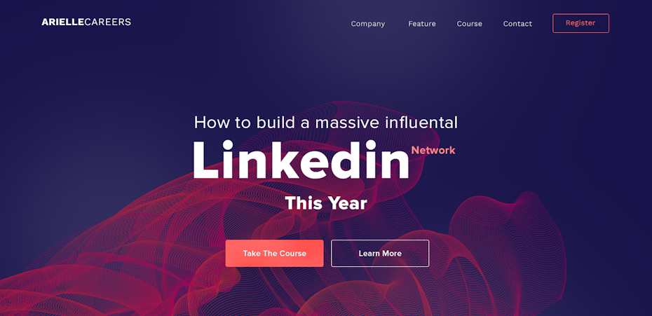
Many web designers find duotones useful for hero images. These backgrounds create immediate visual interest in the header, and the reduced color scheme can also allow for copy and buttons to pop more than they might on a multitone image.

Similarly, duotones can be useful in logo and brand identity design for mockups. Designers choose a photo representative of the brand, mute it through selective toning and then overlay it with the finished logo as part of an impactful presentation for the client.
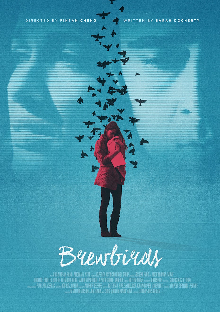
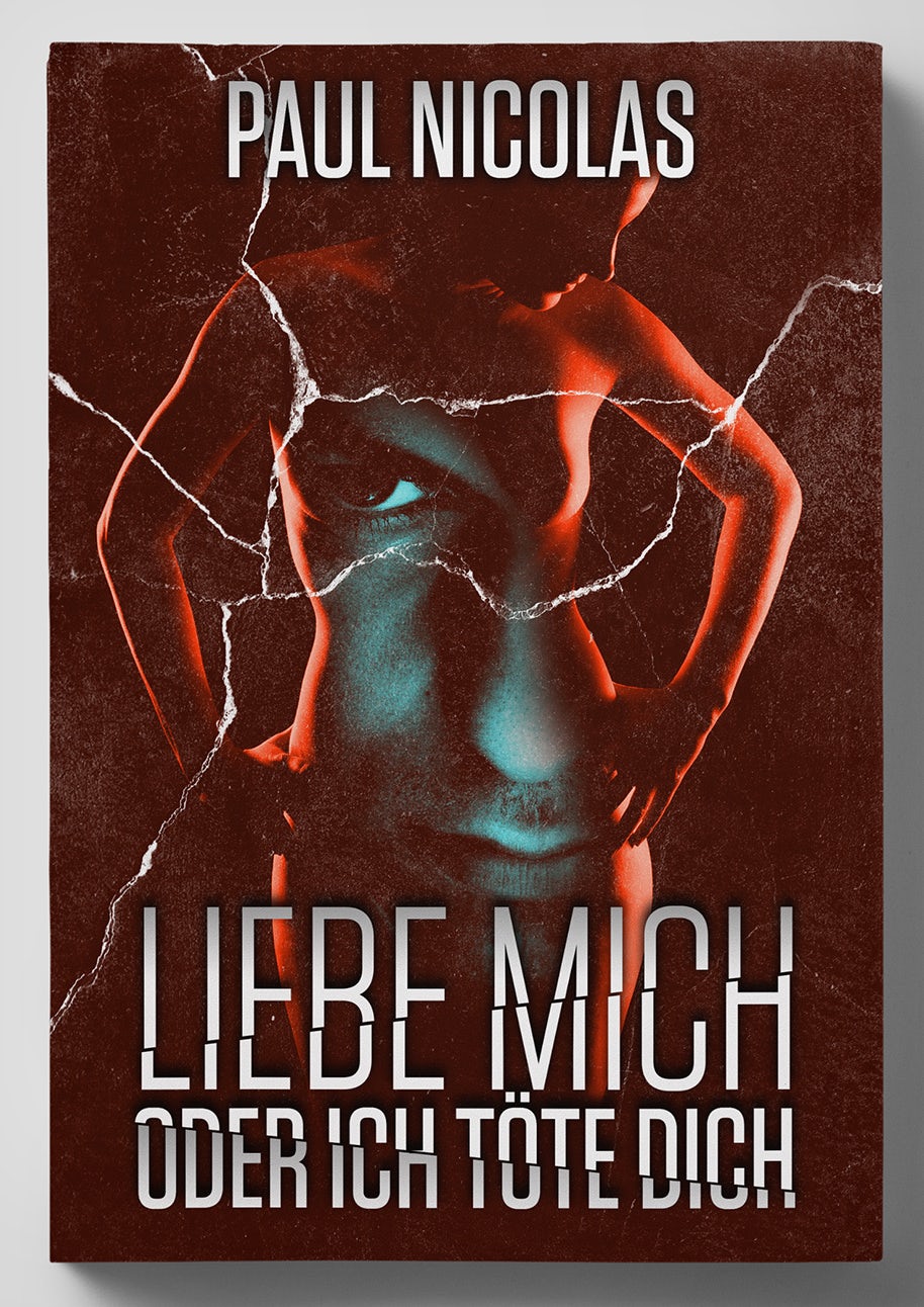
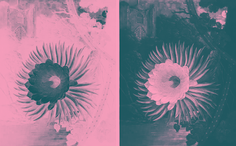
The focal point
Contrary to their role as background players, duotones also work great as the focal point of a design. As the cringeworthy cliche goes: less is more. It so happens that when you replace the multitude of colors in a photo with only two, that image becomes immediately more striking because it’s so unlike the images we normally see.
by subsiststudios
by jestyr37
Take advantage of this by making a duotone photo the main feature of a design. This works well for posters and book covers where the copy isn’t as important as an evocative image.
The slice
Duotones can be stark and arresting, and sometimes, that isn’t what you want. In this case, a strip of duotone color sliced across a grayscale image can provide subtle colorization. Slanting the slice also gives your eye a vector to follow through the design.
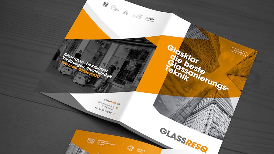
Generally, this style seems to work well with more corporate-friendly design needs, such as brochures, where you want the design to look good without being too avant garde.
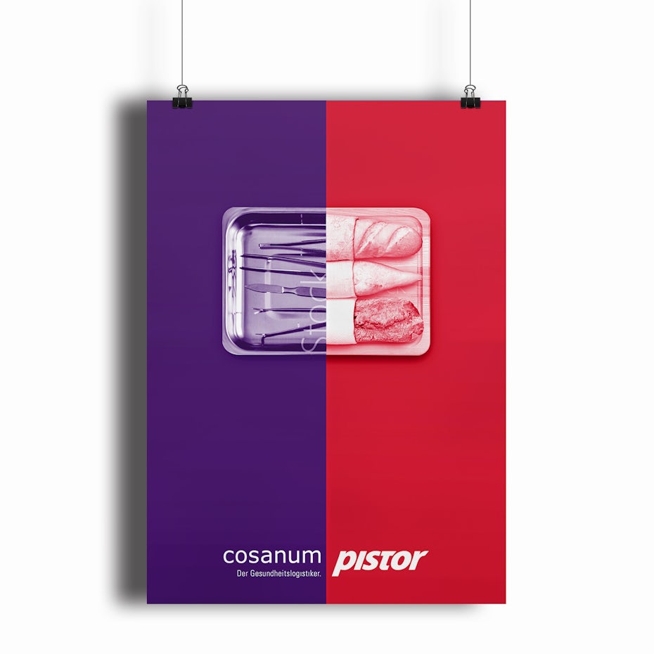
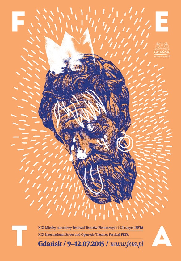
The split
Thanks to Photoshop, modern duotones aren’t restricted to traditional methods (overlaying different screen prints directly on top of one another). This allows designers to get a little more creative with their implementation of duotones. A split tonal image is not only arresting, it is also ripe for visual metaphor and representing duality more so than the traditional duotone.
by MihaiJ
by Tomas Miliauskas
How to create duotone designs
—
To create a duotone design, you overlay a grayscale image with two colors, but of course, there’s a lot more design thinking that goes into getting a good result. In this section, we’re going to walk you through some best practices to make sure you do duotones right.
Prepare the image
Instantly re-toning an untreated image might work for a selfie, but doing so for a professional design will read as lazy. Keep in mind that any photography you work with has likely already gone through some professional adjustments that were intended to enhance the original toning, not your duotones; therefore, you will need to prepare the image before you apply a new, limited color scheme to it. Here’s what you need to do:

- Convert it to grayscale. You can do this easily with the Black & White adjustment filter in Photoshop.
- Heighten the contrast. This is most important. Since you’ll only be working with two colors, you need to make them prominent on the final piece. Photoshop has several options for working with contrast, most notably the Levels and Curves adjustment filters. You can also target specific colors in the Black & White adjustment filter and move each slider to increase the color’s saturation (making them darker/lighter in greyscale). The point is to eliminate most of the midtone grays and keep your highlights high and your shadows low.
Choose colors with care
This is where your basic color theory comes in handy. While you can work with an analogous color scheme for a more subdued effect, generally the point of limiting yourself two colors is high contrast, such as a complimentary color scheme. Then, you just plug your selected colors into Photoshop’s Gradient Map adjustment filter or a similar tool.
Be mindful of which colors you choose to map onto the darks and lights of your image. For example, a vibrant, saturated color may be overpowering when mapped onto the shadows. Experiment with reversing the gradient map and different saturation values until you get the result you want.
Pair with solid colors and white
One of the challenges designers face when limiting themselves to two colors is that of incorporating other design elements.
With buttons on a website, for instance, you may need to bend the rules a little and work with a third color, probably whichever the company has specified for the CTA, since this does need to stand out from the image.
Just be sure to choose colors for your duotone image
ahead of time that won’t clash with this color but also won’t overshadow it.
For typography and hand-drawn elements, white is your best bet, especially if you want to be a duotone purist.
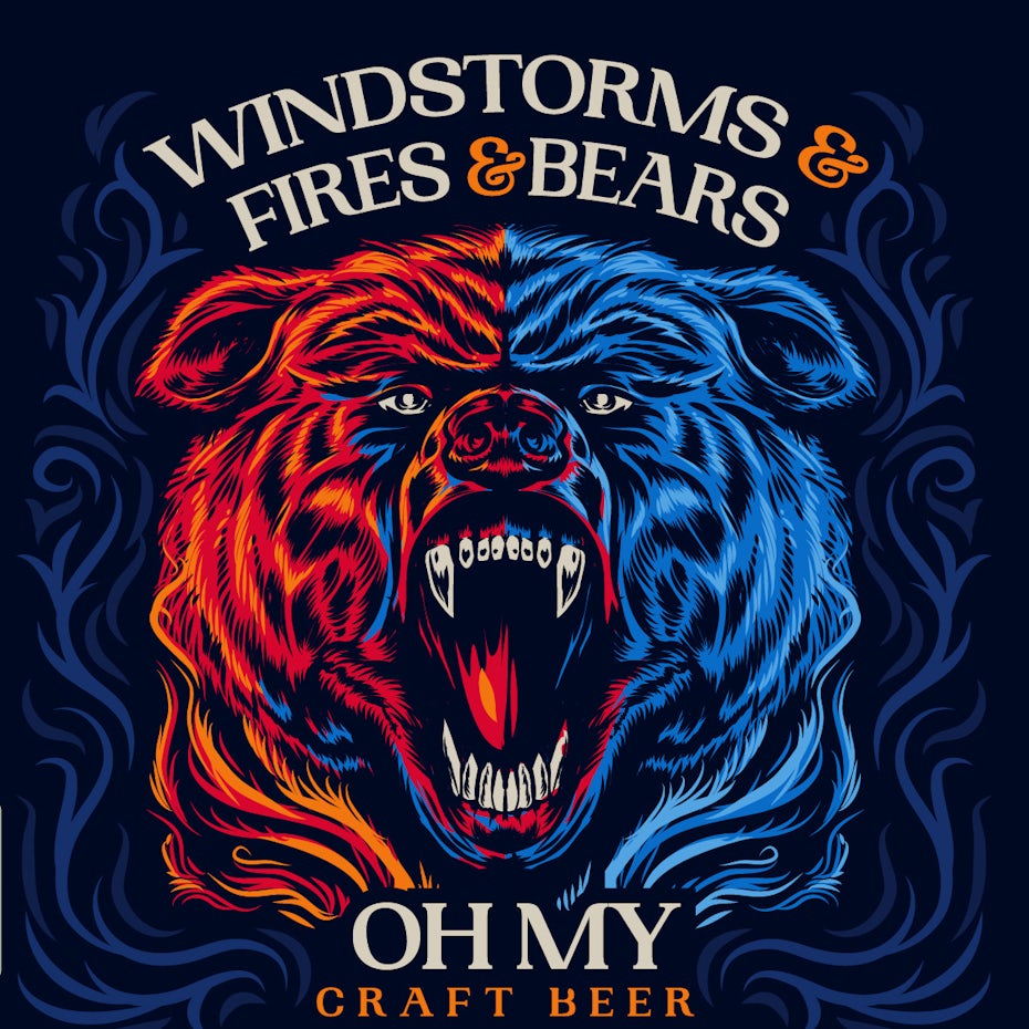
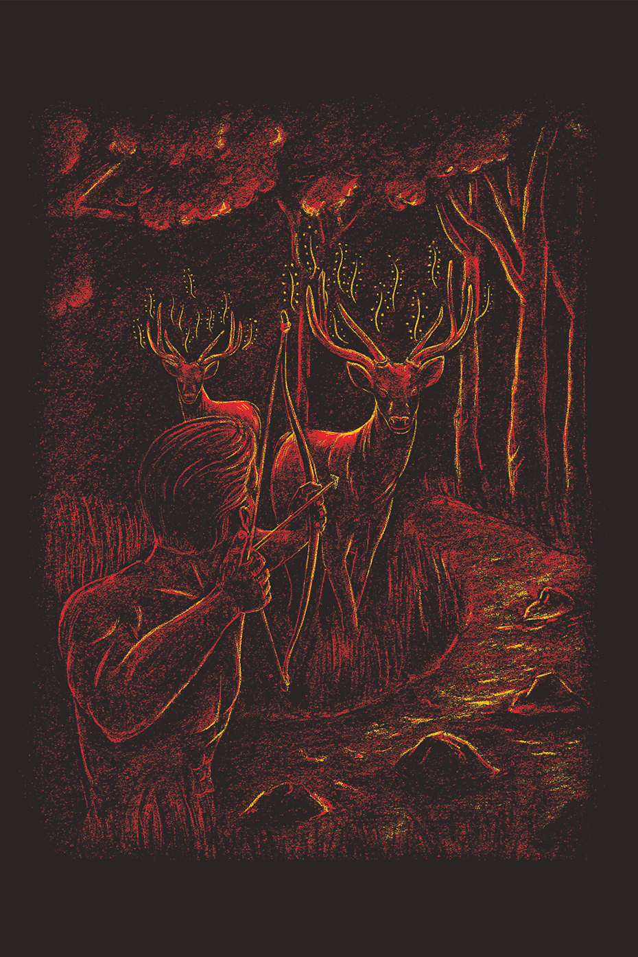
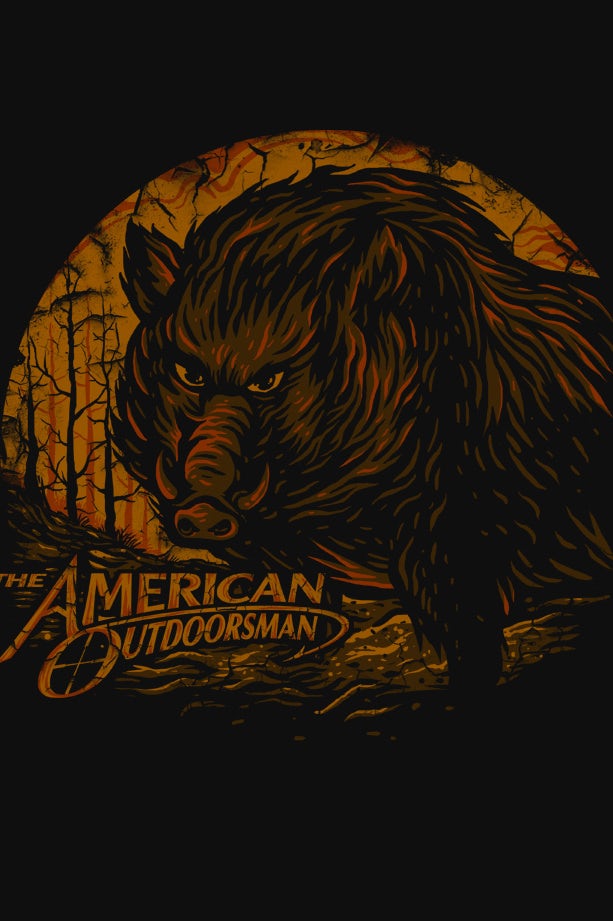
Don’t limit your duotones to photography
Just because duotones started in the photography sector doesn’t mean they aren’t useful for all your other design projects. An important part of a trend’s renaissance is its reinvention—otherwise, these duotones would simply look dated and vintage. So don’t feel confined to the traditional rules around duotones. They can be a great way to add stylistic flair to illustration, packaging, and whatever else you can come up with.
by Irudh
by BATHI
Give your design the right tone
—
Duotones are a beautiful design technique that are useful in almost any kind of project. But the real magic has more to do with how duotones make contradictions possible. By subtracting colors, you add visual appeal. You can strengthen the contrast and still fit a design comfortably in the background. You make images less decipherable, and viewers want to decipher them more.
Duotones can work for pretty much any brand, so it’s no wonder that duotone designs are having a special moment right now. And given how long in design history they’ve managed to stick around, they will always be a powerful tool to keep in your toolbox.
Make design easier!
For more exciting design templates that can be edited online, please pay attention to DRAWTIFY.