Color is an irreplaceable form of communication—immediate and strong. It’s especially important in today’s fast-paced world, where first impressions matter so much. 8 dazzling color trends for 2019.
Origin:https://99designs.com/blog/trends/color-trends-2019/

With just a glance, color can soothe or distract the eye. It can change thoughts and even actions. That’s why designers across the world have been pushing the boundaries, creating new and colorful ways of visualizing emotions for their clients.
With the amount of competition and globalization across the internet, it’s no wonder that color trends are changing rapidly—yet they manage to exist in perfect harmony.
Be assured: there’s a little something for everyone—from clean, subdued whites to bright and vibrant tones. With that in mind, let’s take a look at these diverse color trends coming in hot in 2019.
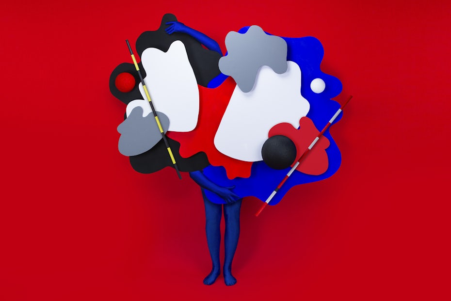
1. Fiery reds
2. White neutrals
3. Earthy tones
4. Less is more
5. Brave contrasts
6. The more the merrier
7. Iridescent color palettes
8. Pantone’s Living Coral
Drawtify, make design easier. Drawtify is an online graphic design software with vector drawing, layout, photo editing, and typography. It works on all platforms. And it’s free.
1. Fiery reds
—
Being such a powerful color, a little bit of red in your design can go a long way. So imagine what you can achieve with a lot of it!
Red was seen as the color of blood and fire by our ancestors, further being associated with love, passion, energy and strength, but most commonly, with joy and wellbeing.
That said, it’s an attention-getter for sure and a risky choice—which is not necessarily a bad thing! The feeling of living on the edge can carry over to your consumers. Just make sure you are certain that using such vibrant reds makes sense for your brand or product. Brace yourself (or your eyes) because you’ll see a lot more of this fiery color all around you in 2019!


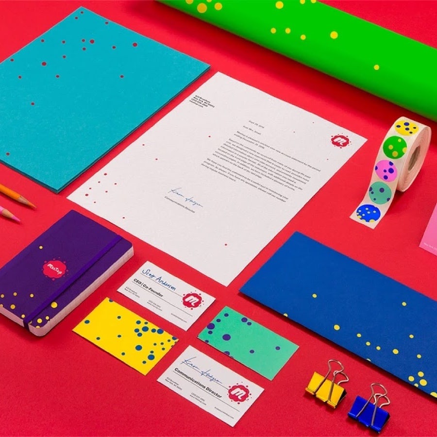
How vibrant are these envelopes by ElleGFXs

Beautiful and sensual branding. Via Nat Dalbem.

Such a festive yet clean design. Via Human . and Tito Romero.

Notice how the white elements seem to be glowing on the red background. Via Human .

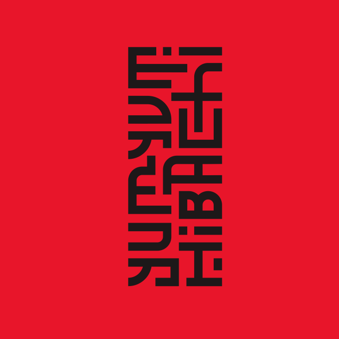
Modern logo design by trinitiff
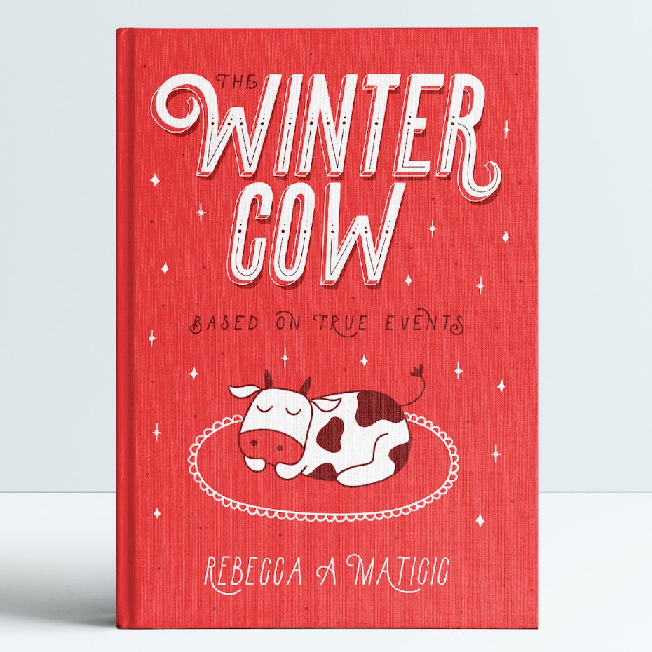
Wintery and festive book cover using the color red. By Mky.
2. White neutrals
—
If you need a break from the sheer magnitude of all this red, you may find serenity in the cleanliness of the white neutrals trend. White is the symbol of purity and is oft
en associated with honesty and neutrality. Thanks to these characteristics, the use of white in design has an immediately calming effect. It makes any composition soft and airy and gives it a sense of wonder.
White has been around forever, but it looks like it is taking center stage in 2019. It’s perfect for brands that are modern and elegant, given that whitespace is the primary ingredient in a sleek, minimalistic look. Obviously, it will always be combined with other colors (usually other neutrals), but as long as those colors don’t take over the composition and overall look, you can still take advantage of this trend.
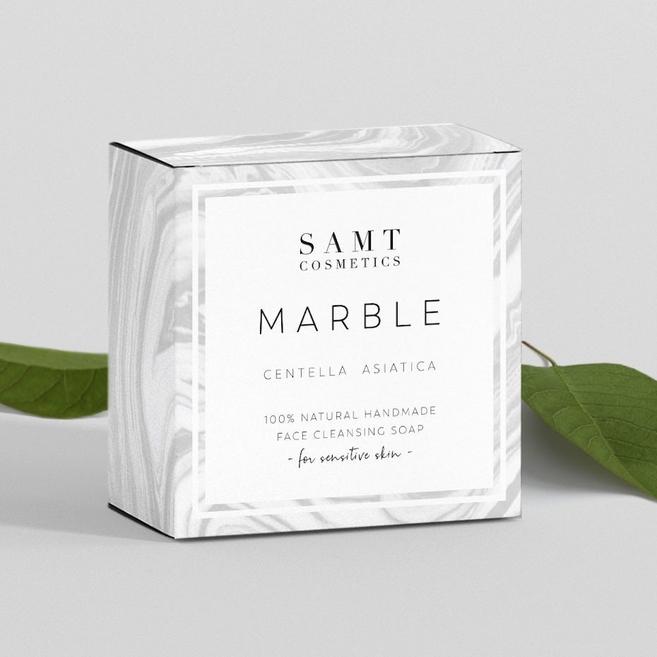
A subtle pattern can always give your design more movement and make it more interesting, like in this beautiful package design by Una.F.
The light marble texture makes the white rectangle really pop in this design by Avenir

Minimal and classy branding. Via Monajans.

Simple makes perfect by HYPdesign

Beautiful web design with lots of white space. Via Mitsugu Takahashi.

Outstanding web design making use of white space. Via Brontidebg.

Elegant yet so simple branding mockup set. Via Jay Snow.

Such a simple and clean yet super impactful web layout. Via Kévin Magalhaes.
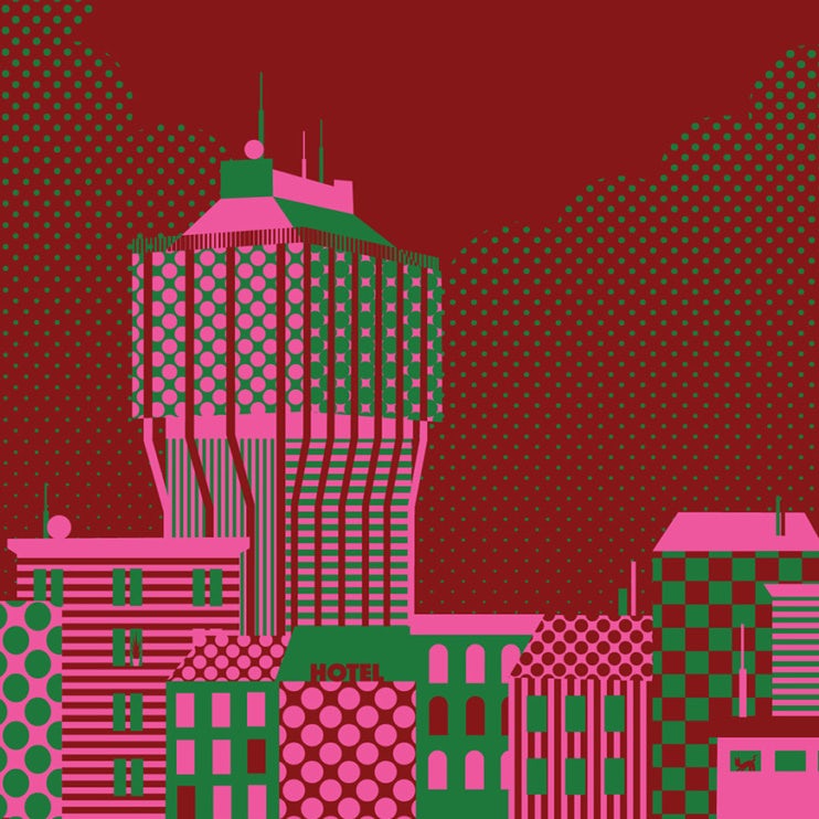
3. Earthy tones
—
Earthy tones connect our subconscious back to mother nature. That is, they evoke a nostalgic emotion. They make you remember a trip to the beach or the desert, the smell of fresh cut grass. To recreate this feeling for your clients, consider greens, browns, yellows, corals or even colder shades like blue—almost pastels but with a dusty and muted base. You can use them in lighter or darker shades, but in both cases you’ll get a raw and effortless feel.
The point is, it’s 2019, and we are all looking for a break from the daily glowing images we see on social media. From time to time we need to see pleasant colors, that make us feel safe and at home—a good reason why these tones are gaining so much popularity right now.

Such a joyous and fun branding by Martis Lupus

Browns and yellows, combined right, can make a design look super raw yet organic. Via Yeye Design.
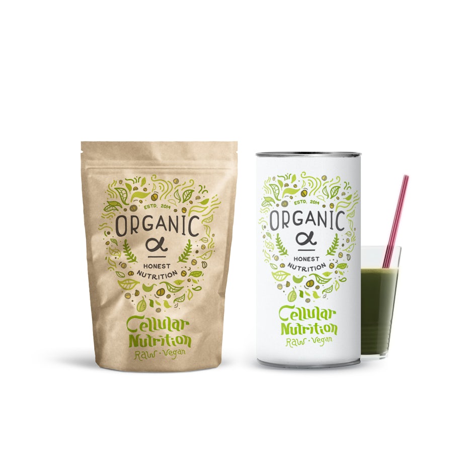
Wonderful organic package design by Martis Lupus

Notice how muted the green hues look in this pretty logo design by Stefsification*

Raw yet super refined looking color palette. Via Viktoriya Semenova
Such a bright and fun color combo, with a nice tropical feel to it. Via Futura.

An effortless and uneven pattern can go a long way. Via Itu Chaudhuri Design, Richa Bhargava and Neha Bajaj.

Perfect example of the dusty tones I mentioned earlier by Mila Katagarova
4. Less is more
—
A simple, minimal composition with just a touch of color will make any design pop. That one little splash of color has the ability to turn a flat image into one that screams and shouts. It adds visual interest, highlights certain information
and guides the eye through the design. It makes the overall look modern and brave. Expect to see designers making use of color sparingly, yet in clever and eye-catching ways in anything from web design to packaging in 2019.

Simple and elegant design. Via Colorz.

Muted colors can also have a huge impact in certain ocasions. Via Sociodesign.
It takes serious skills to make such a bold shade of green work so beautifully. Design by goopanic.

This package design is super bold and uses the electric pink perfectly. Via Sweety & Co.

In this case the colored blocks are there for a well defined reason: to highlight information and guide the eye. Via ROBYNN REDGRAVE.
Notice how the vibrant background makes the otherwise simple layout really pop in this design by florinkozma

Even though that one splash of color is more muted rather than super vibrant, it still has the ability to brighten up a composition. Via Pop & Pac Studio.

Simple makes perfect – and this design proves just that. Via Anna Iva.
5. Brave contrasts
—
Working with contrasting colors can be tricky. Make a mistake and you’ll end up with a piece that literally hurts people’s eyes! On the other hand, if you manage to get them right, you’ll have a super vibrant and striking piece.
Juxtaposing two or more colors that are on the opposite sides of the color wheel will make them accentuate each other—and ramping up the saturation will help them glow, move and yell! Besides traditional contrasts, in 2019 creatives are experimenting with unusual contrasts more than ever before. Contrast is not only achieved by combining two opposite hues, but patterns and shadows too. It all adds up to a highly dynamic composition that’s bold and fearless.
Bold colors, abstract shapes and out of the box thinking equals a cool piece of art. Via Leta Sobierajski.
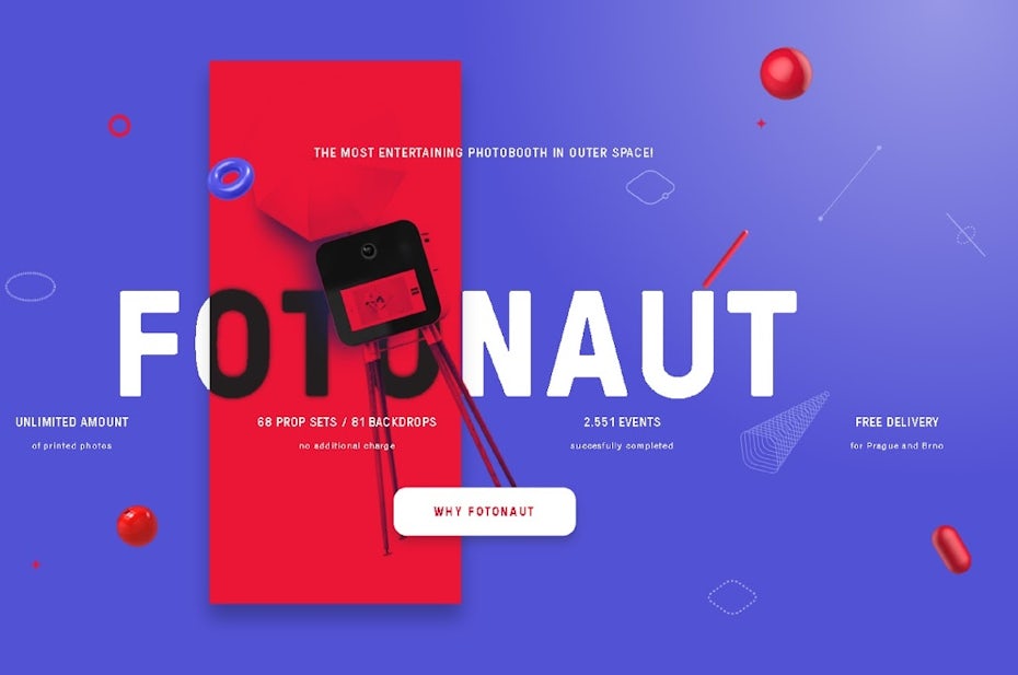
Super clean yet so visually striking. Via Fotonaut.
Such an adventurous and brave piece. Via Sagmeister & Walsh.

You can get a nice contrast with more muted tones as well. Via Cristie Stevens.
Notice how the the vibrant patterns also make a dynamic contrast. Via Olimpia Zagnoli.
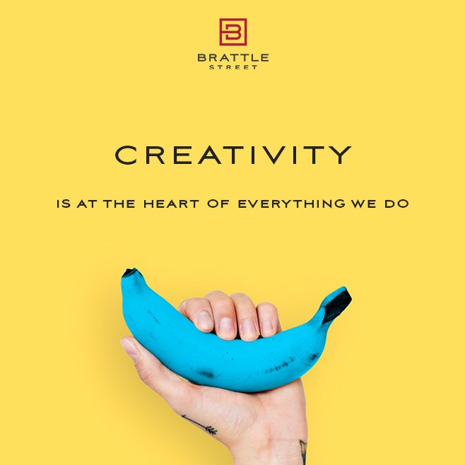
Blue banana? It sure grabs our attention! Design by e2infinity.
Playful and bright contrast by Asael Varas

You can have strong contrast not only by combining colors, but by playing with lights and darks as well – and this design perfectly proves it. Via Song hojong.
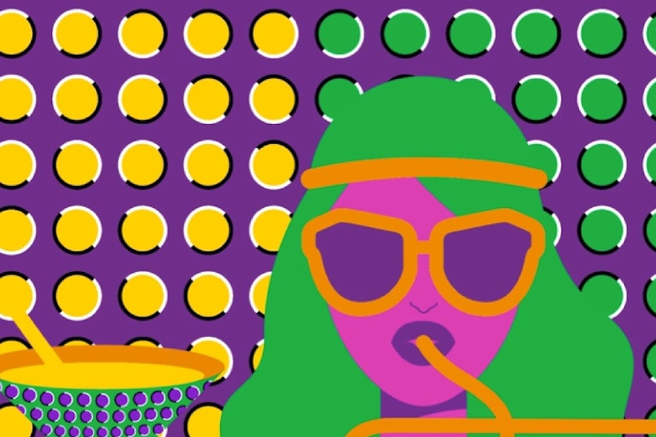
6. The more the merrier
—
Color lovers, this one’s for you! People are embracing colors because they immediately make any composition joyous and fun. In the past, we were told to stay put and avoid super intricate color combinations—nowadays, the whole color spectrum is our playground.
As much fun as it is to play with the color wheel, please don’t jump head first into the deep sea of colors and randomly mix and match. You need to be extremely attentive and careful to create harmonious compositions. For example, you can play with different saturations or
brightnesses of the same hue, or you can add the same amount of brightness to all your hues for a more harmonious and muted palette.
Some designer may even go all in and opt for a rainbow-y color palette. Design by joanna-draws.
Colorful and playful illustration by Molecula

You can’t talk about colorful works without mentioning the striking watercolor work by Daria V.
This branding design is surely not afraid of being bold and loud. Via Sagmeister & Walsh.
You get also get more experimental and play with not only colors, but shapes and effects as well. Via Underline Studio.
Colorful yet not very over the top. Via Futura.
Festive illustration that uses a held back color palette by Keyshod
Bold and geometric colors. Via And Studio.
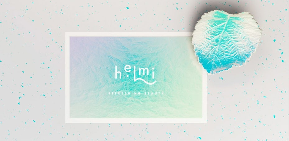
7. Iridescent color palettes
—
High contrast or a super colorful palette are great for a bold look, but there are times when you might want something that’s a little more light and magical. That’s when iridescence can come in handy.
Iridescence is an optical effect where certain surfaces (think of soap bubbles or the backside of a CD) seem to change their color when viewed from different angles. In both design and fashion this effect is gaining popularity due to its enchanted appearance. If you are looking to add a mystical, otherworldly flair to your designs, this is definitely your best choice, as you can easily recreate this effect with the use of pastel gradients.
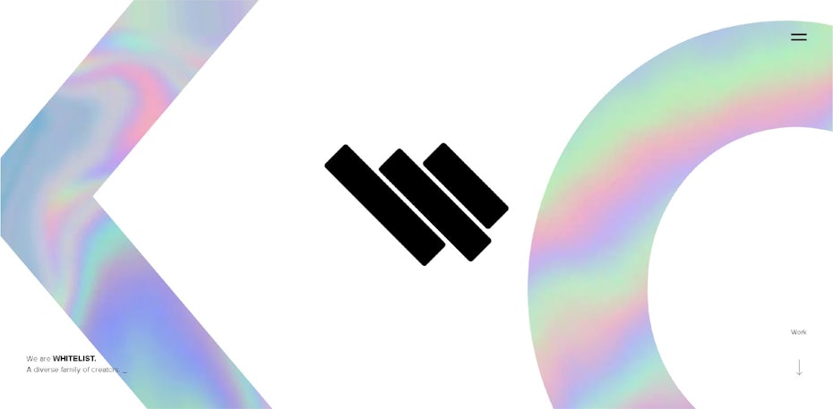
Clean yet visually striking design. Via Whitelist.
Add a little bit of texture to your foil effect and you’ll get a superb result. Via Truu Studio.


Such a dynamic and shiny poster design. Via Vasjen Katro.

See how easily this effect can be recreated? Design by chrisandee.

Shiny and eye-catching design by ruizemanuel87
Obviously, iridescence goes so well with unicorns! Design by Lenor.
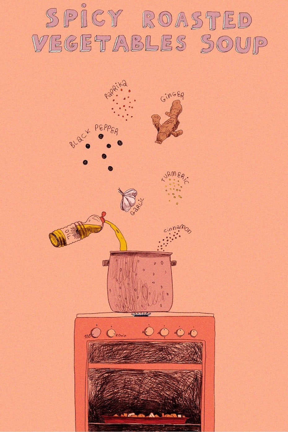
8. Living Coral—Pantone’s color of the year 2019
—
We can’t talk about color trends without mentioning Pantone’s color of the year. Looks like in the upcoming year we will be seeing a lot of Pantone 16-1546 Living Coral, which is a vibrant, yet mellow coral color. It inspires warmth and comfort, optimism and joy.
Representing the fusion of modern life, PANTONE Living Coral is a nurturing color that appears in our natural surroundings and at the same time, displays a lively presence within social media. – Pantone
Some designers may already have guessed or influenced this upcoming trend by using colors that are pretty close to this hue. Now, as yet another sign of 2019’s
return to nature, this color is rising out of its undersea depths onto the surface of our everyday world.

It even looks tasty! Via mauca[tastrophe] studio.
Super cool illustration and color combo. Via Tom Froese.

Combined with this blue, it sure pops! Via mauca[tastrophe] studio and Marion Pirritano.

Such a warm color! Via Verena Michelitsch.

The muted hue gives a sense of belonging and tranquility. Via Panel Studio.

Warm and nice color background by lilgrapefruit
Colors make the world go round in 2019
—
As you may have noticed, 2019 brings us a little bit of everything. Whether you’re into super loud colors or subtle neutrals, classic color or a modern mix—you’ve got options. So aren’t you excited to see what designers, artists and brands will come up with this year? I know I am!