The development of e-commerce has never stopped, especially online shopping, and its graphic design trends will inevitably develop.
E-commerce design trends in 2021 will bring better visual effects, better technology, and more interesting and better communication. Through the development of its design trends, e-commerce will also become more user-friendly, because many e-commerce designs focus on customer experience.
The 2020 e-commerce design trend focuses on cutting-edge technologies such as VR and artificial intelligence. Check out our list of the biggest e-commerce design trends in 2020. These are not only the expectations of today’s customers for online shopping but also graphic design trends that cannot be ignored in the e-commerce field.

Lists related to graphic design trends in e-commerce in 2020
- Extensive use of motion graphics
- Unconventional layout
- Landing page-product page hybrid
- Brand packaging box
- Shop-able social media posts
- Interactive product visual effects
1. Extensive use of motion graphics
From the beginning, the e-commerce design trend began to use more advanced visual effects from sports design. This means fewer static images and more dynamic images. In fact, we are looking for more videos, movies, animations, and micro-interactions. Because this is one of the graphic design trends in this field.
In the past, we rarely saw the use of these sports design elements, but modern technology makes them more and more common. In addition to other industries, e-commerce sites and other industries also rely on them, not just attract attention.
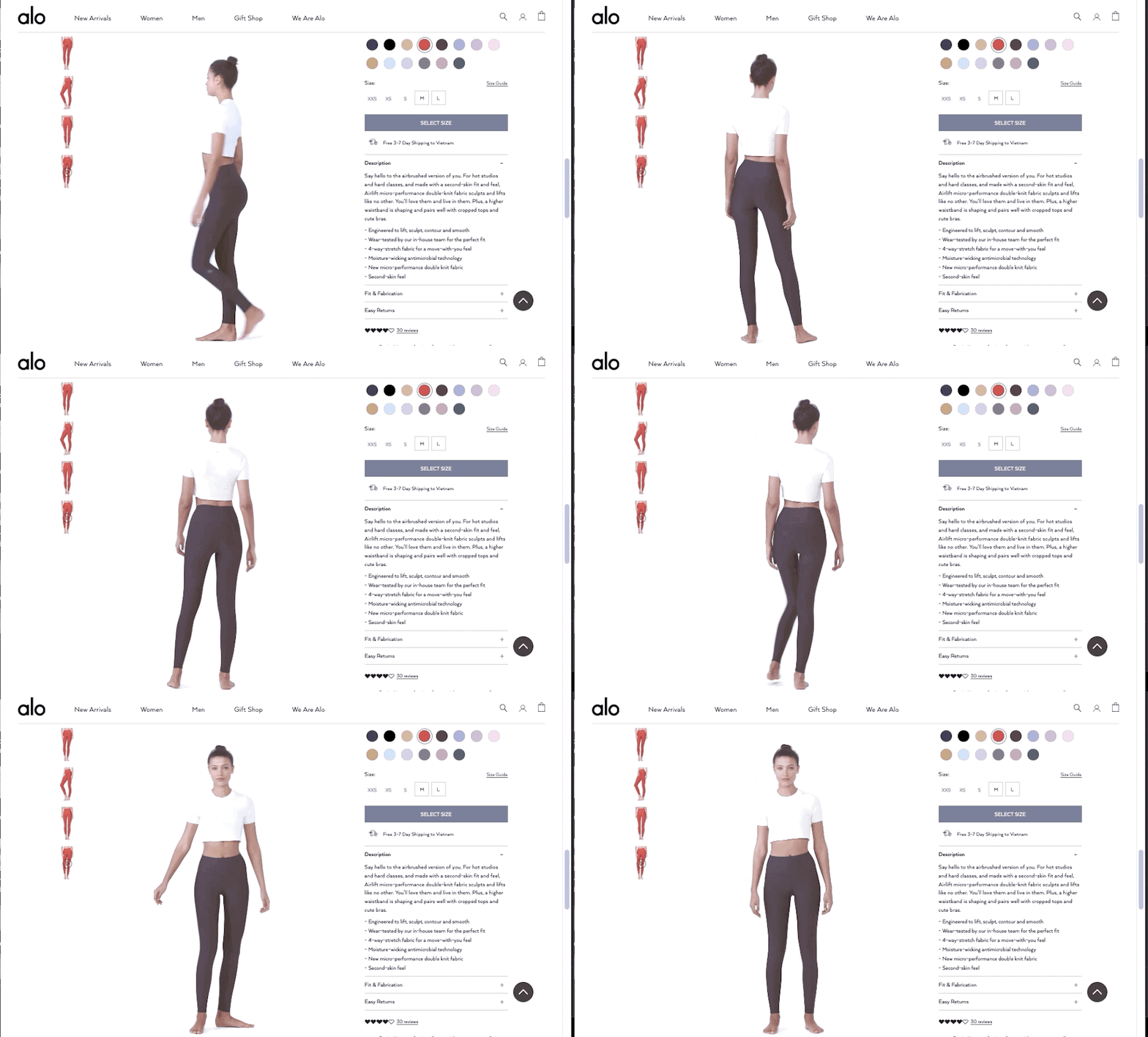
“Motion” in e-commerce design provides many practical advantages and is very suitable for displaying products in a more realistic way. As the Alo example proves, the motion design in the product visual effects can enable shoppers to better understand the products they are buying, and provide consumers with more information to increase conversions and reduce returns.

2. Unconventional layout
For years, square grid layouts have dominated e-commerce (think Amazon’s endless thumbnail scrolling). The strict rows and columns of products of the same size can keep all content structured, make browsing easier, and can be well used for responsive design. But for some brands, it pays to try new layouts, which has caused more and more online stores to get rid of the grid trend. This is also another graphic design trend in this field.
What are the benefits of giving up a uniform grid layout? On the one hand, you will stand out because so far, this design style is still rare. But it also gives your brand a sense of avant-garde and modernity, which is particularly useful for fashion or young industries.
If you design your website correctly, you can also attract or pay attention to certain products, such as highlighting the best-selling products strategically instead of publicly pointing them out.
It is worth mentioning that this graphic design trend is most suitable for brands with a rather limited product range. If you sell a lot of products, this setting may take up too much screen space and confuse shoppers.
 Via Dôen.
3. Landing page-product page hybrid
The past e-commerce design trends revolved around the idea that shoppers start from the homepage of the website and then find the product they want. Although this still applies to some shoppers, many other methods have emerged in the past few years that completely bypass the homepage.
Ads and social media posts usually take shoppers directly to the product page, so many visitors never see the homepage. With this in mind, e-commerce designers can now usually find more elements on the target page of their product page design. The resulting hybrid is like a mini-store, focused on a single product or category, with clear navigation and easy-to-navigate the rest of the website.
What we see is a more independent product page, usually used as an “umbrella” page for products in a specific category. These product pages provide visitors with all the information they need about your online store. And this new graphic design trend is a better, faster, and more convenient experience for shoppers.

4. Brand packaging box
The rule of thumb for branding will never miss any opportunity. Most companies already know the importance of branding on product packaging, but for online stores and subscription services, there is another gap in the brand that is often overlooked: the shipping box itself.
Customized shipping and shipping boxes can not only increase your brand awareness but also make customers more excited about shipping and increase loyalty. You can take this opportunity to promote your special features, website, social media, or even just promote your brand color. Some companies have even gained brand recognition by using environmentally-friendly packaging boxes, and this is the more advanced graphic design trends in this field.
 Design by G@rry.
 Design by Holiday26.
5. Shop-able social media posts
As mentioned in most digital marketing trends in 2020, social media platforms make it easy to sell products directly through posts. The golden rule of UX is to allow customers to work as little as possible, so letting them complete transactions without leaving their favorite social media sites is a shortcut to increase sales.
The benefits of direct sales on Instagram, Facebook, Snapchat, and other platforms are obvious: these visual media are great for online shopping. The social media channels themselves have begun to realize this and are implementing updated features to adapt to e-commerce stores.
Shop-able social media posts encourage followers to become shoppers, and shoppers become followers.
Another rising trend is to promote these posts on your website. Although purchasable social media posts increase followers’ sales, advertising these posts on your website also encourages loyal customers to follow you on social media.
 Via Snapchat Business.
6. Interactive product visual effects
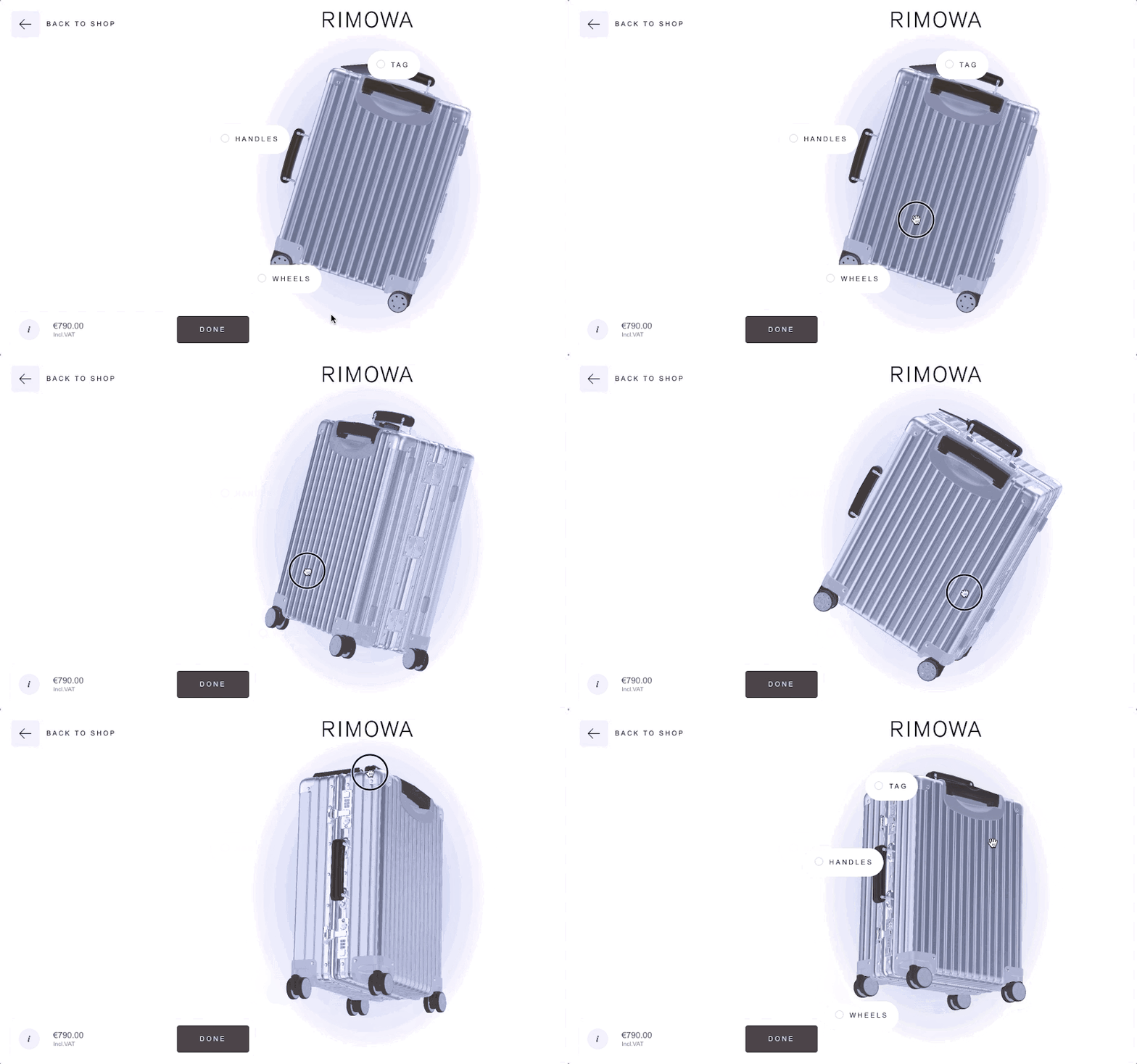
Advanced interactive visual designs such as virtual reality (VR), augmented reality (AR) and 3D imaging are more accessible than ever before, even for small and medium-sized businesses. Just like sports design, this technology can help shoppers better understand their product expectations. A better shopping experience can lead to more sales and repeat customers.
This technology is suitable for fashion accessories such as sunglasses but is also particularly useful for furniture or home decoration. However, AR, VR, and 3D imaging can give shoppers more control over viewing options, which can actually help products.
The technological leadership of online stores here has improved, but we can be sure that this trend will continue to grow exponentially in the future. The era when interactive vision becomes the new norm will soon come, so when it is still impressive and futuristic, it is best to implement it immediately.
 Via Rimowa.
Obviously, in e-commerce design, strengthening technology is as essential as improving visual effects.
Of course, technology, because of its difficulties, you may have to pass a steep learning curve or seek help.
However, the improvement of visual effects is relatively easy. Especially when you have better graphic design software, Drawtify Designer, everything will become very easy. For example, create eye-catching dynamic logos, dynamic graphics, dynamic text, free templates, great marketing images, product images, brand packaging boxes, and compelling social media images.
Because Drawtify Designer is not only powerful publisher, graphic designer, animator and vector editor. It will also bring a more pleasant design experience.
Importantly, it has almost no learning curve, and the online version provides high-quality editable design templates. Therefore, it is also the best solution and secret weapon for non-graphic designers to create outstanding graphics.
Learn more about the 2.0 version of the YouiDraw Vector Graphic Design web app, named Drawtify Designer. Please follow its video tutorial.