Origin:https://99designs.com/blog/trends/gradient-design-trend/
Lots of 90s trends are back in style! Crop tops, chokers, even scrunchies (…seriously). And there’s one trend that’s taking the design world by storm that would feel right at home in 1995—and that’s gradient design trend.
A few decades back, gradients were a popular way to add color and depth to designs. They remained a fairly prominent design trend until the late 2000s, when they took a backseat to flat design. But gradients came back in a big way in 2018, and we see them everywhere. They’re a way to enhance flat designs (a design update known as flat 2.0), add color overlay to photos and add texture to backgrounds.
Guess what? The gradient trend is showing no sign of slowing down in 2019.
So how do gradients work? Why are they so hot right now? And how will we continue to see gradients evolve in 2020 and beyond?
Drawtify, make design easier. Drawtify is an online graphic design software with vector drawing, layout, photo editing, and typography. It works on all platforms. And it’s free.
—
What are gradients?
Gradients, also known as color transitions, are a gradual blending from one color to another color (or, if you’re in a colorful mood, from one color to another color to another color—gradients aren’t limited to two shades).
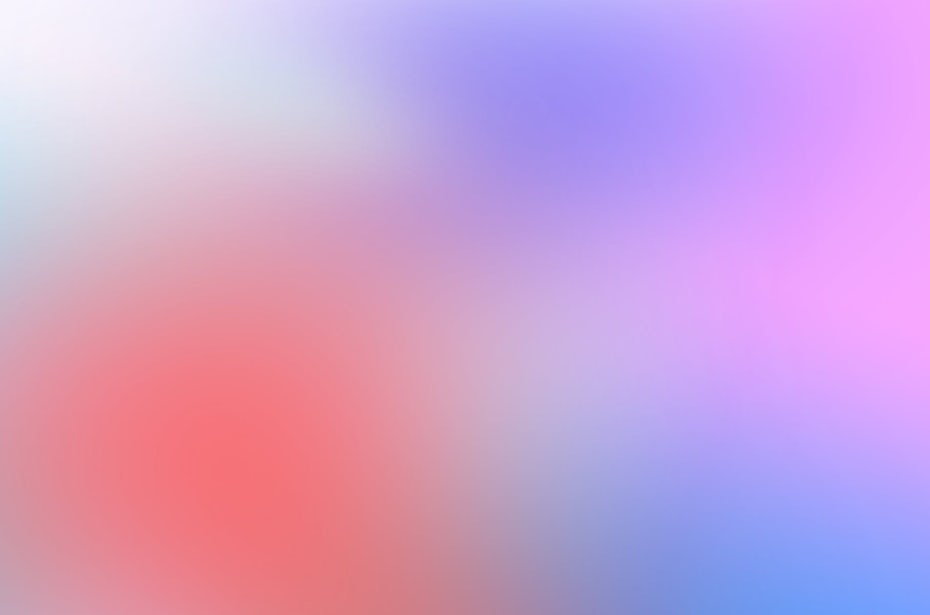
Gradients can blend or transition similar colors (so, for example, different shades of blue or a light orange to a dark red) or completely different or contrasting colors (like purple and red or blue and yellow).

via Impossible Bureau

via designmodo
The gradient trend is extremely versatile. It can be bold or subtle, the focal point of a design or a background element. And because they mix and blend different shades of color, gradients can create new color combinations that feel different and modern, lending a completely unique feel to designs.

A lovely photo—made even lovelier with a pink gradient overlay. Image via Creative Market.

The gradient design adds depth and dimension to the otherwise flat fox graphic. Logo design by Cross The Lime.
You can use gradients to add depth to an otherwise flat design, create an interesting texture for a background, or breathe new life (and color!) into a photo—the possibilities are endless!
Why are gradients so trendy right now?
—
So, why is the gradient trend having such a moment right now? Because they’re so eye-catching and attention-grabbing. The energy of these stunningly vibrant color transitions makes them stand out and helps to elevate any design.

When gradients came charging back onto the design scene in 2018-2019, a lot of designers were surprised—especially when larger brands (we’re looking at you, Instagram) hopped on board. A lot of people thought going the gradient route was too much of a throwback. Nostalgia was one thing, but would people really connect with a trend we’d seen before?
Turns out, people loved it—particularly because the 2019 gradient trend is not old-fashioned at all. It feels more sophisticated and high-end (from backgrounds to texture to overlays)—and less “Saved by the Bell.” These new gradients use bright, luminous colors and interesting color combinations that make them feel fresh and modern.
And apart from the nostalgia factor, people are going crazy for the gradient trend for a larger purpose. With the sheer amount of content consumers are exposed to on a daily basis, brands need to find a way to break through the clutter and grab their ideal customer’s attention. Gradients that add interest and color to a design are the perfect way to do just that.
The gradient trend in action
—
Gradients are versatile, and they’re a solid choice for pretty much any design medium under the sun.
Here are some examples of the gradient trend in action:
Logos
Gradients can add a unique feel to your logo that helps you stand out from your competitors (and because your logo acts as the face of your brand, it’s a fantastic way to incorporate your brand color palette in an innovative and visible way). Try incorporating bold colors for an in-your-face-feel or softer colors for a more subtle effect.

Design by Subqi Std

via Aaptiv

Packaging
You want your packaging to jump off the shelves—and gradients are the way to do it.

Design by Vlad Likh
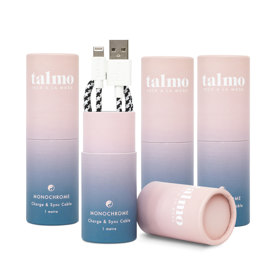
via Talmo
The key to using gradients as a background element in packaging? Make sure it fits with your brand. If you’re designing packaging for an in-your-face new product targeted towards extreme sports enthusiasts, something bold and daring (like a neon gradient photo overlay or a loud color palette) will hit the mark. If you’re going for a more soft and subtle feel—let’s say, for a new face wash—a single hue gradient or a palette that leverages pastel shades is probably a better bet.
When it comes to your packaging, bold or subtle can be just as impactful—as long as they feel true to your product and brand.
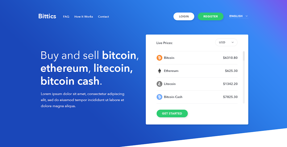
Web design
There are a ton of opportunities to incorporate the gradient trend into your web design.
Seriously. A ton.
You can use a combination of soft colors for a subtle background. You can add a fun, funky vibe with a photo overlay. You can make a big impact—without being visually overwhelming—by adding a gradient with bold colors to design accents. When it comes to gradients in web design, pretty much anything goes—so take advantage of the smorgasbord of opportunities and incorporate this trend into your web design.

Design by webDAE
Design by creativepixels
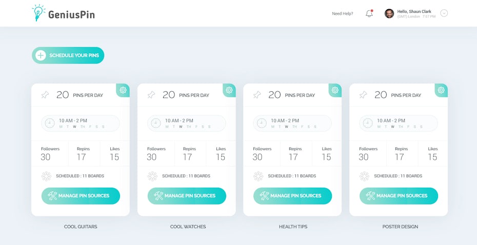
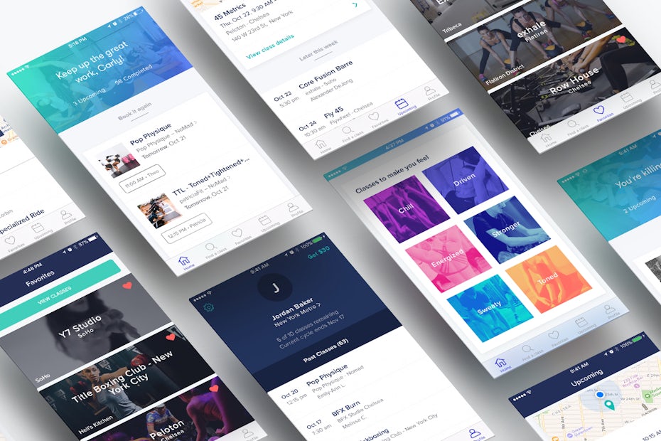
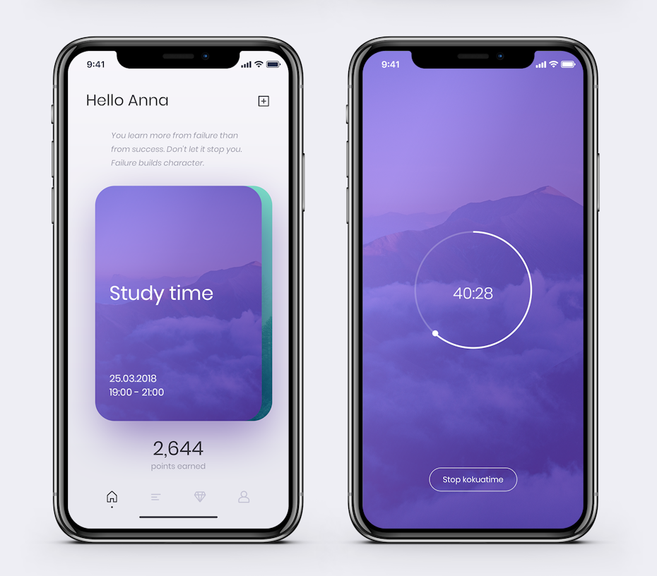
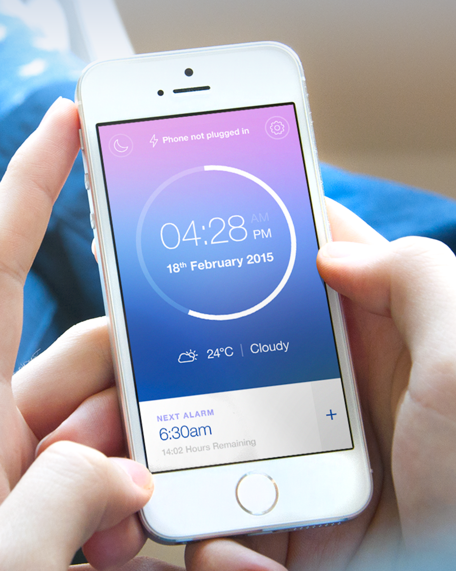
Apps
In a sea of apps, you need to find a way to stand out. And whether you use it in your marketing materials, in your app’s background, or as a UI element or accent, gradients are a great way to do it. Depending on which colors you choose, you can set the mood for your app—bold colors for an energetic feel, pastels for a calming experience.
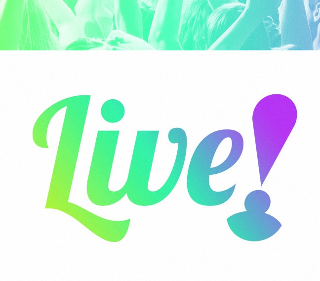
Design by fikandzo for Live Tonight
Design by masiko
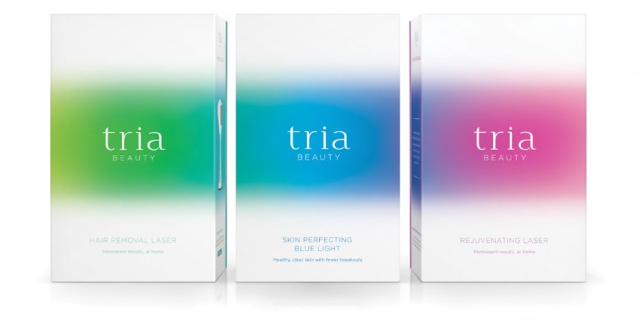
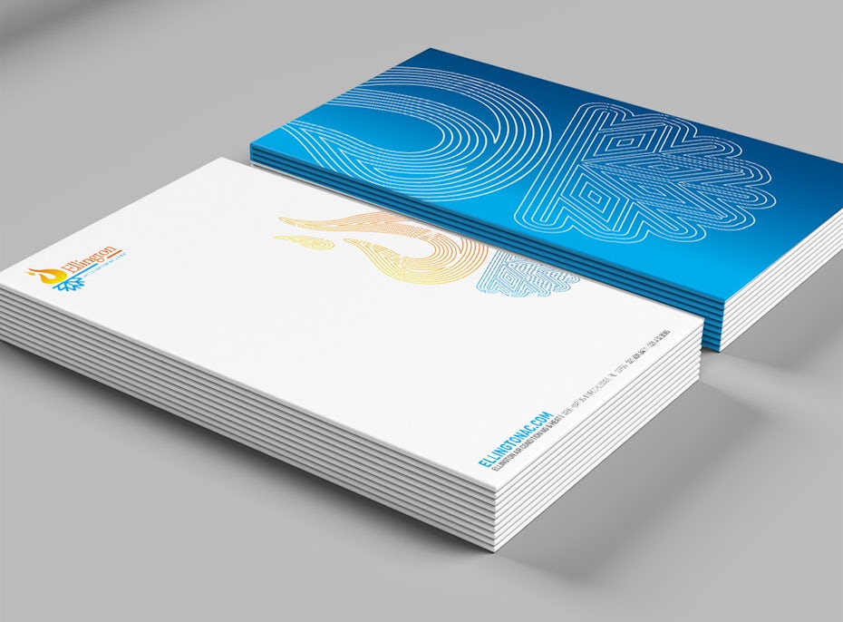
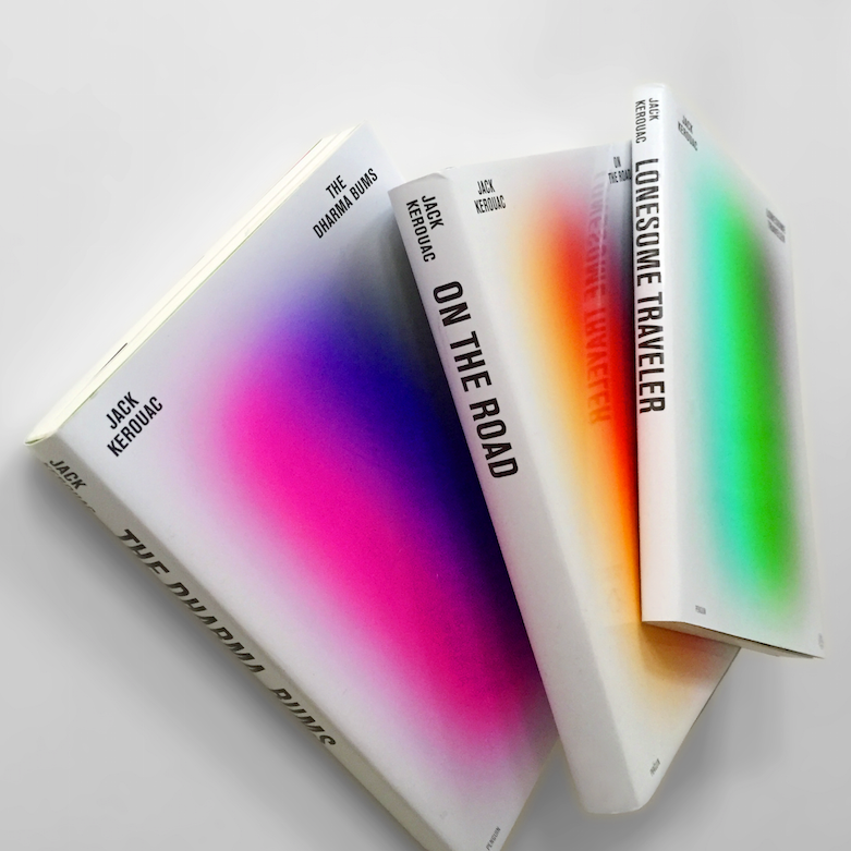
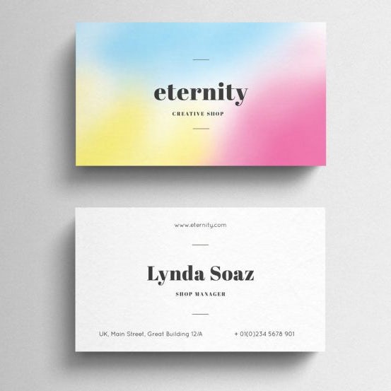
Print materials
Business cards, book covers and posters: print materials are a fantastic opportunity to bring the gradient trend to life—literally. You can incorporate a gradient logo, use a subtle color combination as a background (which will help your text pop), or use it as an accent in an illustration. The possibilities are endless, so go wild!
via Torsten Lindsø Andersen
via Weidea
How to make gradients work for you
—
The gradient trend is here to stay through 2019. So the question is—how can you make it work for you?
1. Choose the right colors
The most important aspect of the gradient trend is the colors you choose. In order for the gradient trend to look well-designed, you want to either choose colors that are a similar shade and hue (so, for example, a gradient that fades from light blue to dark blue) or colors that “work” together according to color theory; so, complimentary colors (colors that are opposite of each other on the color wheel), analogous colors (three colors side-by-side on the color wheel), or triadic colors (three colors spaced equally apart on the color wheel).
It’s also important to choose colors that are aligned with the kind of feeling and emotional response you’re trying to evoke in your audience. Do you want people to feel calm and serene when they visit your website? A gradient that fades from a soft green to blue will do the trick. Want people to be in the right state of mind to buy? Go with bolder colors, like red or orange, that can get people revved up to shop. Color psychology is a powerful thing—so make sure you keep it in mind when choosing colors for your gradient.
And last (but certainly not least), make sure the colors you choose for your gradients are colors that work with your existing brand colors; if your brand color palette is red and blue, doing a lime green and neon yellow gradient probably isn’t going to look so hot.
2. Use gradients wisely
Like we said—gradients are versatile. You can use them to add depth to a flat design, to add visual interest to a solid color background, as an overlay… The list goes on and on.
But just because they’re versatile doesn’t mean #allthegradients should be your new design motto. Just like any trend, when it comes to gradients, less is (probably) more. Keep the design simple. Don’t go overboard. You should be using gradients, but make sure you’re using them wisely.
3. Know your audience
If you want your gradients to have the right effect, you need to really know your audience and what kind of designs they’re going to respond to. For example, if you’re marketing to a group of more traditional businesspeople, a neon pink and yellow gradient probably isn’t going to be your best bet.
Know your audience, and then choose the right gradient—the colors, how you incorporate them into your design, and whether you take a loud or quieter approach.
4. Make it fun
This is a fun trend, so have fun with it! Play with different colors, try using gradients in the background and as the focal point to find what works best for you, go wild with the overlays…the point is, this isn’t a trend that’s meant to be taken super seriously. So let loose and have fun with your gradients!
Fade out
—
Unlike other relics from the 90s (JNCO jeans, anyone?), it looks like the gradient trend is here to stay. And now that you understand the ins and outs of gradients, you have everything you need to incorporate this trend into your designs in 2020.