A logo is like the front door of a business. It’s a first impression. It’s a greeting. It’s got an energy. The world’s most iconic and most famous logos have this down.
What makes a successful logo design? Successful logos are immediately recognizable, reflect a brand’s message and stand out from the crowd. They build trust and look timeless and professional. Effective logos also work at any size and anywhere. The top 10 iconic logos below manage to do all this and more.
Markets and trends are always evolving, but certain characteristics like typography, layout, patterns and color have a huge impact on how people perceive a logo. Knowing how the big brands do it right will help you refine your own brand and connect with your audience.
Let’s dive in and take a look at a few companies who have really raised the bar with their logo design, why they have been so successful, and what we can learn from their iconic logo designs.
Drawtify, make design easier. Drawtify is an online graphic design software with vector drawing, layout, photo editing, and typography. It works on all platforms. And it’s free.
Top 10 famous logos
—
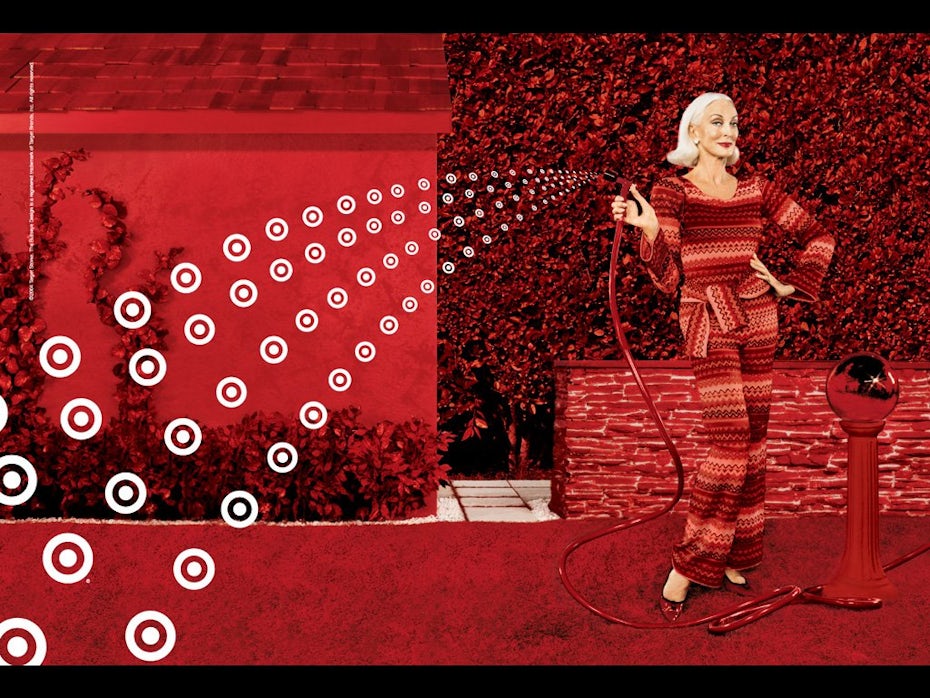
Target
The history
Target created their unique and synonymous logo in 1962. Originally, it had three white and three red rings with the company name boldly displayed across it. Just seven years later, the company launched a famous ad that featured a woman wearing the Target logo as an earring—the earliest use of Target’s branding becoming “unexpected.”
In 1989, the company temporarily removed the image from its logo, and it became a text-only wordmark with “TARGET” in bold lettering. But in 2006, the iconic, standalone bullseye returned with the text removed.
The design
What better way to represent the name “Target” than by using an actual target. Makes sense, right? Simple, yes. But the passion behind the design goes deeper.
Target’s logo stands out due to its strong use of the color red and striking simplicity. Many of the logos we will visit in this piece have stood the test of time due to their impressive minimalist design, and the Target logo is the most prominent in this regard.
The circle-within-a-circle logo design communicates universally. The use of negative space beyond the outer red ring carefully creates an image of strength and trust. Circles convey friendship, community, and endurance—traits which are all important to the Target brand.
In business, the color red denotes passion, importance. and attention. White represents cleanliness, virtue and health. When we explore the philosophy of the company, the colors used in their logo design match perfectly with the vision and purpose of the corporation.
It’s incredible how much thought and effort went into such a simple logo.
The lesson
Depending on your industry, you’ll need to identify certain traits in your logo design. Shapes are a great way to do that. Like Target, if you want to demonstrate trust and community, circles can convey that to your consumers.
Use negative space to avoid clogging up your design with elements that will prevent your consumers from knowing the most important things about your brand.
Apple
The history
Apple’s first logo in 1976 looked nothing like the logo we know today. The original featured Isaac Newton sitting beneath a tree with the apple hanging from it, poised to drop. While it was creative, Apple quickly simplified their logo to a literal apple.

Between 1977-1998, Apple often used a rainbow-colored logo design to coincide with their first color display computer. But this grandiose use of color eventually evolved into shiny chrome and then flat color—the version the world sees today.
The design
As with the Target logo, it’s easy to point out the simplicity of Apple’s current logo design. So, why the shift from its original rainbow to chrome to flat color?
Apple strives to make stylish products that are as accessible as possible, so even the most technologically-challenged individuals can use them. The chrome and then flat-color logos demonstrate sleekness and sophistication; the curved apple denotes style. All three traits are synonymous with the Apple brand.
What about the bite?
Some people say the “bite” out of the apple is a pun on the word “byte” (as in gigabyte, or megabyte for us rookies). Others call it a metaphor for the bite of knowledge consumers get from using Apple’s products. Either way, we think it’s a pretty awesome way to add interest to a minimalistic logo.
The lesson
So what can we learn from Apple’s rad logo design? It’s important to notice how the Apple logo displays the traits of its products in its design. Their logo completely matches the personality of their brand. When we think of Apple’s products, we think of words like accessible, sleek, and intelligent. The logo conveys just that.
The simplicity of their logo goes a long way in sticking in the mind of the consumer—too many things going on in a logo, and we will most likely forget about it easily. The stark and striking simplicity of the Apple logo means it’s universally recognized and easily remembered.
The history
Google created its original logo in 1998 using a standard font to display the company name. The logo remained practically unchanged until 2009 when the company altered the coloring and shading of the lettering. In 2014, Google made a few minor changes to letter spacing.
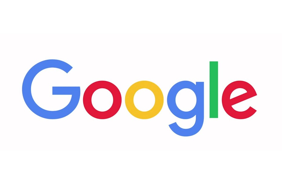
In 2015, Google relaunched their logo with a new, modernized custom typeface and similar colors that were more vibrant and saturated. This is predominantly the logo we know today.
The design
Once again, the simplicity of Google’s logo is clearly evident in its design (starting to see a trend here yet?). As with Apple, Google likes to boast how accessible it is to the masses, which is a huge part of what people know and love about the company.
Since Google chose a wordmark for its logo design, their use of color is very important. Google aimed to use primary colors to give its design a look that pops. However, notice the “l” in the logo. Green is a secondary color, and Google included this in its logo to say “We don’t have to follow the rules,” a choice that arguably makes the company look more innovative.
The wordmark’s letter spacing flows seamlessly to represent how Google moves users through its interface. The use of negativ
e space also provides a stark contrast to the primary colors used, signifying the way the company stands out over the competition.
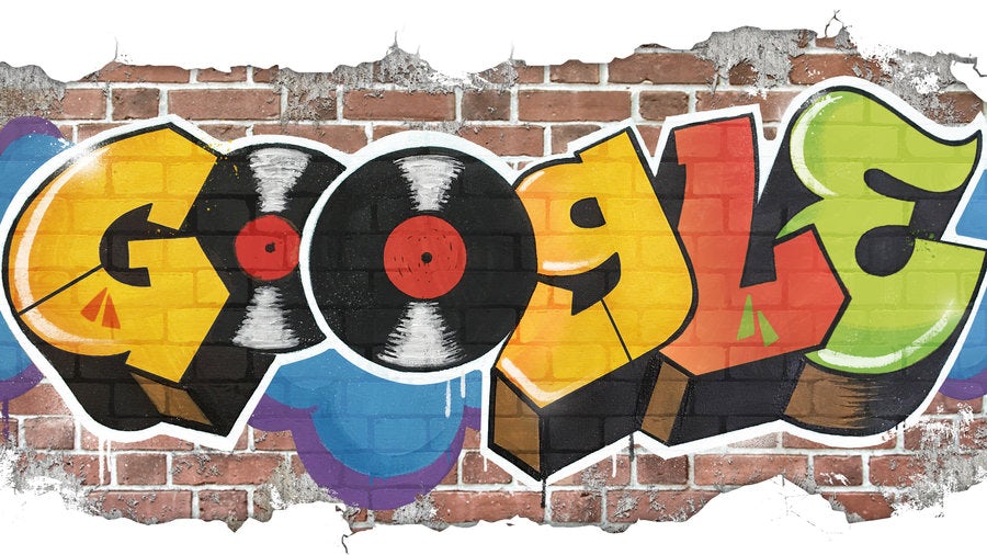
On a final note, Google often uses quirky versions of its logo to reflect world events, a great way for the company to stand in community with a worldwide audience.
The lesson
Just like Google, consider updating your logo to reflect local or world events. While you might not want to go changing your logo every week, an innovative touch like this is a great way to stay relevant with your consumers.
Think carefully about the use of color and lettering in your logo design. Do bright colors represent your brand? How much space do you want to include between your letters? The Google logo gives us some great insight into how this can make a difference.
FedEx
The history
The original FedEx logo was born in 1973, a plain blue wordmark on a patterned blue background. Over the years, the colors and typeface have changed. But in 1994, the company introduced the logo we know today, with the iconic white arrow visible between the second E and the X.
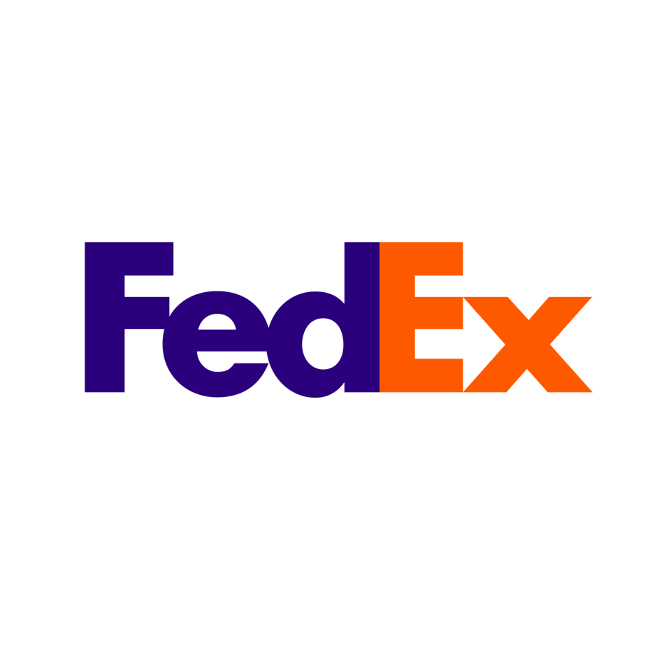
The design
I have given the game away already… FedEx hid a white arrow inside the last E and X, a subliminal symbol of speed, movement and precision—very important traits for a delivery and logistics brand.
FedEx also represents multiple arms of their company through a clever use of color. While maintaining the purple color of the “Fed” in the logo design, the “Ex” portion changes based on the product. The most common color combination we see is purple and orange for FedEx Express, the service used for the bulk of packages.
Pretty cool, right? We think so.
By changing one of their logo colors, the company can symbolize each aspect of their company in a different way. Because color psychology is so important in business, each color can intentionally reflect a specific aspect of your brand.

The lesson
Hidden meanings within a logo might just be the creative edge you have been searching for in your logo design. Why not try something like this? Give your consumers that “a-ha” moment and up the clever-factor of your design to appeal to your audience in a really cool way.
Changing font color is another thing we can learn from the FedEx logo. Do you have different areas of your business where you could do something similar? Look at color psychology and see how you can weave multiple colors for multiple products into your logo design.
LG
The history
Founded in 1958 as Goldstar Electronics, the LG we all know rebranded in 1995 with an original logo and the slogan “Life’s Good” curving around the left side of the design. In 2011, the logo received a glossy, 3D effect, which the company uses today.
The design
When you first look at the logo, what do you see? Hello, winking happy face!
Although more obvious than the hidden arrow in the FedEx design, the emoji face hidden in the LG logo is undeniably clever. The letters “LG” match up with the company slogan “Life’s Good,” and what better way to bring those words to life than a happy face? Additionally, the G is shaped like an on-button, which is very fitting for an electronics company. Told you it was clever.
Like the Target logo, LG uses a red circle in its design to signify friendship, community and endurance. (When you’re buying a new electronic product, doesn’t it sound even better coming from a company that values endurance?) This particular shade of red officially is “the unique LG red color.” It’s not a particularly glamorous way of describing the color, but it does highlight how important red and its color attributes are to their brand.
On its storefronts, the company gives their logo a 3D transformation. This gives it a futuristic appeal which according to LG, helps to “strengthen the visual impact of their symbol mark and helps communicate their attributes.”
The lesson
Again, simplicity in your logo is key. The LG logo design finds ways to convey all of their brand attributes with one color, two letters and simple shapes. A great logo can establish brand identity with just a few elements. Don’t go overboard!
LG also provides us with another example of a hidden image in their logo design. If you can unlock your creative side and do something similar, this is a highly innovative way to represent your brand attributes.
Toyota
The history
Toyota actually began its history as “Toyoda,” named after its company founder. In 1936, the company ran a public competition to design a new logo, and rebranded as “Toyota,” a word that is visually simpler (and luckier!) in Japanese. In 1989, the company launched its current oval logo.
The design
Like LG and Target, Toyota uses red as its primary brand color. When selling vehicles to the masses, a sense of community, friendship and endurance are all vital traits. But what about that silver or gray? It represents conventionality, dependability, professionalism and safety, while the metallic shine adds a feeling of high value and quality.
The curved edges of the logo convey sophistication and sleekness, while the typeface is bold and striking, implying strength and dependability.
So, what do all those fancy looking ovals in the logo mean? According to Toyota, the two perpendicular ovals inside the larger oval represent both the heart of the customer and the heart of the company. They overlap to model the mutually beneficial relationship between both. Together they form a “T,” the first letter of the company that also resembles a steering wheel shape.
While being one of the more complex logos out there, the thought and creativity behind the design definitely goes a long way in displaying the care and sophistication Toyota puts into its products.
Pretty awesome, right?

The lesson
While still staying simple, Toyota pa
cks in a lot of hidden meanings into its logo design. You can do this too, which is a huge stride toward demonstrating the care you put into your business and building better relationships with your customers.
The Toyota logo is also a great example of contrast. The curved edges of the design combine well with the striking boldness of the font. Think about including a similar contrast in your own design. Do you want to imply strength as well as sophistication? Or maybe sleekness and endurance? Too much contrast can lead to confusion, but when used well, it’s a great way to present multiple attributes to your consumers.
Mercedes-Benz
The history
Most car companies change their logos over time to evolve with design trends. But a logo that’s managed to stay original and significant for over a century is the Mercedes-Benz star. The company introduced the star in 1909, and it’s still the central element of their logo to this day.
The design
Mercedes displays its logo on many of its vehicles and advertising without any lettering. With decades of brand awareness, the company can easily tap into consumers’ universal knowledge. But the star itself is packed with meaning: the three prongs represent the air, land and sea—each a segment of the automotive industry.
Like Toyota, the logo’s silver color evokes dependability, security, professionalism, and conventionality along with value and quality. Notice an industry trend?
Compared to other brands, the Mercedes typeface is thin and curved, which gives it a touch of elegance—exactly the image the company wants to create.

The lesson
Fonts matter. Compare the Mercedes typefaces to the one in the Toyota logo, and you can clearly see the difference. The curved edges allow the company to evoke luxury—all with just letters. Imagine if that font was thick, bold and blocky. Not quite so elegant, right?
If you plan to use text in your logo, remember that every typeface has its own personality. Find one that fits your brand, and run with it.
Shell
The history
You might know Shell as a gasoline and oil company. But wayyyy back in 1891, Shell began as a trading company that specialized in bringing sea shells to Western nations. That was quite the pivot.
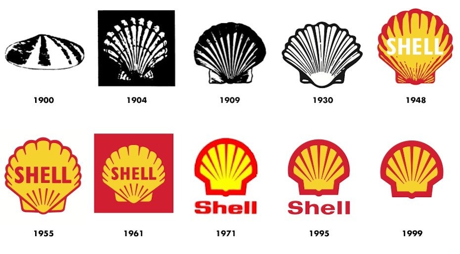
In 1900, Shell introduced its first logo, a black-and-white drawing of a seashell. Since then, the image of a shell has never disappeared from the company logo, though its various facelifts include a color makeover in 1948. The current logo appeared in 1995, the company now uses it as a standalone mark without any text.
The design
Shell’s bright red and yellow brand colors are iconic. But rather than color psychology, these choices play up a cultural significance. When Shell first appeared in California, the company wanted to match the colors of the Spanish flag—where many early California settlers were born—to try and form an emotional bond with their customers. Looking at how the company has fared over time, that bond’s become pretty strong.
The shell represents a mollusk, which points back to the company’s trading roots, but is also part of the eco-cycle of oil exploration. A bold font and strong lines reflect a bold company with a strong standing in the business world. Can you imagine how people might view the logo if it was curvy and soft?
The lesson
Could you reflect your company history in your logo? Or even make a strong cultural connection? Shell’s colors remind us of the company’s heritage, and you could use this technique to forge an even stronger bond with your consumers.
Coca-Cola
The history
Coca-Cola introduced their first black-and-white logo (that’s how most things were back then) in 1886. Over time, the logo has evolved, but that classic, script lettering has largely remained the same. By 1958, the brand’s famous red and white colors officially became part of the logo.
Across dozens of iconic marketing campaigns (we all remember the “Enjoy a Coke with [insert name here] bottles), the logo hasn’t changed dramatically, aside from the addition of the “white wave” we commonly see underneath the text.
The design
You’d be hard pressed to find a logo that has been more resilient than Coca-Cola’s. So what is it about the logo design that makes it undoubtedly one of the most impressive in the world today?
Originality and class.
The Coca-Cola logo design reflects classic Americana; the two are synonymous with each other. The cursive and fashionable lettering is truly unique and absolutely personifies the fashionable class of its brand. When we think of classic America we simultaneously see the Coca-Cola logo, which gives the company both a nostalgic and cross-generational appeal.
The modern Coca-Cola logo is recognized and loved around the world because of its famous red and white colors. So, why red?
Red is a very powerful color. It evokes excitement, energy and passion. Don’t these traits seem reflective of the classic America already mentioned? Red also stimulates the appetite, which undoubtedly works in a soft-drink company’s favor!
The lesson
What lessons can’t we take from Coca-Cola’s original, innovative and simplistic design? Seriously, if you ever need inspiration for your logo, you can surely find it here.
Lead with color. Coca-Cola and red are synonymous. The company goes all-in when it comes to pushing its brand colors into its products and marketing—and it works. Use color psychology to find a primary color that fits your brand to “stimulate the appetite” of your own consumers.
Consider custom fonts. The Coca-Cola logo is particularly impressive because of the way the font clearly matches the personality and identity of its brand. That’s because it’s completely custom. As you develop at your brand, get creative with how you can use or reimagine fonts, letters and shapes that aren’t off-the-shelf to make your brand truly unique.
Nike
The history
We all know the Nike “Swoosh,” but the story behind its design is not one many would guess. In 1971, graphic design student Carolyn Davidson designed the logo and sold it to Nike co-founder Phil Knight for a mere $35.
Yes, y
ou read that right, $35!! Not a bad investment. Knight forged Nike with the power of the swoosh, and the rest is history.
The design
The swoosh began with text that accompanied it. But now it doesn’t even need it. Like Shell, Apple, Mercedes and Target, few companies can boast that their logo is universally recognized.
Well played Nike, well played.
In Greek mythology, Nike is the goddess of victory, and the meaning behind the name inspired the logo. The swoosh mimics the wing of the goddess combined with Nike’s own brand traits.
What do you feel or see when you look at the Nike logo? Speed? Acceleration? Power? That’s exactly what the company wants you to feel, and this innovative design represents all of these traits in a simple and creative way.
The swoosh also resembles a check mark, which signifies “yes”, a symbol of reinforcement and positivity.
The lesson
One of the most prominent lessons we can take from the Nike logo is how to convey attributes through shape. The swoosh evokes motion and speed. What shapes tell the story of your product, brand and mission?
Also consider how you can display your logo with and without text. Few logos can stand alone, but when its done right, they’re just as powerful.
How famous logos do design right
—
These famous logos belong to companies that people all over the world admire because of their success, philosophy, identity, or customer satisfaction. Each logo captures the brand perfectly to forge an identity that everyone can relate to.
What do they have in common? Perfect use of colors, shape and lettering—all while keeping it simple. Use these techniques to create a stellar logo design that tells your customers everything they need to know about you, your products and your values. And don’t forget to pay attention to not only what you want to know, but also feel, when they look at your logo.
A great logo isn’t the sole indicator of a successful business, but a thoughtful, eye-catching logo design will help you establish yourself as a reputable brand in a competitive space. And you’ll look super awesome, too!
Origin: https://99designs.com/blog/logo-branding/famous-logos/
Looking for more logo design tips? Learn how to design a logo here.