Choose fonts for your brand. While less flashy than brand marks and imagery, solid brand font selection is the glue that ties your whole organization together. Fonts tell a story by bringing a voice and personality to your work. Whether in print or online, a good typeface can engage your audience—while a bad one can drive them away, cringing.
Origin:https://99designs.com/blog/tips/brand-fonts/
If you’ve already settled on a logo, you might already have one chosen font that matches your brand’s aesthetic. But the work doesn’t stop there—you’ll also need a strong secondary font and clear body copy font.
When you start the process, the sheer amount of fonts now readily available might be overwhelming. Follow these guidelines to find the typefaces that work best for your brand.
Drawtify, make design easier. Drawtify is an online graphic design software with vector drawing, layout, photo editing, and typography. It works on all platforms. And it’s free.
The branding messages fonts send
—
Sign up for our free, 7-day email course and learn to build the perfect brand identity.We’ll also send you creative tips, trends, resources and the occasional promo (which you can opt-out of anytime).Sign me up! View our privacy policy
Even before a customer reads the message in your marketing, the font is already communicating something to them. Each font delivers a different message and has different strengths and weaknesses.
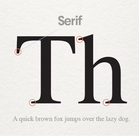
Serif fonts
Serif fonts are the oldest, most classic typefaces. A “serif” is a small decorative line at the end of a character’s stroke. The most popular and ubiquitous example is Times New Roman, the default font for a generation of people using Microsoft Word. Serif fonts are classy, literary and high-end. They are always a good choice for extended paragraphs of text—like books, brochures, and fine print—because they are highly legible and our eyes are accustomed to their shape.
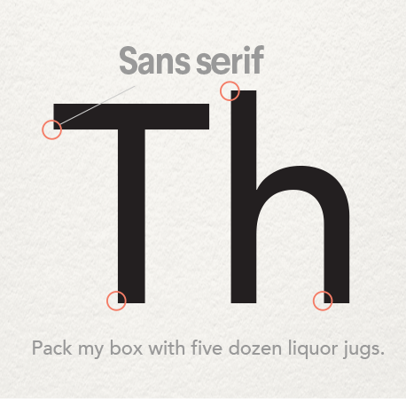
Sans serif fonts
If you remember your high school French you may have already put together what sans serif means—“without serifs.” They don’t have the little feet that serifed fonts have and also tend to have lines that arena thickness from one end to another. This very article is in a sans serif font! They are great for general readability and work very well for fine print. They also have the added benefit of working well in lower resolutions which makes them perfect for digital uses, including websites and e-readers. They always bring strength, clarity, and a modern, clean look to any project they are featured in. Different weights of the same font can offer drastically different tones, for example: thick sans serifs are masculine and hardworking, while thin line version looks glamorous and noble.
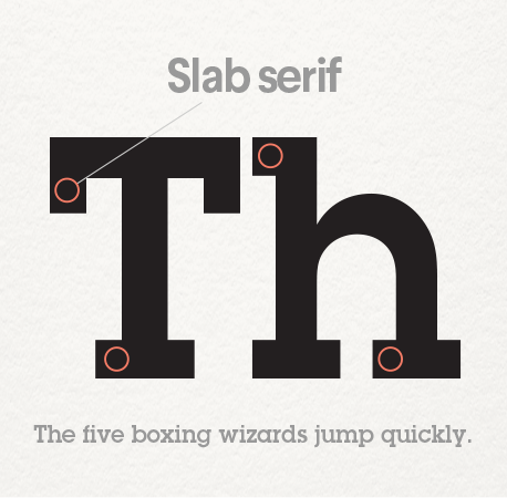
Slab fonts
Slab fonts are characterized by their blocky serifs. If you’ve ever typed on an old-school typewriter, you’ve seen slab fonts. They bring a old-school, almost nerdy, charm to a project or brand. They have to be used carefully and are usually better for logos and headers, rather than extended text, but are still easy on the eyes.
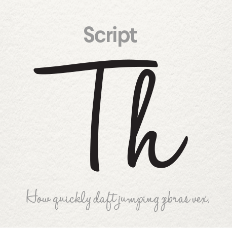

Script fonts
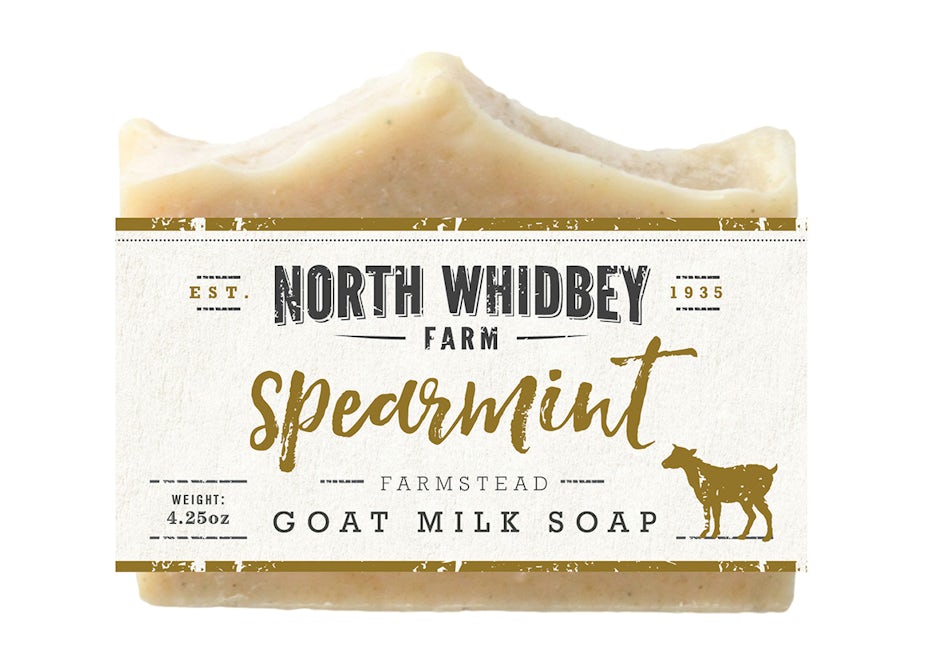
Script fonts are intuitive—they look like cursive! In recent years, the availability of script fonts has skyrocketed as people look for a unique way to represent their brand. Much like handwriting, there are a vast array of unique script fonts available. They range from the highly calligraphic styles found on wedding invitation, to the incredibly down to earth styles used by bloggers to mimic handwriting. They are decorative and so not suitable for long paragraphs of text but can bring a gentle femininity to anywhere they they appear.
Decorative fonts
These are the highly stylized fonts that evoke very particular feelings in a reader. You should always be careful when using decorative (or display) fonts. Why? Because lots of
them are very, very bad (we all know how the internet feels about Comic Sans). But they shouldn’t be completely avoided as there is also the odd good one.
They are never a good choice for secondary fonts or for body text fonts. Think of them like fireworks: while they can be lots of fun, they’re best if left to the trained professionals.
Whichever font you choose, be wary of using types that are too “trendy.” While every designer will have their own opinions on which fonts fall into this category, the decisions you make for your brand need stay consistent over a range of years. You don’t want your fonts to look dated too quickly.
Crafting successful font combinations and building hierarchy
—
Five minutes on Pinterest will have dozens and dozens of graphics promising shortcuts to creating amazing font combinations. While clicking through will often yield a lot of dead links and free fonts with limited usability, it still underlines the importance of successful font mixing. Fonts are most powerful when used in opposition and support of other fonts, especially ones that provide contrast.
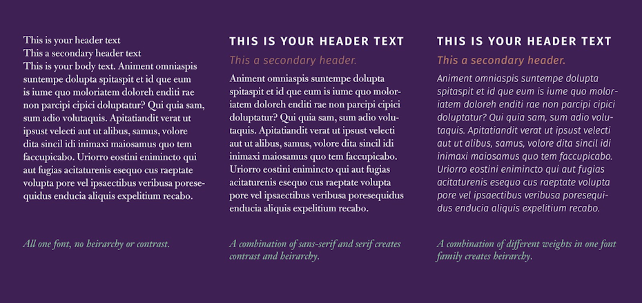
There are two basic ways to do this: you can either use two complementary fonts from two of the categories above, or you can mix two styles from the same family. For example: sans serifs work beautifully as a secondary font for section headers, especially if your body font is a serif. On the other hand, using a font in bold caps for heads and smaller, regular weight for the body creates the same pleasing contrast.
Whichever method you choose, make sure your fonts are have a proper hierarchy. Typographic hierarchy is the ordering of your fonts to best communicate the information you need the reader to understand. In this article you’re reading right now, for example, “Crafting successful font combinations and building hierarchy” let you know, from its size and weight, that we were moving onto a different topic.
Which brand should use which font?
—
Picking out fonts is a lot like picking out an outfit. You can technically wear anything in the store, but you have to learn to trust your gut on what’s practical for your needs and what works best for your personal style. While it’s impossible to say that any font would be bad choice, some just won’t be appropriate.
If you’re a financial firm it might not be appropriate to use a highly decorative font that suggests artsiness and not seriousness. If you’re running a wedding photography business you might want to use a script font, which can read more romantic. Recently brands have been moving to more classic fonts (witness the stratospheric rise in popularity of Helvetica) which can be boring but never risks a potential customer being turned off.
Free fonts versus paid
—

If you’re trying to do some of your branding yourself you might be tempted in the direction of free fonts, since there are thousands and thousands readily available on the internet. Many of them are clean and might serve your brand well. Be highly selective and evaluate them carefully. As mentioned above, you might find you need various weights (bold, semi-bold, italic, etc) that free fonts often don’t have. You might find you need a character or symbol that isn’t included. Many free fonts don’t have extended characters for foreign languages and currencies; others don’t even have apostrophes and hyphens!
For web use, Google Fonts offers a wide array of open source typefaces that you can use on any website, even if it’s for a business. (They also have a nifty type combination tool that can help you see what fonts other people are pairing together.)
Brand fonts to avoid
The most important rule is pick fonts that are legible and clear. The won’t tire the eyes after extended reading. Pick fonts that seem timeless and classic but don’t remind people of writing high school english papers (I’m looking at you, Times New Roman). Don’t pick fonts that are closely tied to another brand—just because someone made a rip-off of the Disney font and is offering it as a free download doesn’t mean it’s a good idea, or even legal, to use it.
Now that you have a better idea of what fonts will work best for your brand, it will be easier to create a clear style guide to make sure your company’s marketing stays cohesive across platforms.
Want more branding tips? Here’s how to create a great brand identity for your business.