Choosing the right logo colors can highlight your business’ strengths and help you attract the right customers. And, as you might guess, the wrong combination can have the reverse effect.
Origin:https://99designs.com/blog/tips/logo-color-meanings/
Everyone has heard of color psychology, which tells us that colors impact our emotions and behaviors. Yellow is cheerful (because the sun is bright and yellow!) and green is calming (like laying in the grass and looking up at a bunch of leaves is peaceful). But do these logo color “rules” really mean anything in business and branding?
Researchers Lauren Labrecque and George Milne looked into that question and found that some colors have a measurable impact on consumers and others don’t. So yes, yellow will make your brand look youthful and approachable, but a green logo doesn’t inherently make customers think your brand is peaceful. We’ve used their research (and others’) to come up with a definitive list of what logo colors actually tell potential clients. Read on to learn:
- Which logo colors mean what
- Where logo color meanings come from
- How to choose a logo color
- How culture impacts logo color meaning
- What you can do to stand out from the competition
Drawtify, make design easier. Drawtify is an online graphic design software with vector drawing, layout, photo editing, and typography. It works on all platforms. And it’s free.
Which logo colors mean what?
—
Red logos
Red is the universal sign of excitement, passion and anger. It draws attention and makes you stand out from the crowd. Is your brand loud, playful, youthful or modern? Think red. More mature, classic or serious? Red may not be for you.

Intense design by ultrastjarna
Attractive logo design by nnorth
Design by KisaDesign
Design for life coach by CostinLogopus
Design by Dexterous”
Strong angular design by Dexterous”
Red is the first color that babies can see (besides black and white). Scientists theorize that humans evolved the ability to see red better than other colors because it allowed us to more easily identify fruits growing on trees. It developed a strong evolutionary meaning, as well: when they’re emotional (either with anger or passion), human faces turn red. Thus today we associate that color with hightened emotion, including love, sex, anger and passion. And while not exactly an emotion, red has also been shown to stimulate appetite (which is why you see it in many food and restaurant logos).
Whether used alone, or as an accent color, red is a powerful choice for a logo color.
See more red logos >>
Orange logos
Orange is an invigorating, playful color. Go orange to stand out from the crowd. It’s used less often than red, but still packs an energetic punch. Be cautious when using orange if your brand is trying to appear luxurious, feminine or serious, as orange does not invoke those traits to consumers.
Tub company logo by C1k
Knitting webshop logo by ananana14

Cheeky logo design by Cross the Lime
Minimalist logo design by makmoer
Duck logo by cucuque design

Logo design by gromovnik
A combination of yellow and red, orange takes on traits of both of those primary colors.

Orange was one of the more recent color words added to the English language (in fact in old English it was known as “yellow-red;” the word orange was adopted from French when the orange fruit was imported from the Mediterranean.
Orange is associated with change (think autumn leaves or orange skies at sunrise/sunset) and is often used by brands who like to think of themselves as a little bit different.
See more orange logos >>
Yellow logos
Yellow logos reflect accessible, sunshiney friendliness. Yellow exudes cheer, and your brand will radiate an affordable, youthful energy. On the other hand, most consumers do not associate yellow with maturity or luxury brands, so think twice if that’s how you want your business to be seen.
Minimalist logo design by goopanic
Eggcellent logo by Stephen.

Dreamy logo by CostinLogopus

Spiritual logo by majamosaic

Design by chilibrand™

Rally Car logo by Dexterous”
Yellow is a primary color in subtractive color systems, and was one of the first paint colors humans were able to mix. It has many cultural associations (gold, fields of wheat and corn, sunlight, etc), and is one of those colors that’s very diverse. A soft, bright yellow is light and fresh, where a deep gold holds more weight and history.
See more yellow logos >>
Green logos
The ultimate in versatility, research shows that green isn’t linked with many brand personality traits, but it has strong cultural associations. That means you can use green for just about any type of business.

Earthy design by Mila Katagarova
Intimidating logo by Dexterous”
Natural design by Creative Dan

Design by green in blue

Logo by Musique!
Mini alien logo by goopanic
Since plants are green (and they come back to life after a long winter), many people say green is the color of growth or new life—and in the middle ages pregnant women were almost always painted wearing green. But historically and in different cultures, green has been a color of death. (In fact, a popular green dye created in the 18th century included arsenic, and it literally killed people. Some have argued that it may be partially responsible for the death of Napoleon Bonaparte, whose walls were covered in green-dyed wallpaper).
In the US, we associate green with money because dollars are green, but remember that this association won’t hold across other cultures. What does all this mean? Green can work for just about any brand. Build meaning through hue, shade, logo shape and your font choice.
See more green logos >>
Blue logos
Blue symbolizes trustworthiness and maturity. You should use it for your brand if you want to be taken seriously. One thing to keep in mind, though, is as the classic king of colors, blue appears in over half of all logos. If you use blue for your brand you’ll need to find a way to stand out!

Oceanic design by Hes4Ka
Tree logo by Jani Tavanxhi
Cute dragon design by PicSee
Spartan design by arkum

Glassy logo by Graphyte
Logo for boutique development house by REØdesign
Ironically, considering its popularity today and the fact that it’s a primary color, it’s likely that ancient people (Greek, Chinese, Japanese and Hebrew) couldn’t see the color blue, making it one of the newer colors to be experienced by humans. It’s one of the last color words to appear in virtually every language (which scientists believe is linked to the ability to actually see that color). In fact there’s still a tribe in Namibia today that can’t differentiate between green and blue.
All that being said, choose blue for your brand if you want to exude classic confidence or ensure trust in your brand. (Well, unless you’re in Namibia!) Be wary of blue if you are in the food service (it supposedly suppresses appetite). If you love blue and want to be more playful, just make sure you choose a lighter blue that is more on the teal side of the color wheel.
See more blue logos >>
Purple logos
Purple is where the rainbow gets luxurious. Use purple to appear simultaneously cutting-edge and wise. There’s just a hint of femininity in there too.

Logo by gromovnik
Elegant design by goreta
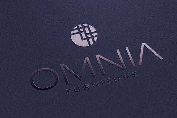
Furniture logo by ultrastjarna
Childlike logo by TheBluebird
Design by **Faith**
High-fashion logo by ananana14
Purple probably gets its luxurious associations because historically purple dye was very expensive, thus the color was only worn by the very wealthy. One interesting thing about purple, though, is while it’s associated with luxury and wealth, it’s not seen as an overly serious color. Got a playful, expensive project? Purple is perfect. Sell affordable men’s clothing? You’re going to be fighting an uphill battle with a purple brand.
See more purple logos >>
Pink logos
In modern, Western society, nothing says “girly” quite like pink. But it’s more versatile than that. From soft millennial pink to neon magenta, pink can give a brand a modern, youthful, luxurious look.
Pink is an unusual color. All 6 colors listed above are either primary or secondary colors in subtractive color systems. In theory, pink is just light red. But we don’t have an equivalent English word for light blue or light yellow. It’s also a relatively modern color word—it only entered the English language in the 17th century. So in the long history of color, pink is still very young and hip.
Watercolor logo by Huntress™
Bold logo by cindric

Design by shaka88

Blowfish logo by blue spin
Smart logo by blue spin
Skull design by Cope_HMC
The well-known cultural meaning of pink=femininity didn’t exist before the 1940s, when clothing manufacturers realized they could make more money if they gendered children’s clothing. Before that it was a unisex color and represented the height of luxury.
See more pink logos >>
Brown logos
What can brown do for you? Make your brand appear rugged, masculine and serious. Brown is the least-utilized logo color, so if you choose it you’ll be sure stand out from the competition. You may want to avoid brown, however, if you want your brand to appear feminine.
Rustic logo by TheBluebird
Design by Project 4
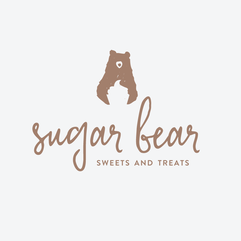
Bear logo by green in blue

Australia logo by Ridhogillang
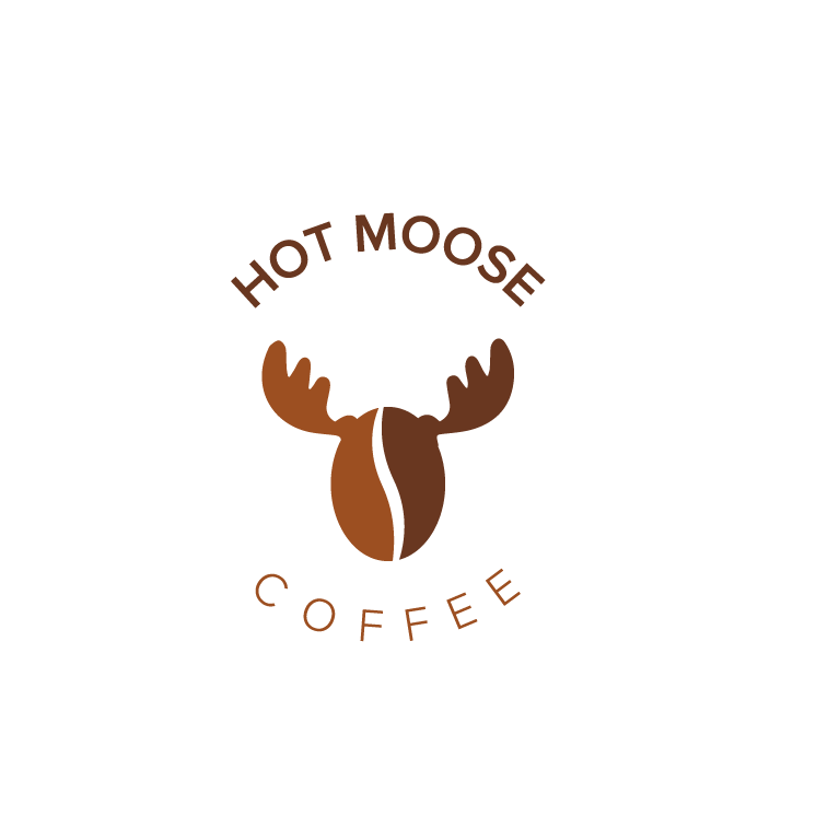
Coffee logo by cucuque design
Magic logo by Henning Bo
Brown is probably not used very often because humans have learned to associate it with rotting and decay. However, that association can be overcome. Brown is also a deep, rich, natural color (that’s made from mixing all other colors together). It can be great to give a brand a rugged, natural feel and is great for outdoorsy companies or those selling naturally brown products (like coffee or chocolate). It also represents aging, so is often used by companies wanting a vintage, hand-made feel.
See more brown logos >>
Black logos
Black is the new black. Want to look slick, modern and luxurious? Time to go black. Rather be economical and affordable? Stay away from the dark side.
Badger logo by Cross the Lime
Old fashioned logo by Project 4

Origami logo by ludibes
Superhero logo by DORARPOL™

Design by goreta

Minimalist logo by Milos Zdrale
Black isn’t a color in the same way that orange and purple are. Humans see those colors because they’re a specific wavelength of light that we can identify and differentiate. Black, on the other hand, is the absence of light. For something as old as light itself, black still feels modern. It simplicity is almost jarring, giving all-black logos a feeling of mystery and exclusiveness that can capitalized on by luxury brands.
See more black logos >>
Gray logos
Not quite dark, not quite light. Gray is the middle ground of mature, classic and serious. Go darker to add mystery. Go lighter to be more accessible.
Design by Project 4
Wild logo by evey81

Maternal logo by m-art

Architectural logo by Bacterykey
Elegant logo design by anapekic
Sophisticated logo design by goreta
Like with black, there is a stark simplicity to gray. Because it’s softer, however, it takes a more muted, serious vibe, giving gray logos a classic feel.
See more gray logos >>
White logos
White is the absence of color. While you can have a white logo, it must always be paired with another color (as a background) and that color will dominate. When used as an accent—or added to another color to make it lighter—white is youthful and economical. But it can work for almost any brand.

Logo design by Dara T.

Logo design by DAROSE

Logo design by cucuque design
Logo design by Huntress™
Where do logo color meanings come from?
—
Logo color meanings come from the collision of science, art and culture. How your customers respond to colors and color combinations is influenced by 3 things: aesthetics, learned cultural associations and evolutionary programming.
Get the free logo ebook and learn how to build the perfect logo for your brand.Enter your email to get the ebook, along with creative tips, trends, resources and the occasional promo (which you can opt-out of anytime).Get the ebook! View our privacy policy
- Aesthetics: Just like musical notes, some logo color combinations harmonize well, some create tension that gains notice, while others clash and turn the customer off. Basic color theory explains that consumers will tune out bland, too-similar color palettes, and will become overwhelmed by chaotic, conflicting color arrangements.
- Learned associations: Over time, we’ve all learned to associate certain colors with certain feelings: think of brides wearing white on their wedding day as a symbol of purity, or mourners dressing in black to embody a somber occasion. Many of these associations, however, are purely cultural: brides in India wear rich, multi-hued saris, and in South Africa, red is the color of mourning.
- Programmed associations: Researchers suspect that at least some of our color associations are the result of evolution. For example, few humans choose brown as a favorite color because of its association with rotting—and possibly contaminated—produce. Red, on the other hand, is a universal sign of heightened, passionate emotions, which makes both people and animals stop and take notice.
How to choose a logo color
—
Before picking your logo color scheme, think about the message you most wish your business to convey. What virtues do you want to highlight? Speed, bold innovation, efficiency, compassion, intuitiveness?
Brand personality traits that appeal to your target customer are an important consideration when choosing logo colors. Consumers consciously or subconsciously choose products that align with their personal identities. Colors help consumers to categorize products and services, identify which are for them, and in turn make purchasing decisions between similar products.
Once you know what you wa
nt your brand identity to represent, go through the list of colors above and identify which might help you convey the right message.
You don’t have to pick just one color for your logo!
via ebay
via Coors
Remember that you are not limited to one color. If what you choose to emphasize about your business is its variety of products (like eBay) multiple colors are a great way to show that diversity. Similarly, choosing two or three specific colors can highlight what makes you unique. The original Coors banquet logo pairs a golden brown—which not only is the color of beer but is a combination of masculine brown and affordable yellow—with a mature blue wordmark. This is perfect for their target customer.
Don’t be afraid to experiment before making your final logo color choices. See what works and what doesn’t. Once you get a logo design you like, experiment to see what it looks like in different colors. Show the samples people who have never seen it before and ask them what type of company they think each logo is for.
Translate the language of color
—
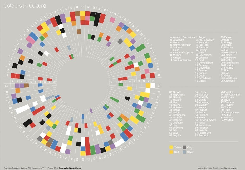
If your brand is international in scope—as so many today are—you should be aware of the symbolic meanings your logo colors can have when viewed in other cultures. A common example is the way white is viewed in most Western cultures as symbolic of purity while in some Eastern cultures as symbolic of death. A little foresight and cultural sensitivity can go a long way toward making effective color choices and getting your logo color meanings right.
Stand out from the competition
—
The key to an effective logo is brand recognition. So if you want to stand out, it’s a good idea to choose a color palette that differs dramatically from those of your largest competitors. Cell phone service providers in the United States are an excellent example of this; each has chosen a distinct color for their brand that most consumers can instantly identify.
via AT&T
via Sprint

via T-Mobile

via Verizon
What logo colors will your logo be?
Choosing the color of your logo is not as simple as liking green and wanting a dark forest logo. Consider how you want your brand’s personality to be perceived and what colors can help you share that with your customers. It’s also worth considering what your competitors are doing. Can you benefit from being the exciting, fun company in a more traditional field? Sometimes zagging is far better than following everyone else’s zigging.
Let us know in the comments what color your logo is (or will be). Want more logo design tips? Check out our article on how to design a logo.