What associations will they bring to the font? What assumptions will they make about your brand identity based on it? To answer these questions and more, we’ve put together these tips and guidelines to help you choose a font for your logo that’s right for you. Read on to find the typefaces that work best for your brand.
When we think about logos our minds often go to the graphic or pictorial elements. And why not? Distilling a brand into a single graphic is a complex process. But choosing the font for your logo is of equal importance since it communicates crucial information like your name and industry.
While you will have the opportunity to use other fonts in other design assets—websites, brochures and printed products, email blasts, business cards—your logo font is what audiences will most associate with your brand. That’s why it’s important to consider how a font will perform when customers see it not only for the first time but on repeated viewings.
Origin:https://99designs.com/blog/tips/how-to-choose-a-logo-font/
Drawtify, make design easier. Drawtify is an online graphic design software with vector drawing, layout, photo editing, and typography. It works on all platforms. And it’s free.
The basic font types and their brand associations
—
Different fonts communicate different attributes and have their own individual personalities. Your future customers will make assumptions about your business just by the font in your logo without even realizing it! This is why—with logos more than almost any other design project—it’s so important for your font to resonate with your brand.
The following is a basic rundown of the font categories at your disposal, but do read our more detailed discussion on the different types of fonts to understand more deeply what association each font type will evoke in potential customers.
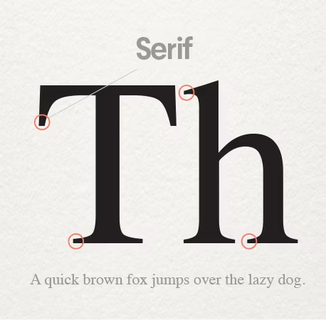
- Serif
- Classic, refined, conservative, tradition.
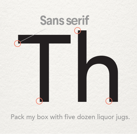
- Sans-Serif
- Modern, clean, geometric, simple.
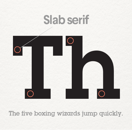
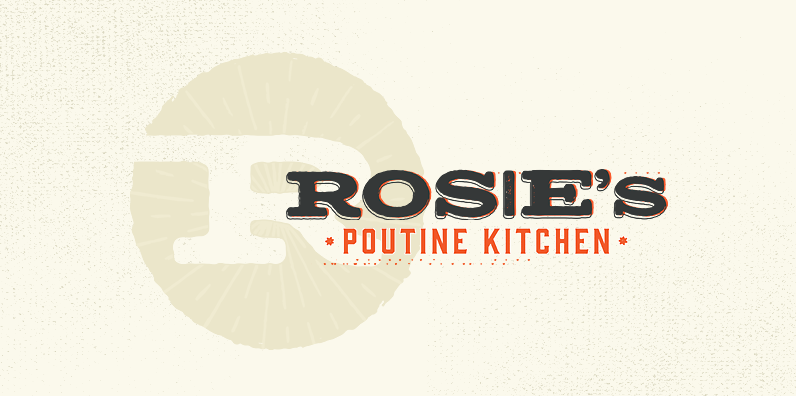
- Slab serifs
- Vintage, rustic, masculine.
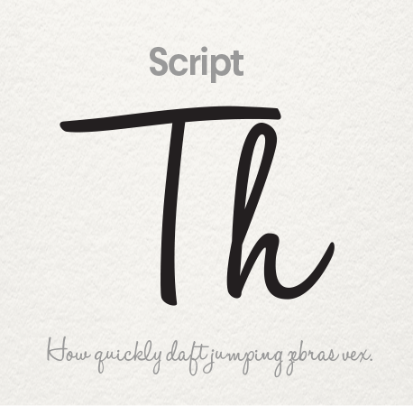
- Script
- Refined, feminine, ornate, elegance.
- Handwritten
- Bespoke, custom, casual, approachable.
- Display: typewriter, novelty, everything else
- Funky, unusual

Font weight and style
—
Once you choose your basic font category, you can narrow down your selection further through style characteristics. Most fonts come in a range of subtle variations and weights—from hair thin to super fat and thick, condensed tight to wide and spacey. A thick weight might work great for a short name but could look too thick and bulky for a longer name. A thin font might look great on a billboard but also could vanish on a business card at a small point size. Thin fonts will always feel delicate and are better suited for a more refined logo, while heavier fonts feel more assertive.
Be sure to review the entire font before you make your choice.
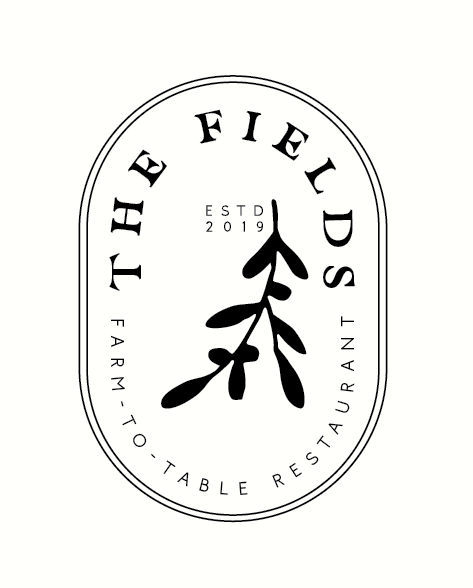
Every font has one or two small elements that make it new and different—the way a y curls beneath another letter or maybe the way the P and r lean into each other. In the case of The Fields logo pictured here, the thick serifs of the E are incredibly distinctive. Because they only appear twice in the logo, they create visual interest—more than that might have been distracting and a poor choice.
These characteristics are the little touches that make your logo unique but also contain potential pitfalls. Imagine buying the license for your dream font and finding out you hate how the upper-case S’s look—no big deal, right? It would be for a business called Sally’s Salon! Take the time to look at all the letterforms in both cases before selecting your fonts.
Meeting industry expectations
—
An important consideration when choosing a font for a logo is not only how you want it to look but how you want it to feel. Does your logo need to have a historic connotation or a sleek and modern sheen? This most likely comes down to industry. A rustic vibe might suit a mechanic shop but will feel out of place on a logo for a software company. Finding a typeface that gels with a particular industry is all about meeting the consumers’s expectations.
by olimpio
by petiteplume
At the same time, be wary of fonts that feel too overdone. Retro slab serifs are so popular with breweries that they’ve ceased to stand out. Same with characterless sans-serifs for tech companies. There’s a balance that needs to be struck between recognizable and overdone. You want a logo that feels in-line with competitors but also still feels fresh.
How to combine fonts in a logo
—
First off: never use more than two or three different fonts in a logo.
A design composition must maintain visual hierarchy so that a reader’s eye clearly knows the order of importance within the data being presented.
The main brand name should be in one font and the supporting text, such as your tagline or brand description, should be in another. If you have other information you want to include—your establishment year, for example—keep it small and clean. Consider using a different weight of one of the other fonts to keep the elements harmonious.
Focus on finding fonts with a shared quality—something in their proportion or structure that ties them together. Even if they are from wildly different type families, their underlying shared quality will make the logo feel cohesive.
Your brand name is the place to use a font with the most character like scripts and hand-lettering.
The supporting text should be the clearest: stick to the highly readable sans-serifs and serifs. This ensures a potential customer will be drawn in by your cool main brand font but the supporting information will quickly and cleanly communicate what you do. Never combine statement fonts like scripts—they have too much character and even if they’re different, hierarchy will be muddy.
By aerith

by winnertime
If you have a graphic element, consider how the font can compliment it.
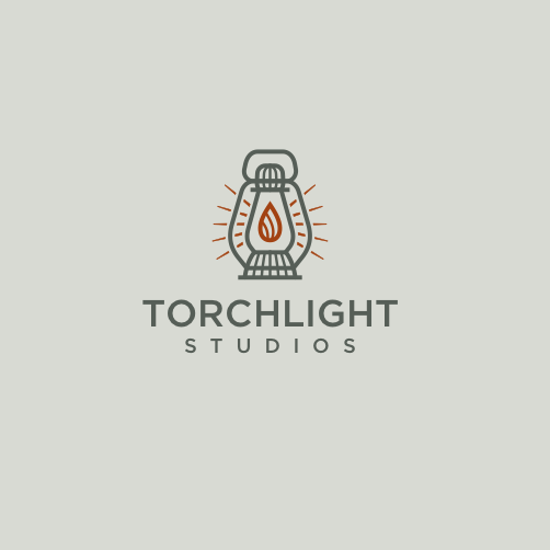
Look at the line weight of your logomark and make sure it matches the line weight of your font. If your graphic element is swirly and feminine, it might pair well with the swashes and loops of a script. If it’s a highly detailed, realistic graphic, it will most likely work with a meatier sans-serif. In both the Lifepath and Torchlight Studios logos, the weight of the font matches the line art of logomark perfectly. They are clearly tied together as part of one composition.
 A wordmark is a logo made up of primarily type. Design by JayJacks0n™.
 A wordmark is a logo made up of primarily type. Design by JayJacks0n™.
You can also forgo the graphic entirely and make the type the logo in what is called a wordmark. Sometimes this is a better choice for small businesses that are focused on building brand recognition. Think about it: you’d rather that someone sees your awesome logo and remembers the name of your business, not how cool the graphic was.
That being said, it’s important to make a decision about which element—the logomark or the logotype—is more important. If you plan on using the logomark by itself, the type can be basic and clean and do its job. If the font will always be used with the logo, this is a stronger reason for infusing your type with as much brand character as possible.
Technical considerations
—
For maximum readability—especially from a distance—consider a font that can be kerned out.
Choose a font that kerns well if you need it to. Design by Zvucifantasticno
Kerning describes the process of putting space between letterforms in order to create a visually please and legible result. Sans serifs in particular retain their readability when they are kerned out with a lot of white space. A script relies on each letter touching the other forms and the white space should never be increased.
If your logo will predominantly be used in the digital space, pick a typeface that is optimized for web and for small logo sizes. This means your logo will look equally great on a large monitor display and a small phone screen. A little digging in the description of the type or foundry will usually reveal this.
Also experiment with how your logo looks in different colorspaces. You might design a logo with solid colors and then need to use it in a flyer with a gradient background. Some typefaces lose character and readability when they are changed to all white or grayscale. It’s far better to find that out in the design stage rather than when you’re stuck with a final product.
Make sure the font works in various colors. Design by reza ernanda.
 Make sure the font works in various colors. Design by reza ernanda.
If you download a font, always make sure you have the appropriate licensing in place to use your logo on the various print and digital assets you might eventually want to create. Some fonts are licensed only for personal use. Make sure your font doesn’t infringe on anyone’s copyright—if you run a website that sells books, you might run into trouble if you choose a font for your logo that looks too much like Amazon’s!
 You can’t beat custom lettering. Design by nevergohungry.
As always, consider choosing a custom or handmade font over a font available to everyone on the ubiquitous word processing program. While those fonts are great for writing term papers or reports, they don’t cut it when it comes to designing an attention-grabbing logo. A custom font will have unique and appealing elements that will make sure your logo sticks out from the crowd.
Logo fonts speak louder than words
—
Font selection is always an important consideration for any project or design asset. But when it comes to your brand’s identity and logo, it’s imperative. While you want to choose a logo font you like and think is aesthetically pleasing, it’s also important to keep in mind the feelings and associations it will evoke for future clients and customers.
Use your brand’s values as your guide while following the above guidelines and you’ll be on your way to stunning logo design!
Want to learn more about logos? Check out our article on how to design a logo.