Realizing visual data by creating charts is one of the best solutions for data exchange. Because the chart is very vivid and intuitive, it can help readers understand and analyze the data provided. In fact, many people try to choose an online chart maker, do it yourself, and create charts for free. However, the results can be frustrating and time-consuming. Because you may have chosen a charting software with a steep learning curve or a simple tool that is too simple and has no design features. In addition, you may be very creative but have no experience in graphic design.
If the above is your past experience, or you are preparing to do so.
Okay, congratulations! Because you will see a secret weapon that allows you to create charts online for free. A powerful and easy-to-use online chart maker. And built-in rich chart style templates. Most importantly, you can use it for free forever.
Now, keep reading this article to learn about the best online chart maker in 2021. And get the ultimate guide on how to create beautiful charts for free.
The Best Online Chart Maker In 2021 – Drawtify
Drawtify is not only a super user-friendly online graphic design software but also a delightful graphic design experience. At the end of April 2021, it completed its first major update. This update not only makes the design process more human. And most importantly, it enriches its built-in chart tool. Now, its online chart maker not only makes it easy to create 15 types of outstanding charts, but it is also easy to use and supports 100% customization of any detail.
Built-in 15 chart types can help you quickly create charts for free:
1. Bar Chart
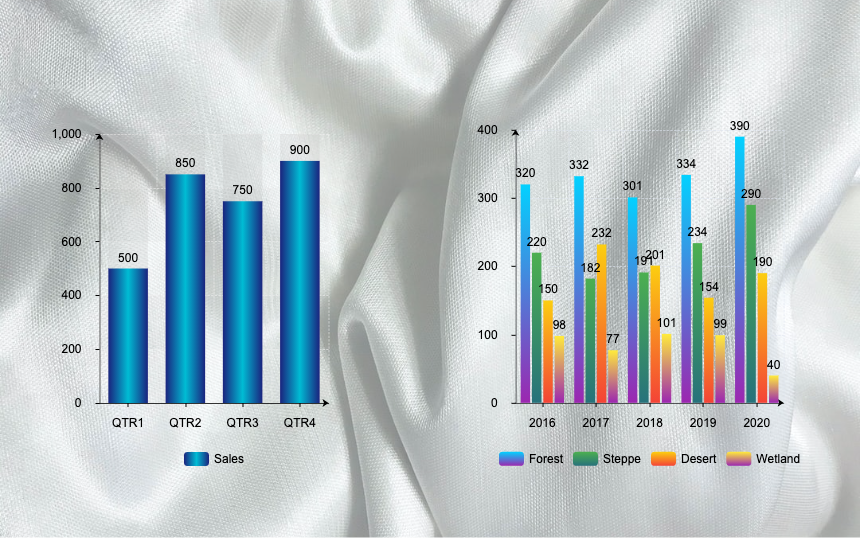
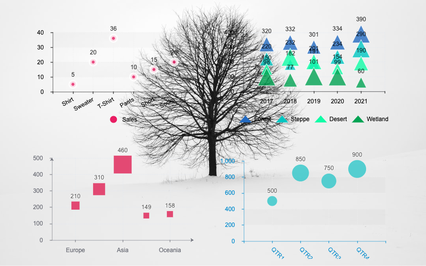
In a bar chart, the value is indicated by the length of the bar, and each bar corresponds to a measured group. Vertical bar charts are sometimes called column charts. When you have multiple sets of data to compare, you can choose grouped bar charts, stacked bar charts, etc.
2. Horizontal Bar Chart
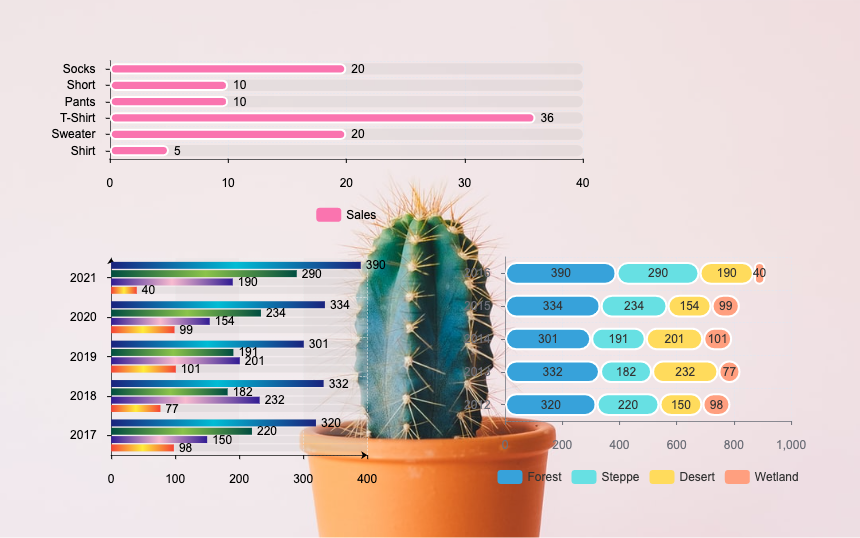
The bar chart can also be placed horizontally. When you want to draw a lot of bar charts, or when the labels on them need more space to be clearly displayed, the horizontal bar chart is a good choice.
3. Percentage Chart
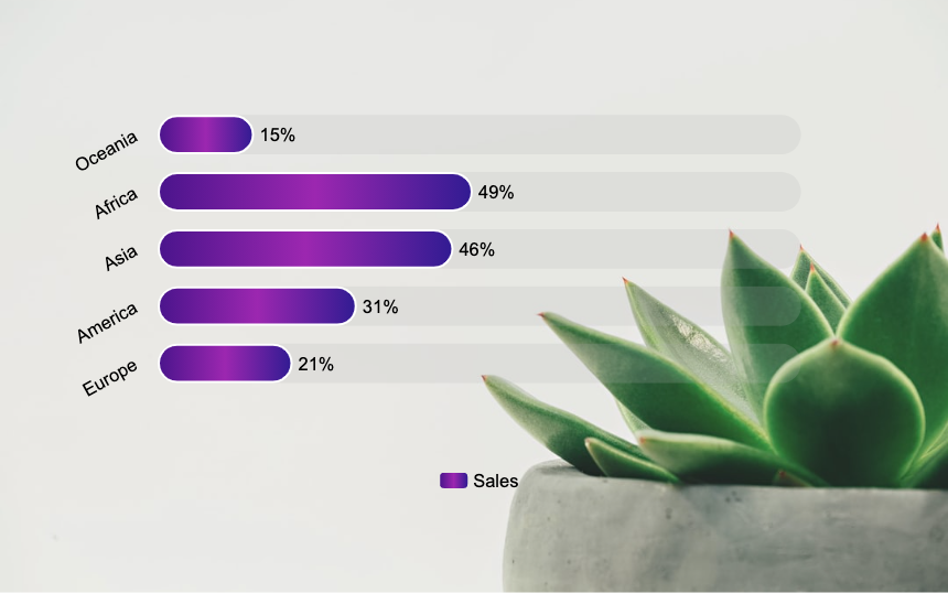
A percentage chart is a kind of bar chart, but it is more suitable for displaying multiple sets of progress data. For example, the amount of work done by multiple people.
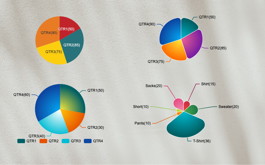
4. Pie Chart
Pie charts are good at telling readers to compare various parts of the overall data. Should be one of the main contents of visualization.
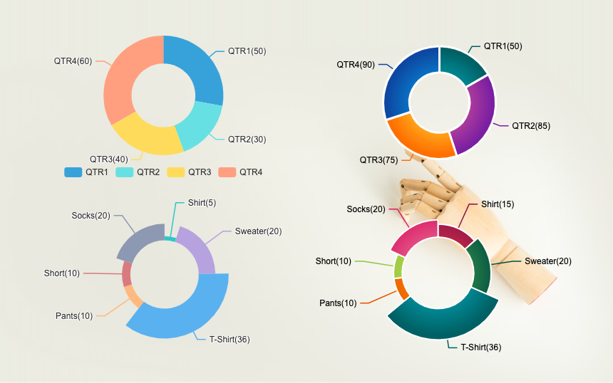
5. Ring Chart
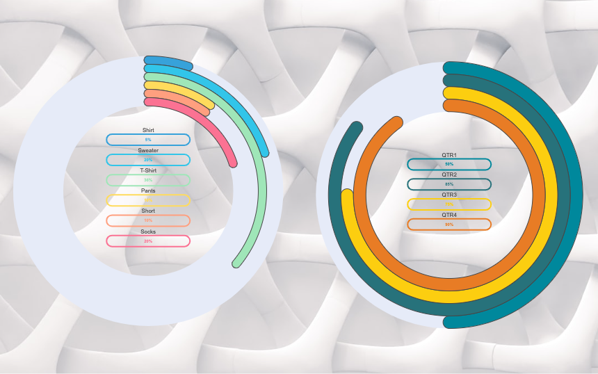
The ring chart is also called a donut chart, and its function is the same as that of a pie chart. It is also one of the main contents of visualization.
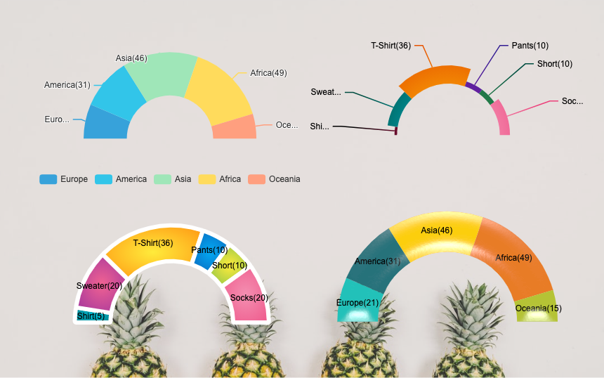
6. half-ring chart
The half-ring chart is another presentation form of the ring chart.
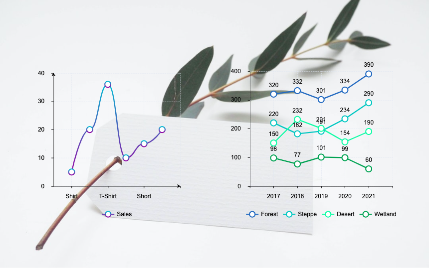
7. Line Chart
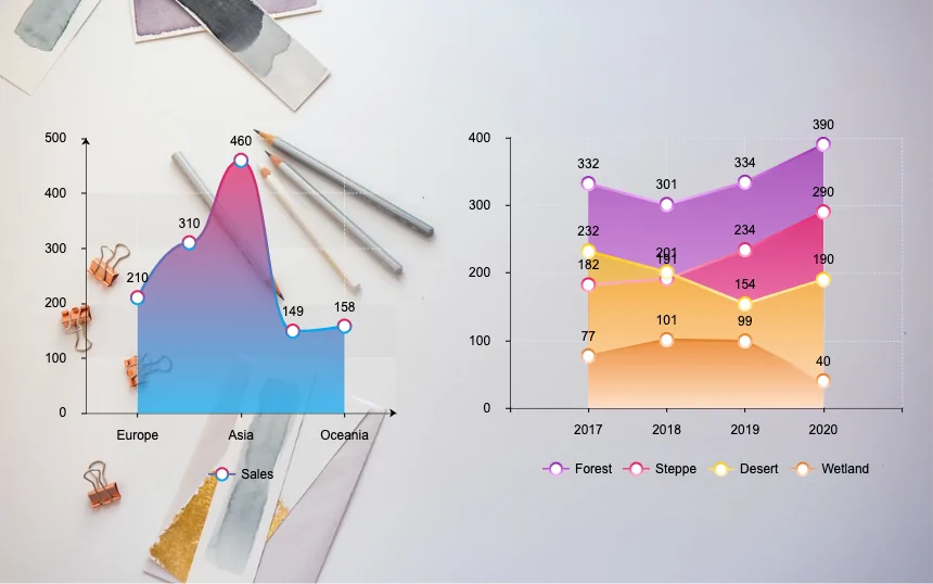
The line chart shows the change in the value of continuous measurement (such as a measurement taken over time). The upward or downward movement of the line helps to bring about positive and negative changes, respectively. It can also reveal overall trends to help readers make predictions or predictions about future results. Multiple line charts can also cause other related charts.
8. Area Chart
The area chart has the same basic purpose as the line chart. However, when you use this chart in conjunction with the stacking concept, you usually see more content. For example, it shows the change of the total amount over time and the change of its components.
9. Scatter Chart
A scatter chart displays many different data points on a single chart. A Scatter plot is an effective method to study the relationship between different variables. It can show whether one variable is a good predictor of another variable, or whether they tend to change independently.
10. Funnel Chart (pyramid)
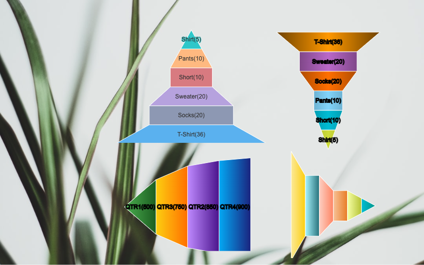
The funnel chart (pyramid) is often seen in business environments. The chart shows the number of users entering each stage of the tracking process from the width of the funnel divided by each stage. The taper of the funnel helps sell analogies.
11. Solid Gauge Chart
Solid Gauge Chart is similar to the Angular Gauge Chart and is most commonly used to mimic real-world gauges. The main difference from the Angular Gauge Chart is that the values are displayed by a filled portion of a gauge scale rather than a hand of a mechanical-like gauge.
12. Pictorial Bar Chart
Pictorial Bar charts are visual representations of bar graphs used by designers in infographics. By using matching icons or illustrations instead of bar graphs, you can get a better visual effect.
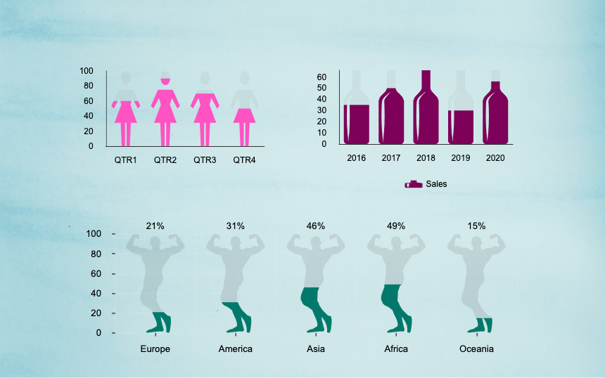
13. Horizontal Pictorial Bar Chart
The horizontal Pictorial Bar Chart is similar to the horizontal bar chart. It is also by using matching icons or illustrations instead of bar graphs to obtain better visual effects.
.png)
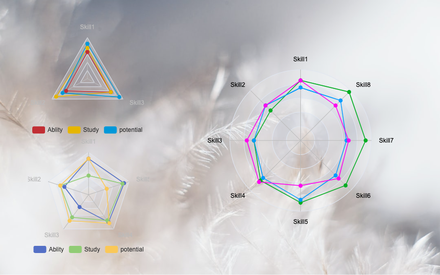
14. Radar Chart
Radar charts are used to compare multiple quantitative variables, for example, to see which variables have similar values, or whether there are limit values. They also help to observe which variables in the data set have higher or lower values. Radar charts are suitable for demonstrating work performance.
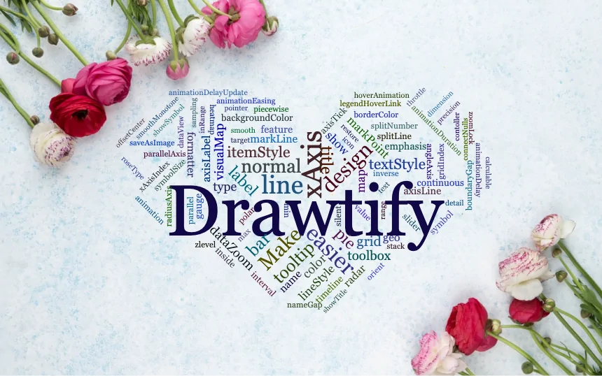
15. Word cloud
A word cloud (also called a tag cloud) is a visual representation of a word. They use intuitive sizes and colors to mark key points. Therefore, it can provide you with quick and convenient visual insights.
Of course, excellent visualization data is far more than the 15 types mentioned above. But don’t worry, because Drawtify’s powerful and easy-to-use built-in online chart maker is not limited to creating these 15 common chart types.
For more visual data tools, please join Drawtify and use them for free. For example, create your own QR code, barcode, map, organization chart, etc.
Importantly, it also provides thousands of editable chart templates. They can help you easily create eye-catching and beautiful diagrams in minutes, even if you are an inexperienced 100% non-graphic designer.
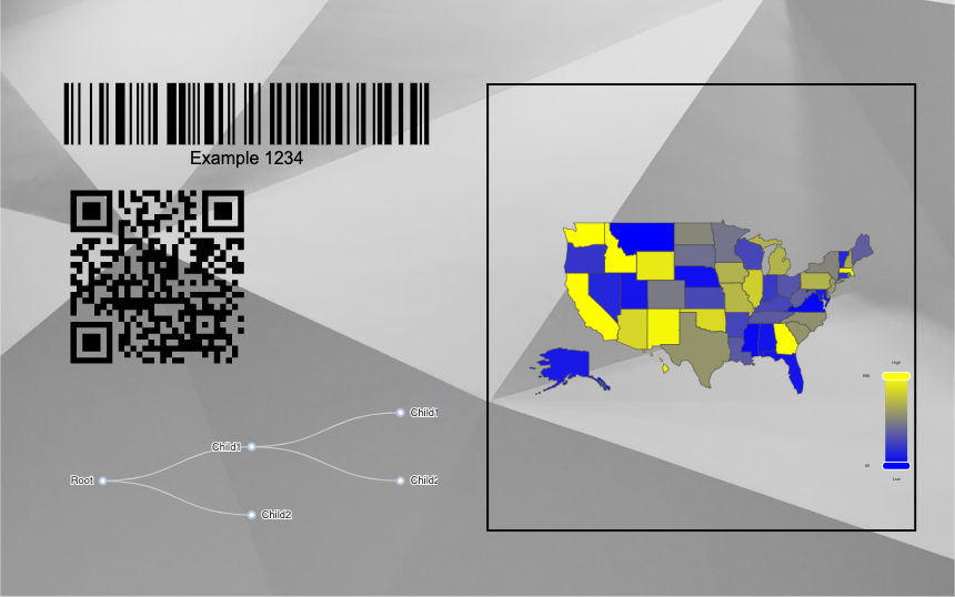
Easily create eye-catching and beautiful charts for free in minutes.
With Drawtify’s online chart tool, you can easily create charts with intuitive and beautiful colors. Just a few steps, you can complete your chart creation in a few minutes. After that, just download your completed design and share it on any digital or print platform.
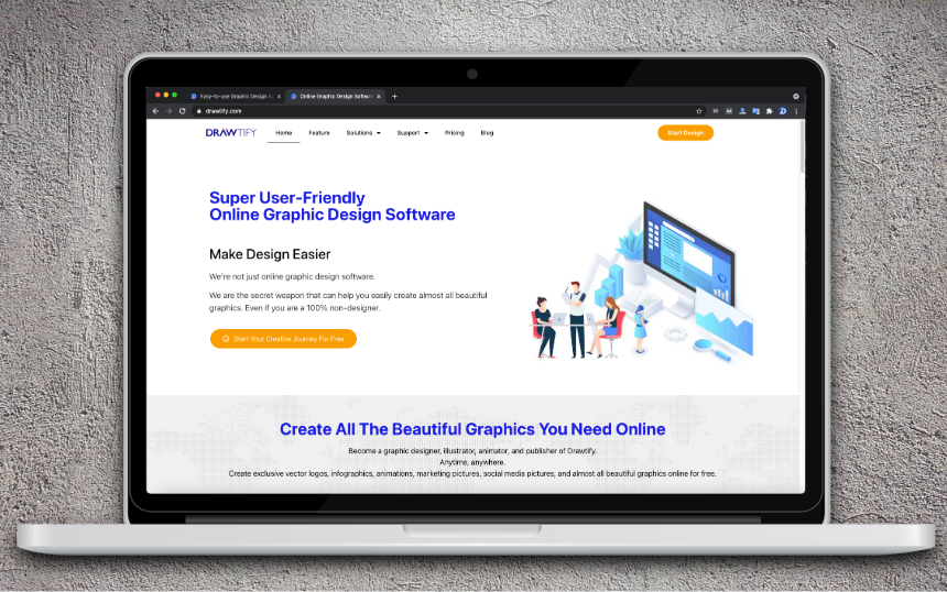
Step 1: Please start the super user-friendly online graphic design software-Drawtify.
No need to worry about any problems. Because Drawtify does not need to be downloaded, installed, and there is almost no learning curve. Most importantly, it can be used for free forever.
Step 2: Please select the design task you need to create.
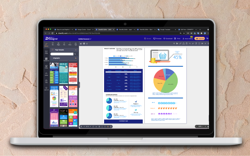
If you only need an eye-catching chart, start with a blank file.
If you need to start a design task with charts, it is recommended that you first browse the editable design template you need. For example, create beautiful infographics, reports, flyers, etc. Because they will help you get beautiful graphics faster and easier. Of course, you can also start with a blank file.
Step 3: Start creating your own chart.
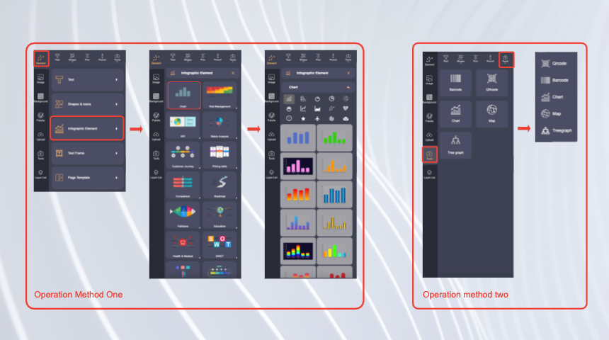
You can find “Infographic Elements” from “Elements”, and then click on “Chart”. You can immediately use its built-in 15 types of chart creation tools, and you can use its rich and exquisite chart templates to accelerate your design tasks.
After that, you only need to modify or import your data, choose a suitable chart type, and choose a suitable style template, and you can immediately get a beautiful exclusive chart.
Of course, you can 100% customize any detailed information on the chart. For example, titles, labels, color schemes, adding special effects (gradient colors, outlines), and even changing icons.
Step 4: Complete your unique and amazing chart.
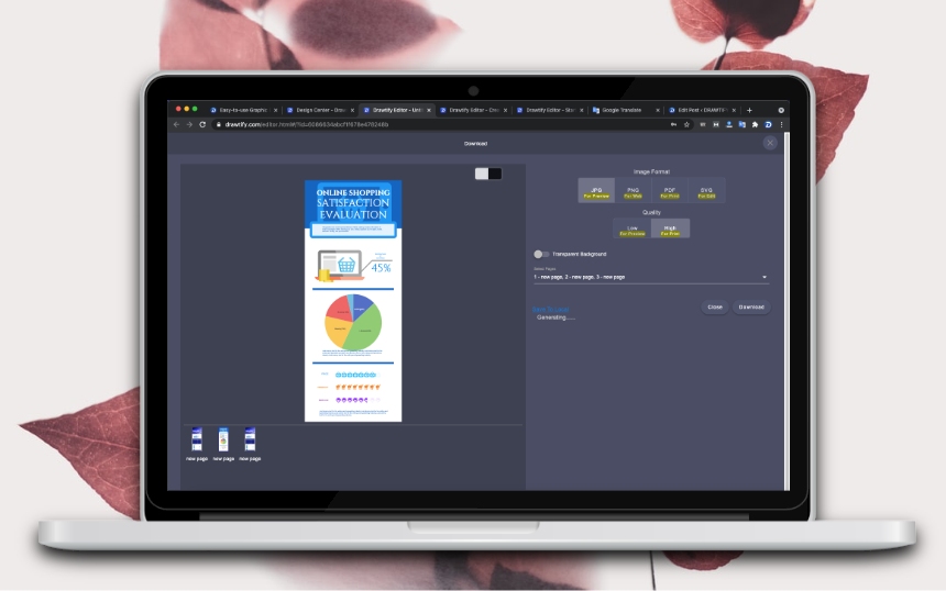
If your design task is only to create charts. Then, congratulations, you only need to click “Download” to get it immediately, and you can display or share it anywhere without worrying about any copyright issues.
If your design task is other design projects with charts. Then please continue your design work. Similarly, there is no need to worry about any problems, because other design features of Drawtify are equally powerful and easy to use.
At last
The chart is an important part of our infographic maker, you can also check our Free Online Infographic Maker.
Or click the link below to start making your chart immediately.
About Drawtify
The Drawtify team is a young graphics software design company. It optimizes many powerful design functions and combines rich design resources to develop “professional and easy-to-use” graphic design applications.
At the same time, Drawtify is also its main product, a super user-friendly online graphic design software. It has rich and easy-to-use design features, as well as a large number of exquisite editable design templates and copyright-free design resources. Suitable for all people who need to create beautiful business graphics, especially small and medium enterprises and start-ups, including 100% non-designers.