Introduction
In this article, we’ll go over how to make a comparison infographic so you can present your data in an easy-to-digest format that makes sense. With some infographic templates and design ideas, even if you don’t have much experience with them.
Comparison infographics are perfect for presenting different variables and making comparisons between them. For example, suppose you’re comparing two types of coffee beans or two other brands of coffee machines. In that case, a comparison infographic is one way you can show off these differences while still staying simple. It’s also a great way to find out which of your products are better than others!
Infographics help readers understand complex information by putting it into an easily digestible visual format that they can quickly scan through at their own pace—no reading required! Comparison infographic shows multiple things alongside each other on one page; they’re usually arranged vertically (like on this page) but sometimes horizontally, as well as stacked or scattered across banners or boxes instead. But what exactly is a comparison infographic?
Understanding the science behind infographics
It works because the human brain processes image 60,000 times faster than text. As a result, visual content like infographics can be used to convey complex information in an easy-to-understand way.
Infographics are also effective at presenting data because they allow you to display large amounts of information in an organized way. It’s easier for the viewer to process and retain the information you want them to learn from your infographic.
When to use a comparison infographic
Here’s a quick checklist of when you should use a comparison infographic:
- When you’re exploring two different ideas, concepts, or people and want to show how they compare.
- You have two similar things and want to show how they compare with each other in a new way.
- You want to convey that your product or service is better than the competition by comparing it point-by-point.
- If you’re trying to sell your product or service but aren’t sure how (or if) it differs from its competitors, consider including some comparisons in an infographic on your website or social media channels.
Comparison infographic ideas
Comparison Infographics are a great way to compare two or more things to give your audience a visual summary of their differences.
- Compare Products: This infographic will do it for you if you want to compare two or more products. You can include text explaining what each product does and images of each product in action. For example, comparing cars, one could show cars driving on different roads. In contrast, another car shows its engine parts up close while another has its interior cabin in detail with the steering wheel and seats visible. This type of infographic works best when comparing products with similar functions because there’s not much else to say about them since they’re both just things that processor function) in various ways!
- Compare companies: Company comparison infographics are great because they help people understand how companies differ without reading long articles about each company. Instead, they get all their information at once visually! This infographic helps clients make decisions based purely on facts instead of relying solely on personal preferences or biases, which may cloud rational thought processes leading to making bad decisions later down the road. So yeah, stay away from those types.
How to design a comparison infographic
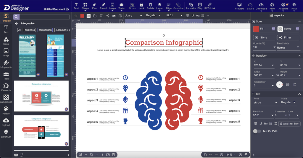
So you want to create a comparison infographic but don’t know where to start? Use the following template and design ideas from our online vector graphic editor – Drawtify.
- Create a layout with a grid. A good design makes your data easy for readers to understand, so try using a grid to organize your content.
- Choose an appropriate color scheme based on the topic of your infographic. If it’s about something optimistic (like “5 reasons why orange is my favorite color”), then use warmer hues like red or yellow; if it’s more severe or darker in tone (like “5 reasons why people are dying from eating too many oranges”), choose more fabulous shades like blue or gray instead!
- Select appropriate fonts that suit the topic and how formal/informal you want things to sound: think “lighthearted” versus “serious.” Do this by matching up two different fonts: one bolder one should go with another lighter onscreen typeface. Hence, they complement each other perfectly without competing too much visually against each other.
Creating your comparison infographic
The template is ready to go. All you need to do is add a few key points, choose the best layout for your idea, and you’re all set!
You can use the comparison infographic templates for any topic. If you want to illustrate how something works, use our templates. If you are explaining a concept or idea, create an infographic using our tools too! The options are endless when using these templates: they can show anyone how something works or why they should care about something in particular—all while looking beautiful and quickly engaging the reader’s imagination.
How to create a compelling comparison infographic
- Use a template to get started.
- Make sure your data is accurate and complete.
- Remember the 3 R’s of good design: relevance, readability, and resonance.
- Make sure the infographic is visually appealing.
- Use a clear, concise title and subtitle that tells readers what they’re about to see and why they should care about it (and put in some keywords).
By using a template, you can create your infographic faster.
A template is a pre-designed layout that is used to create an infographic. By using a template, you can create your infographic faster.
Templates are available in many formats, you can design and export to image, PDF, SVG, etc,. For example, if you use Microsoft Office programs like Word or Excel for work, it might be easiest for you to use templates created there instead of starting from scratch every time.
Choosing a comparison infographic template
Choosing the proper comparison infographic templates is essential in creating your infographics. The goal is to select a template that works for your industry or topic, makes it easy for you to create an infographic, and looks visually appealing.
The first step in this process is finding the right balance between ease of use and design. If you’re starting infographics, selecting a template with pre-made data sets and graphics may be better. It will give you more time to focus on other aspects of your project, such as writing content or analyzing data. On the other hand, some templates require more work by people with little or no experience designing infographics.
Some customers also prefer working with templates designed by third parties because they don’t have enough time on their hands due to busy lifestyles or other commitments like family life where there might not always be enough hours in each day!
When looking at different types available online today, though, make sure these factors aren’t sacrificed over anything else because otherwise, there really wouldn’t be much point using them at all (and as someone who works full-time doing this type work daily, I know firsthand how frustrating seeing these things happen).
You also can use Drawtify free comparison infographic templates for various industries and topics. And use our online infographic maker to customize this template with your information and branding.
Conclusion
As we’ve seen, there are a lot of options when it comes to different styles for your infographic. It all depends on the information you want to include and how sleek or minimalistic you like the design. There are plenty of other things that can affect your decision-making process as well, including colors, fonts, and images.
This post has looked at some of the best comparison infographic templates. I hope you found the templates and examples helpful. If you want to try creating your infographic, I recommend starting with a template like those included in this post.
Get more Inspire from the Top 10 Infographic Design Ideas and Templates.