Origin:https://99designs.com/blog/web-digital/web-design-colors/
Picking the right web design colors is not a decision to take lightly. While copy, sales-pitches and testimonials communicate with the viewer on a (slower) logical level, color communicates on an emotional level. Good color choices can influence how a visitor interprets what they see, and it can have a positive impact on their vision of a brand in general. Clashing color choices might lead them to try another website.
In short, color is the fastest and most direct way of setting a good first impression. While it may seem overwhelming at first, you can easily nail down your choices with a basic knowledge of the science behind the color theory.
Drawtify, make design easier. Drawtify is an online graphic design software with vector drawing, layout, photo editing, and typography. It works on all platforms. And it’s free.
What do colors mean?
Choosing colors is more than a matter of personal preference. Each color has a different meaning and can influence people in a particular way. That is why color is so important for web design—it has the power to convey the right message about your business right away.
Let’s have a look at the meanings that colors have and what emotions they can trigger.
Warm colors
These can have an energetic effect on the visitor, but when they are used alone they tend to over-stimulate. It is a good idea to mix them with cool and neutral colors for balance.
- Red—active, emotional, passionate, strength, love, intensity
- Pink—sweet, romantic, playful, warm, compassionate, soft
- Orange—warm, enthusiastic, success, determination, friendly
- Yellow—youthful, lively, energetic, fresh, optimistic
Cool colors
These have a calming effect on the viewer, and that is why they are the most common colors used on websites. But be careful—if they are overused, they can also have a cold or impersonal feel.
- Green—fresh, calm, relaxed, trust, peaceful, hopeful, healing
- Blue—comfort, clarity, calm, trust, integrity, loyalty, reliability
- Purple—glamour, power, nostalgic, luxury, ambition, spiritual

Neutral colors
These are great to mix with warm or cool colors and they are often used to tone down primary colors and provide balance in web design.
- Gray—respect, wisdom, patience, modern, longevity, intelligent
- Black—powerful, bold, serious, elegant, luxurious, dramatic, formal
- Brown—friendships, earth, home, outdoors, credibility, simplicity, endurance
Color psychology and brand recognition
—
When it comes to facilitating brand engagement for a website, color acts as a key function to attract attention, create desire, drive conversions and earn a visitors loyalty. With the right color selection, a user will be able to spot a familiar brand even without seeing the logo.
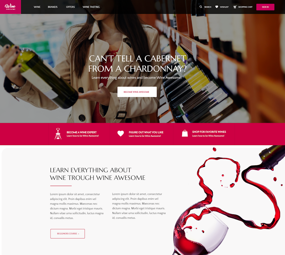
In addition to the general meaning behind each color mentioned above, there are also certain trends that brands often follow to create recognition. For example, restaurants are usually red and orange, banks and financial institutions are often blue, luxury products are typically packaged in black, hotels are usually white, blue, black or green. Some iconic brands known by their colors include CNN for red, white and black, National Geographic’s yellow, and McDonald’s for the red and yellow combination.
If you’re stuck trying to decide on a color that will resonate for your brand, a useful exercise can be to check out one of these iconic brands and, using the color meanings section above, piece together what the reasoning might have been for these color choices.
Color theory in web design
—
Now that you know how colors can affect your visitors, you can mix them and use them intentionally to gain more influence on user behavior using color theory.

via 99designs
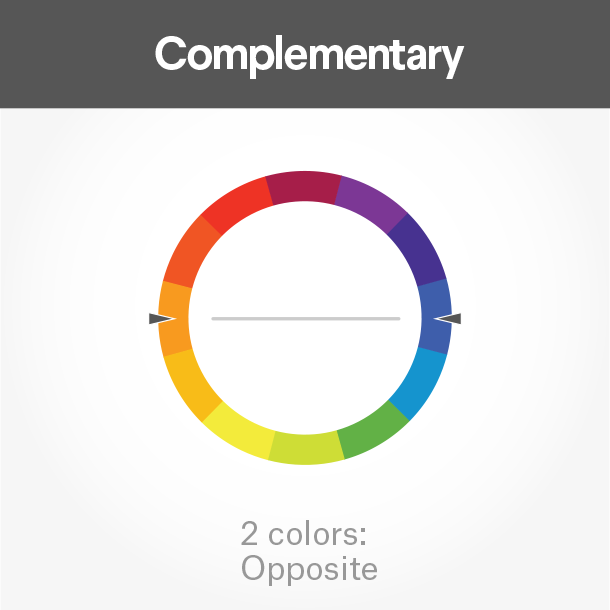

In a nutshell, color theory is the science behind the interaction of colors on the color wheel, which work well together in a design. Three commonly accepted structures for a color scheme are triadic, complementary and analogue colors.
Good implementation of the triadic color scheme via MercClass
Interesting use of complementary colors via FuturisticBug
Analogous colors via Studio FLACH
You can make more nuanced selections on the color wheel by considering complementation, contrast and vibrancy.
Complementation is the way we see colors interact with other colors. When you match colors from the opposite ends of the colors wheel you’ll get a visually appealing effect because it provides balance to the eye as one color enhances the other.
Contrast focuses visitors attention by clearly dividing elements on the page, either supporting the readability of text or drawing the eye to a specific portion of the page.
Vibrancy can influence visitors emotional response. Brighter colors can make you feel more energetic and darker shades can relax you and help you focus more on content.
Selecting the primary color
In order to get started mixing your web design’s colors, your first priority is to establish the primary color for your brand. This should be determined from your logo or other brand materials that exist, but if that is not possible, use color psychology and association to select one.
Developing tints and shades
Once you have a primary color in mind for your website, you can get to work on the color scheme. Some websites can get away with using a single color for their design, but most of the time you’ll want at least a few shades or tints to work with.
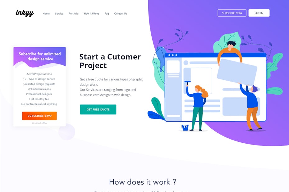
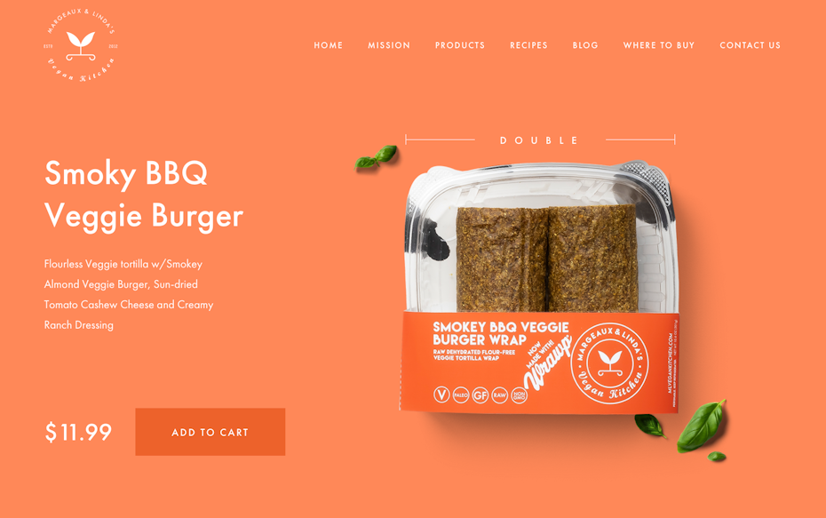
It is not always the best solution to use your primary color throughout the whole design. You can tone it down or brighten the tint to create subtle variety on the website while keeping the same base color. For example, if you choose lighter shades of one color for the sections of the web site, then you can use the primary or most prominent tint for CTA buttons so that they will stand out more. Take a look at how designer UI Maniac did it in the example below.
One of the best tools for color selection is Adobe Color Wheel, or choose directly in the Drawtify color scheme. You can set the middle selector to your primary color and then play with the color rules to get some options. This tool is simple to use and can help a lot when you’re exploring color schemes for your website.
The 60-30-10 rule
This technique is simple but effective for mixing different colors. To create harmony, colors should generally be combined in the proportion of 60%—30%—10%. You don’t always have to go with three colors, but it is a good number to be safe and balanced. Using this method, 60% should be the dominant color, 30% a secondary color and 10% an accent color. This proportion is pleasant to the human eye since it allows the visual elements to emerge gradually.
Contrast
Color contrast is a stunningly important part of a visual composition. For example, if you need visitors to pay special attenti
on to a specific area of the website (such as a CTA button), you can make use of two highly contrasting colors such as orange and green or red and blue for your background and button.
While contrast can be useful, it should be used carefully. If you use high contrast all throughout the site, it will be difficult to read or look at the text. I would recommend that you create a mid-level contrast for most of the design and apply high contrast only when you are highlighting key elements.
Working with images
In some cases, starting with an image can be helpful. If you have an image in mind that can define the brand or the client has already selected images, you can pull out the main colors from there.
Working with multiple images can be tricky as you will have to find a way to create color harmony in the design. There are several ways of balancing your images in that case:
- consider turning them to greyscale,
- adjust the vibrancy of the images to bring down the tone,
- use neutrals to balance the images,
- or create a gradient overlay with the hues of the color palette that you’ve chosen for the web design.
Depending on which solution works best for your project, you can easily make your selected images fit together in harmony.
Colors bring web design to life
—
Colors are everywhere and when used correctly they can promote any type of emotion or action you’d like from your visitors. While colors play an extremely important part in web design, they are not the only key to a perfect layout. Color theory is just a tool in the gamut of countless tools that you can use to create outstanding web design.
Hopefully, you’ve found these tips helpful, but try to remember that in design there are no strict rules. In fact, the best designs often break the rules. Use color psychology as your guidepost, but don’t be afraid to trust your creative instincts.