Your brain uses colors in marketing to recognize traits about products and the brands that produce them. That’s why a shade of chartreuse that would feel appropriate for a PC is puke-inducing for a cupcake. In a nutshell, this is color psychology at work. Here’s a complete guide on how to use colors in marketing and advertising.
The associations our brains make with certain colors are key to bridging the gap between marketing materials and their target audiences. When you look closely at commonly used colors in advertising for your industry, you’ll see many of the same ones popping up again and again. It’s not a coincidence, and they’re not just your competitors’ favorite colors! These are the colors that (research shows) audiences tend to connect with their needs and expectations from brands in your industry.
Choosing which colors are the ideal palette for your marketing and advertising efforts is part aesthetic, part testing and part science—much more a part than you probably realize. The science of color marketing is what we’re going to explore today to help you communicate your messages most effectively.
Origin: https://99designs.com/blog/tips/colors-marketing-advertising/
Drawtify, make design easier. Drawtify is an online graphic design software with vector drawing, layout, photo editing, and typography. It works on all platforms. And it’s free.
Why colors matter in marketing and advertising
—
Colors speak a language words just can’t replicate. That is, they communicate with us on an emotional level and are thus more effective at persuasion.
A product’s color can convince us that it tastes fresher than the same product with a different color. It can even make medication (and placebos!) feel more effective. Drug manufacturers lean on color associations to make sleeping pills blue and stimulants yellow and red because these are the colors consumers associate with their respective effects.
Although this might sound like magic, there’s data to support it. 85 percent of consumers cite color as the primary reason for choosing which products to buy. Additionally, up to 90 percent of impulse decisions about products are based solely on the products’ colors. According to color psychology researchers, 42 percent of consumers form their opinions of websites based on the sites’ designs, with color contributing more to their opinions than any other factor. And 52 percent of the time, poor color choice and other inferior design choices send users off a website, never to return.
How colors communicate with buyers
—
It’s one thing to know that colors are important in marketing and advertising, but the real challenge lies in harnessing color psychology to speak to your buyers. You probably already know the basics of color psychology, like red = passion and white = cleanliness, but that’s only the beginning of all the complex ways color can influence how a buyer thinks and feels about a product.

For example, researchers have noted links between specific colors and behaviors, like red, royal blue, black and orange connecting easily with impulse buyers. For bargain hunters, the colors of choice are teal and navy blue. Some of these less obvious color associations make a lot of sense, like pink, sky blue and other soft colors connecting with traditionally minded clothing shoppers. Similarly, brown’s not a great choice for produce packaging because it makes us think of overripe, rotting fruits and veggies.
Color psychology isn’t just about evoking certain emotions. It’s about using colors to meet consumers’ expectations for products and brands. Consider colors that are bad fits for certain products or types of services, like a bright yellow and orange logo for a bank or a brown or gray box for feminine hygiene products. These colors feel wrong to us because they don’t match our expectations.
At the end of the day, our expectations are largely rooted in biological programming. Red is a popular color for food brands because bright red fruits are ripe and ready to eat, as is freshly cut meat. Nature taught us what certain colors mean, and in design, it is best to use colors according to nature’s rules. People make purchasing decisions based on what they expect from the colors they see and whether they feel the colors are doing what they are supposed to do.
The ways colors influence our perceptions of the world aren’t always obvious, nor are they always logical. Our associations with a color can even vary depending on our cultural backgrounds, our personal backgrounds and our individual tastes. But there are generalizations we can make based on the science of color psychology. Combine this with target audience research to get deeper insight into what your unique consumers prefer.
What’s the effect of colors in advertising and marketing?
—
Colors can influence buyers and each color has its own list of associations that you can take advantage of in your marketing and advertising materials. Here, we’ll go color-by-color to give you a breakdown of the bes
t situations to use specific colors to meet your marketing and advertising goals.
Blue
Blue is typically regarded as a masculine color, but that’s not all blue brings to the table. A few other associations include:
- Calmness
- Tranquility
- Refreshing
- Stability
- Responsibility
- Peace
- Relaxation
- Sadness

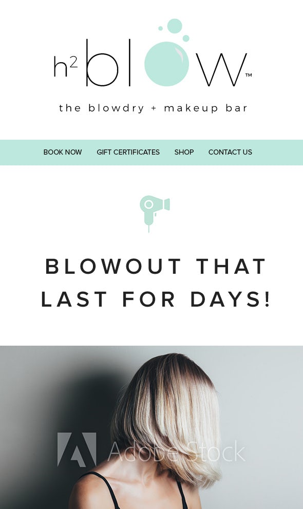
Blue is a popular color for banks because it communicates authority and stability, values consumers expect from people who handle their money. A yoga studio, meanwhile, might use blue on a flyer to emphasize the sense of tranquility visitors can expect when they visit, and a brand of safety gear like helmets and goggles can use blue to tell users that they can trust the brand to protect them.
Green
As a cool color, green is best for calm, mature and professional brands. In fact, it is known to lower blood pressure and heart rate in viewers. Some of the associations we tend to make with the color green are:
- Finances
- The environment
- Health
- Good luck
- Growth
- Wealth
- Harmony
- Balance
- Soothing
- Renewal
Green reminds many people of the recycling logo, which makes it perfect for any brand that advertises itself as eco-friendly or organic. It’s also a great choice for a spa because it emphasizes the soothing, renewing experience the client expects from a day at the spa.
Purple
Purple is mystical, mysterious and sensual—not a color we see often in nature. Common associations we have with purple include:
- Royalty
- Luxury
- Intrigue
- Magic
- Mystery
- Military honor
- Wealth
- Imagination
- Spirituality
Depending on your business, these perceptions can often go hand-in-hand.
Consider a financial planning firm that specifically works with veterans and their families to handle the financial circumstances they face. A purple brochure plays into thoughts of wealth and luxury while reminding readers of the Purple Heart.
Red
Red is an attention-grabbing, vibrant, hot color that is generally associated with:
- Passion
- High energy
- Love
- Warmth
- Fire
- Warfare
- Anger
- Danger
- Confidence
A dating service that specializes in creating blind dates can use red on its landing page to emphasize that their service is sexy, intimidating and reserved only for the bold. Red is also known to boost viewers’ metabolisms and blood pressures, which makes it ideal for restaurant signage looking to whet the appetite of customers into coming in for a bite—especially a spicy bite.
Orange
Orange is a friendly and cheerful color that has a few traits in common with red, like warmth and high energy. Other associations consumers tend to make with the color orange are:
- Youth
- Affordability
- Vitality
- Friendliness
- Humor
- Seasonal changes (particularly summer into autumn)

Orange is a great color to use if you’re an indoor trampoline park looking to attract kids and teens for a bouncy, energetic good time. It’s just as great for a beauty brand that’s more girl-next-door than full-on glam and wants to show that it’s for everybody, not just top models and tastemakers.
Yellow
Customers associate yellow with optimism and affordability. It has the advantage of being both light and bold at the same time. Some of its basic associations are:
- Energy
- Happiness
- Danger
- Youth
- Playfulness
- Cheerfulness
- Warmth
Notice that one of these associations is not quite like the others.
Danger’s association with yellow, much like fire and war’s association with red, can seem negative at the outset. But sometimes, these associations are exactly what a brand needs, like a power tools brand using yellow to say “handle with caution.”
Pink
Pink is a loaded color. There’s no getting around it: pink is a lot more for girls than blue is for boys, to the point that using it in certain cases can be off-putting to men. There’s a lot of psychology to unpack surrounding the color pink and its gendered associations, but here we’re just gonna cover what pink does in the marketing and advertising world. Pink can be:
- Fun
- Girly
- Upbeat
- Sweet
- Delicate
- Romantic
- Peaceful
Pink is a popular color for bakeries because it’s sweet, just like the pastries they’re selling. It’s also the color for brands that are feminine and proud of it, like a women’s self-defense instructor who uses hot pink graphics in her ads to show that she teaches women how to be bold and protect themselves.
Gray
Grey stands for professionalism and practicality. You might think gray is boring, and in a lot of cases, it is. But gray doesn’t have to be boring. With the right marketing strategy, it can also be:
- Neutral
- Professional
- Efficient
- Formal
- Corporate

These are all factors a payroll service would want to emphasize on their invoices. Gray can also show that your brand busts out of the binary, like a website for a progressive children’s clothing brand that wants to set itself apart from the sea of pinks and blues.
Black
Black might technically be the absence of color but it is also powerful and bold. These are some of the associations we have with black:
- Luxury
- Mystique
- Power
- Formality
- Elegance
- Darkness
- Mystery
- Sexuality
- Control
- The occult
Black is mostly cool and modern, but it can be creepy if you want it to be. And for some brands, like purveyors of smudge sticks and candles and other occult goodies, creepy is perfect. Black also means power, which makes it a solid choice for a gym that challenges its members to be the strongest versions of themselves they can be.
White
White is a blank slate. It’s fresh, new, mint in box and garners the following associations:
- Cleanliness
- Purity
- Blankness
- Simplicity
- Youth
- Honor
- Peace
- Blandness
- Coldness
White is another color whose “negative” connotations can be spun into positives. As the coldest color, the color that reminds us of snow and the arctic circle, white is a great choice for an ice cream vendor cart, emphasizing the relief they offer on a hot day.
Brown
Brown is a color you can trust. Brown has your back, brown’s been there by your side for years and it’ll still be there for years to come. For the UPS, brown gets packages to your home safely and on time and promises that anything you send with them will get to its destination unscathed. In marketing and advertising, brown tends to mean:
- Reliable
- Old-fashioned
- Earthy
- Masculine
- Natural
- Dependable
- Warm

Brown can also feel dirty, which makes it a less-than-great choice for a hotel. But for a gardening supply store or a brand of mulch? Conjuring up images of dirt won’t hurt.
How color meanings vary by culture
—
Anytime you’re choosing a color scheme, always take into account your target audience’s cultural background. Many colors have specific associations in some cultures that are different in others. Sometimes, even the same country can have regional-specific color associations.

Take just one color—yellow, for example. In Japan, the color yellow is associated with courage whereas in parts of the American south it can be slang for cowardice. In many Latin American cultures, it’s the color of mourning and death. In China, yellow can have vulgar connotations. In Germany, you go yellow—not green—with envy. Head over to the Middle East and you’ll find yellow is imperial and sacred (not purple, which is associated with royalty in European cultures) often worn by members of the ruling or royal classes.
Whenever you design marketing and advertising materials for your brand, researching your target audiences’ cultural associations with each color is an important part of your due diligence. Using a color scheme that doesn’t fit with your audience’s expectations for your brand can doom it before it reaches the market.
The best colors in marketing for your call to action
—
Red is the best color for a call to action because it’s all about action and doing things NOW, right? Not necessarily. Although red can be a great color to use for your call to action (CTA) and it certainly is used successfully by many companies, it’s not your only color choice for a CTA button—nor is it always your best choice.
Context is important to buying decisions, and sometimes the optimal button color depends on the overall design and the specific brand and product. The right call to action color for your brand matches the state of mind your customers need to be in to make a purchase.
Sometimes, that’s a calm, clear state of mind that the buyer can only reach when they’ve thoroughly researched your product and determined it’s the best choice to fulfill their needs. In that case, green is a better choice for your call to action button, especially if your call to action is more “book your consultation” or “let’s talk more” than “buy it now.”

Other rules of thumb to follow with your call to action are:
- Your call-to-action button color must be easy to see, but not an eyesore; it should complement the website’s overall design yet contrast with it enough to eliminate any searching for it.
- Call-to-action buttons generally, and checkout buttons in particular, should be big, clean, and simple, set against plain backgrounds that aren’t distracting.
If you are in the “buy it now” camp, warm colors are the colors for you. According to color psychology and marketing research, red, green and a shade of orangey yellow perform best for call to action buttons. Red because it pushes urgency on the buyer, green because it’s soothing and gently guides buyers to make a decision, and a firey yellow-orange because it creates a feeling of warmth and happiness. And ultimately, you’re offering buyers happiness, whether that’s from the pure pleasure of owning your product or the relief you’re offering from the struggles they face.
How to test your colors in marketing strategy
—
Color psychology is helpful for making informed design decisions in your advertising and marketing, but testing is the only real way to know whether you’re making the right decisions.
To do so, you might need to run multiple iterations of an A/B or split test to determine which color palette is most effective. Once you’ve got your color finalists (the colors with no negative connotations in the markets you’re after and contrast with each other while communicating your brand identity), it’s time for them to go head-to-head in a “bracket tournament.”
A bracket tournament is essentially another way of saying “split testing,” which is where you test one color against another to see which garners a stronger positive response from your target audience. Then, you pit individual winners against each other to determine which of those reso
nates more effectively with your buyers, and so on until you’ve got the optimal color. To avoid messing up your results, make sure you keep the rest of your marketing strategy consistent throughout the tournament.
Once you’ve tested, you can confidently implement your color choices for each element of your design, from calls to action to backgrounds to text.
Amplify your colors in marketing message
—
Hopefully, you now have a better sense of how the psychology of color works in marketing and advertising. The more you work with color in mind, the easier it will become to convey your unique branding message to your audience.
Using color strategically is more than just choosing what looks good to you. After all, there are people walking around out there today who think olive green and fuchsia are a match made in heaven—and for some businesses, maybe they are!