Colors and emotions are closely linked. Warm colors can evoke different emotions than cool colors and bright colors can create different feelings than muted colors. It all depends on how the psychological effects of color are being used.
Colors can make us feel happy or sad, and they can make us feel hungry or relaxed. These reactions are rooted in psychological effects, biological conditioning and cultural imprinting.
That’s why it’s important to understand the psychological effects colors might have on an average person as well as the fundamentals of color theory and the meanings of colors.
In this article we explain how colors make you feel and what impact colors can have on our emotions.
Origin:https://99designs.com/blog/tips/how-color-impacts-emotions-and-behaviors/
Drawtify, make design easier. Drawtify is an online graphic design software with vector drawing, layout, photo editing, and typography. It works on all platforms. And it’s free.
Colors and emotions
—
The way different colors can affect emotions depends largely on a color’s brightness, shade, tint or tone and whether it’s cool or warm toned. Let’s take a look at some of the effects colors can have on how you feel:
Warm colors
Red, orange and yellow are next to each other on the wheel and are all warm colors. Warm colors often evoke feelings of happiness, optimism and energy. However, yellow, red and orange can also have an attention grabbing effect and signal danger or make you take action (think stop signs, hazard warnings and barrier tape). Red can also increase a person’s appetite.
Cool colors
Cool colors include green, blue, and purple. Cool colors are usually calming and soothing but can also express sadness. Purple is often used to help spark creativity as it’s a mixture of blue (calm) and red (intense). If a company wants to display health, beauty or security, incorporate these colors.
Warm colors. Illustration by MWart.
Cool colors. Illustration by Marrieta.
Happy colors
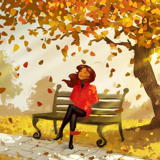
Happy colors are bright, warm colors like yellow, orange, pink and red. Pastel colors like peach, light pink or lilac can also have an uplifting effect on your mood. The brighter and lighter a color, the more happy and optimistic it will make you feel. Another way colors can create happy emotions is by combining multiple primary and secondary colors together for a youthful, colorful effect.
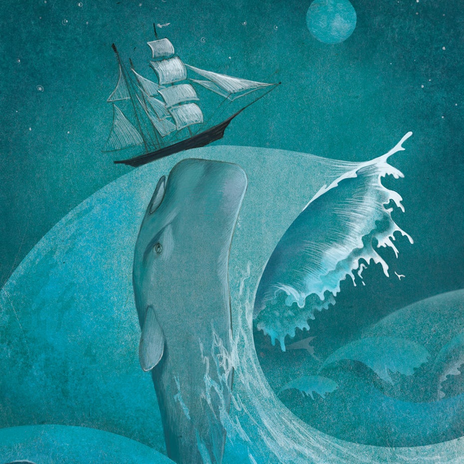
Sad colors
Sad colors are colors that are dark and muted. Black and grey are the quintessential sad colors, but dark and muted cool colors like blue, green or neutrals like brown or beige can have a similar effect on feelings and emotions depending on how they’re used. In Western cultures black is considered the color of mourning, whereas in some East Asian countries it’s white to emphasize purity and rebirth.
Sad colors. Illustration by Znik.

Happy colors. Illustration by Daria V.
Calming colors
Cool colors like blue and green can make you feel calm. Pastel colors and particularly cool toned pastels like baby blue, lilac and mint have a calming and relaxing effect. Neutrals like white, beige and grey can also make you feel calm. The fewer colors you combine and the more simple and pared back a design is, the more calming it will feel.
Energizing colors
Strong, bright colors and neon colors can have a powerful effect on emotions. Colors like bright red, bright yellow and neon green can feel energizing and make you feel more alert, but can also be irritating on the eyes. These colors will grab your attention and stand out from their surroundings. Highly pigmented, strong colors like royal blue, turquoise, magenta and emerald green can also have a stimulating effect and make you feel refreshed and energized.

Calming colors. Illustration by Marrieta.
Energizing colors. Illustration by Daria V.
How colors make you feel
—
Next, let’s dive into the emotions and feelings different colors can evoke.
Red

Photograph: Cas Cornelissen (via Unsplash)
Red makes you feel passionate and energized.
Red is the warmest and most dynamic of the colors—it triggers opposing emotions. It is often associated with passion and love as well as anger and danger. It can increase a person’s heart rate and make them excited.
If you want to draw attention to a design element, use red. But use it as an accent color in moderation as it can be overwhelming.
Orange

Photograph: Afroz Nawaf (via Unsplash)
Orange makes you feel energized and enthusiastic.
Orange enhances a feeling of vitality and happiness. Like red, it draws attention and shows movement but is not as overpowering. It is aggressive but balanced — it portrays energy yet can be inviting and friendly. Orange is great for a call to action to buy or subscribe to a product.
Yellow

Photograph: Alexander Shustov (via Unsplash)
Yellow makes you feel happy and spontaneous.
Yellow is perhaps the most energetic of the warm colors. It is associated with laughter, hope and sunshine. Accents of yellow help give your design energy and will make the viewer feel optimistic and cheerful. However, yellow tends to reflect more light and can irritate a person’s eyes. Too much yellow can be overwhelming and should be used sparingly. In design, it is often used to grab attention in an energetic and comforting way.
Green

Photograph: Buzo Jesús (via Unsplash)
Green makes you feel optimistic and refreshed.
Green symbolizes health, new beginnings and wealth. Green is the easiest on the eyes and should be used to relax and create balance in a design. It is a great color to use if a company wants to depict growth, security or inspire possibility. Green can also feel calming and relaxing.
Blue

Photograph: J DuClos (via Unsplash)
Blue makes you feel safe and relaxed.
Blue evokes feelings of calmness and spirituality as well as security and trust. Seeing the color blue causes the body to create chemicals that are calming. It is no surprise that it’s the most favored of the colors. Dark blues are great for corporate designs because it helps give a professional feel, but using too much can create a cold, disengaged feeling. Light blues give a more relaxing, friendly feel. Great examples are social sites like Facebook and Twitter who use lighter blues.
Purple
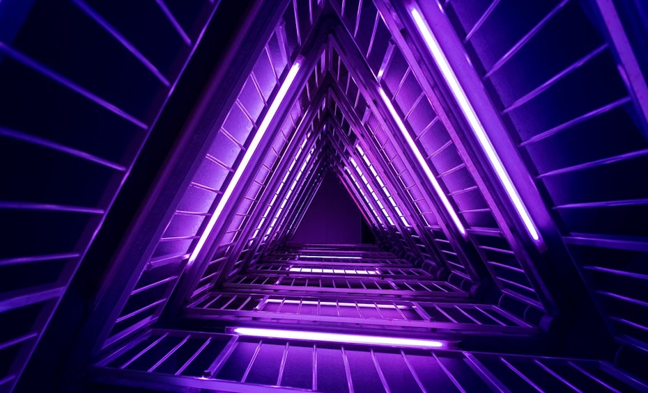
Photograph: Sandro Katalina (via Unsplash)
Purple makes you feel creative.
Purple is associated with mystery, creativity, royalty and wealth. Lighter shades of purple are often used to soothe or calm a viewer, hence why it is used in beauty products. Incorporate purple to make a design look more luxurious and wealthy or a lighter purple to show romance and mystery.
Pink
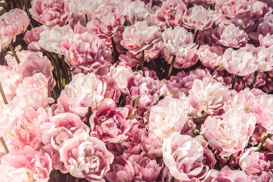
Photograph: Miroslava (via Unsplash)
Pink makes you feel playful and romantic.
Pink represents femininity and romance, sensitivity and tenderness. It’s inherently sweet, cute and charming.
Brown

Photograph: Bruno Nascimento (via Unsplash)
Brown makes you feel down to earth.
Brown creates a sense of stability and support. It’s warm and friendly, practical and dependable, and can also represent the old fashioned and well established.
Black

Photograph: Hannah Troupe (via Unsplash)
Black feels sophisticated and serious.
Black evokes power, luxury, elegance, professionalism and simplicity. It’s bold, powerful and a little mysterious. But black can have some negative connotations—it’s the color of mourning, fear and sadness and it can feel intimidating and unapproachable as well.
White

Photograph: Philipp Berndt (via Unsplash)
White makes you feel pure, fresh and clean.
White evokes purity and innocence and creates a minimalist aesthetic. It can be very simple, clean and modern. It’s also the most neutral color of all.
Gray

Photograph: Tobias van Schneider (via Unsplash)
Gray feels serious and professional.
Gray is a more mature, responsible color. Its positive connotations include formality and dependability, while the negative side can mean being overly conservative, conventional and lacking in emotion. It’s safe and quite subdued, serious and reserved.
Colors and feelings are inextricably linked
—
It is important to note that colors can be subjective—what might make one person feel cheerful can make another person feel irritated depending on the viewers’ past experiences or cultural differences.
Color is not completely agreed on universally and can appeal differently to individual countries. But colors and emotions are closely linked no matter what, so you need to take their effects into account whenever you are using colors. Now that you know how colors and emotions are connected, you can choose colors accordingly and get the results you’re looking for.