
A wise dude named Steve Jobs once said, “Simple can be harder than complex: You have to work hard to get your thinking clean to make it simple.” Let’s use Jobs as inspiration to roll up our sleeves and chisel our design into something so simple, it can move mountains!
Neo-minimalism is a trending design style that takes traditional minimalism to the next level. It’s minimalism on steroids. That means subtracting even more details and bumping up the negative space all while using eye-catching colors and gutsy typography.
Origin:https://99designs.com/blog/trends/neo-minimalism-graphic-design/

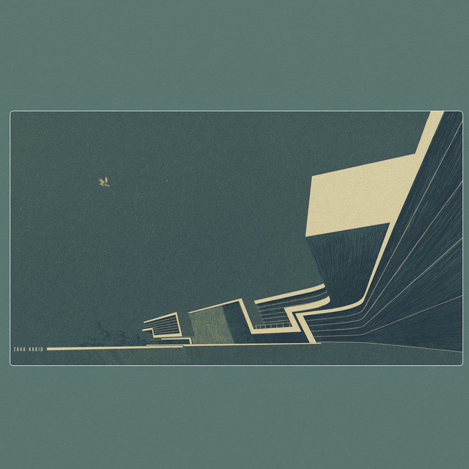
from traditional minimalism architecture design by -Z-


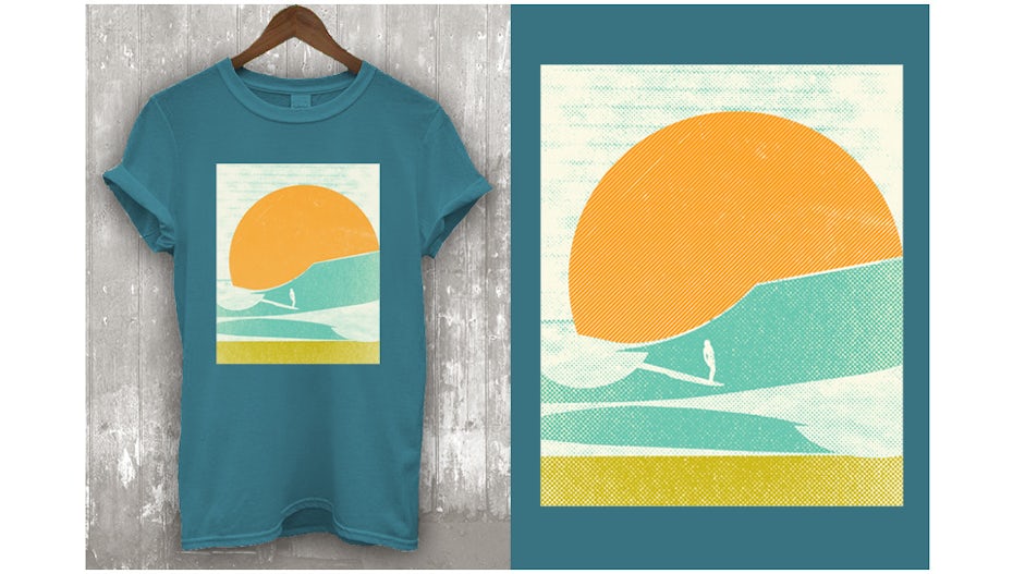
…to neo-minimalism. T-shirt design by Tebesaya*
Want to learn more about using neo-minimalism in graphic design? Then, read on!
- Why is neo-minimalism trending now?
- The problems of complicated design
- How to make an awesome neo-minimalist design
- When to use neo-minimalism in design
- Where to use neo-minimalism design
Drawtify, make design easier. Drawtify is an online graphic design software with vector drawing, layout, photo editing, and typography. It works on all platforms. And it’s free.
Why is neo-minimalism in graphic design trending right now?
We’re seeing a spike in the neo-minimalism trend now because this is the less is more age. Attention spans are shorter than ever and people are savvier than ever—basically, we need less info to “get it.”
This is also the time when the strong silent type has more allure than the blabbermouth. When a fascinating person is quiet, people listen more carefully to whatever little they do say. The same goes for visual designs. If you achieve maximum creativity using minimum elements, your audience will appreciate that and pay closer attention to your product or service.
The challenges of complex design
—
It might seem logical to think that the more complex a design is, the smarter or more sophisticated it is. But don’t fall into that trap. Here, we’ve outlined the three main reasons why complex designs are limiting. Below each, we’ll share why neo-minimalism is the better way to go. Lite is right!
Complex design can be suffocating.
Neo-minimalism gives viewers room to breathe. Ever walk into a room cluttered with a bunch of stuff? It feels claustrophobic because you can’t move about. It’s also visually exhausting. Your eyes are constantly darting around and everything loses importance because nothing stands out.
Complex design is often less memorable.
Simplicity is easier to remember than complexity. Think of religious icons: a cross, a star, a moon and star, an Om symbol, etc. These simple symbols have the power to encapsulate the contents of not only entire books, but entire lifestyles. Religious followers worldwide get emotional when they see their symbol, because it encapsulates all the lessons and stories they hold dear.
Complex design can be less persuasive.
When you’re working with just one or two elements, each carries a lot of responsibility. There are probably many benefits to your product or service. But neo-minimalism requires that you pick the top one or two benefits and showcase them efficiently. This clarifies and focuses your design, adding to its persuasive power.

How to make an awesome neo-minimalist design
—
Use impactful images
This is especially useful for establishing a focal point. When using imagery, carefully consider balance, symmetry, open space and contrast.

Choose fonts carefully

Because neo-minimalism has so few focal points, typography receives lots of attention. So get creative with your font, just make sure it’s legible. And keep it down to one or two font types.
Keep colors simple
Pick a color that compliments the message and mood. Use two contrasting colors to create pop and pique interest.

Prioritize the bare necessities
Steer clear of extraneous decorations. If you’re thinking about adding an element, ask yourself if it enhances the design. Does it serve a purpose? If not, cut it.
Stay balanced
Maintain the overall harmony of the composition by making sure it’s not lop-sided.

When to use neo-minimalism in design
—
When you want to appeal to a sophisticated audience
Similar to reading a book or listening to instrumental music, neo-minimalism leaves room for the viewer to add their own ideas. This creates a two-way exchange of engagement and participation.
When you hope to speak to a straightforward audience
Neo-minimalism works both ways. The straightforward viewer can also appreciate the directness of neo-minimalism. Nothing fancy here. No tricks, just the real deal.

Enhance design convenience and versatility
Neo-minimalistic designs are faster to load and look better on smaller screens and surface areas.

Where to use neo-minimalism design
—
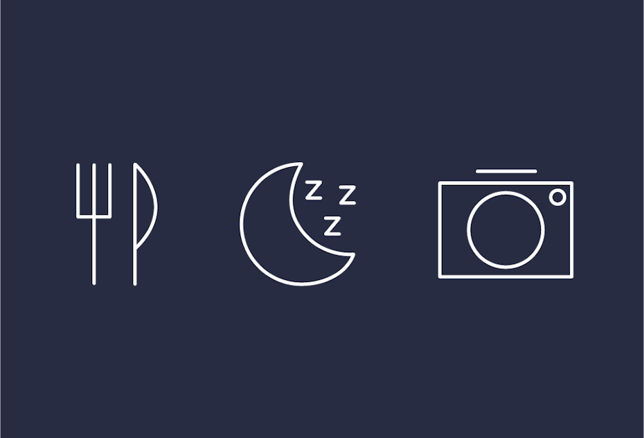
Icons
An icon should be simple enough to understand at a glance and easy to spot on a busy screen. These are the perfect conditions for neo-minimalism.

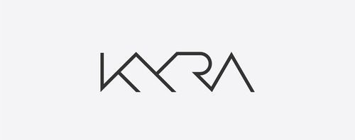
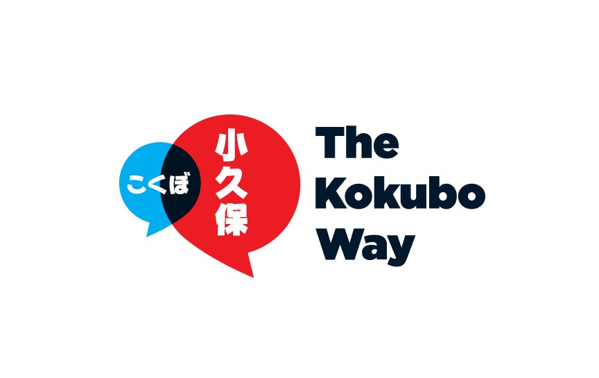
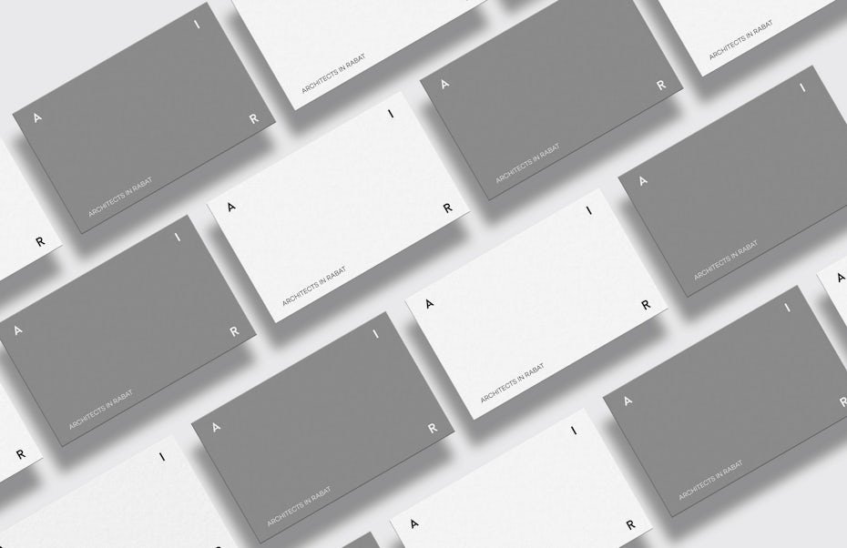
Logos and designs
The more simplicity a design has, the greater viewer recall will be. With neo-minimalism, you can put an indelible mark in the mind of the viewer.
Websites
Above all else, website design should be helpful to the user. They shouldn’t be wondering where to start or what to do. This type of no-nonsense requirement is the stock-in-trade of neo-minimalism.


Packaging design
Great neo-minimalism packaging design continues the customer’s experience of the brand in a simple and seamless way. Too often, businesses lose their customers with packaging design by making it generic.
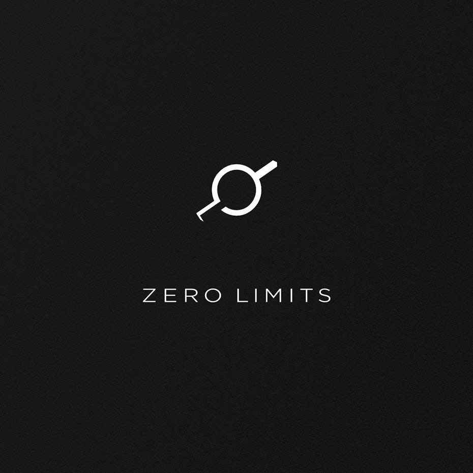
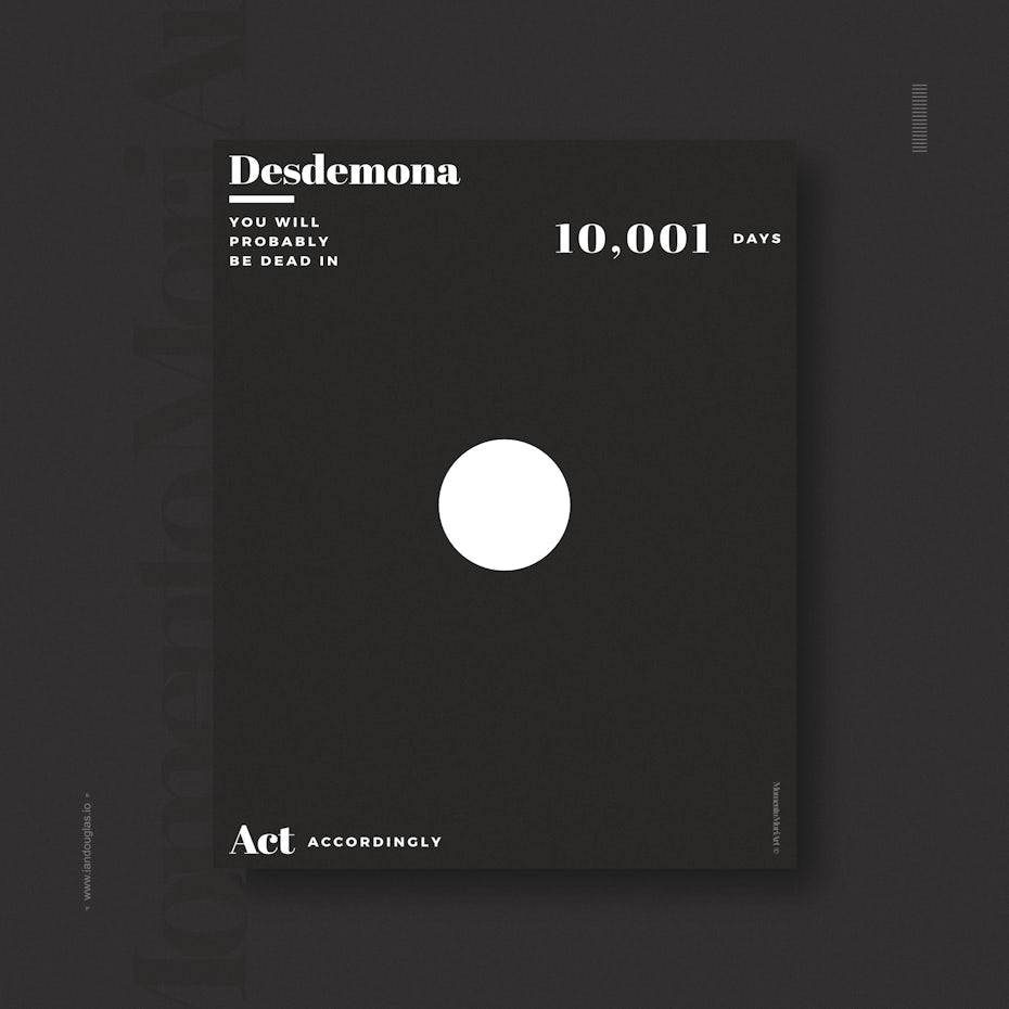
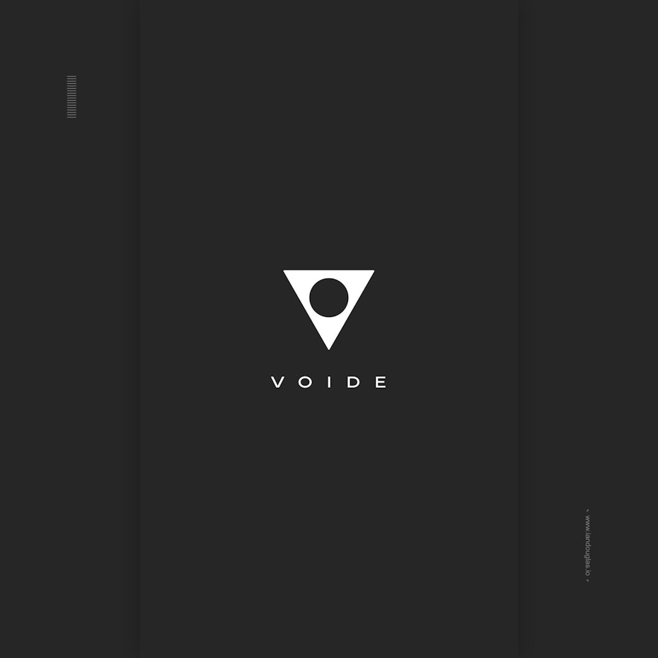
Does it seem like this neo-minimalism logo design doesn’t have a lot going on? Look again… it’s unlimited. Design by Ian Douglas
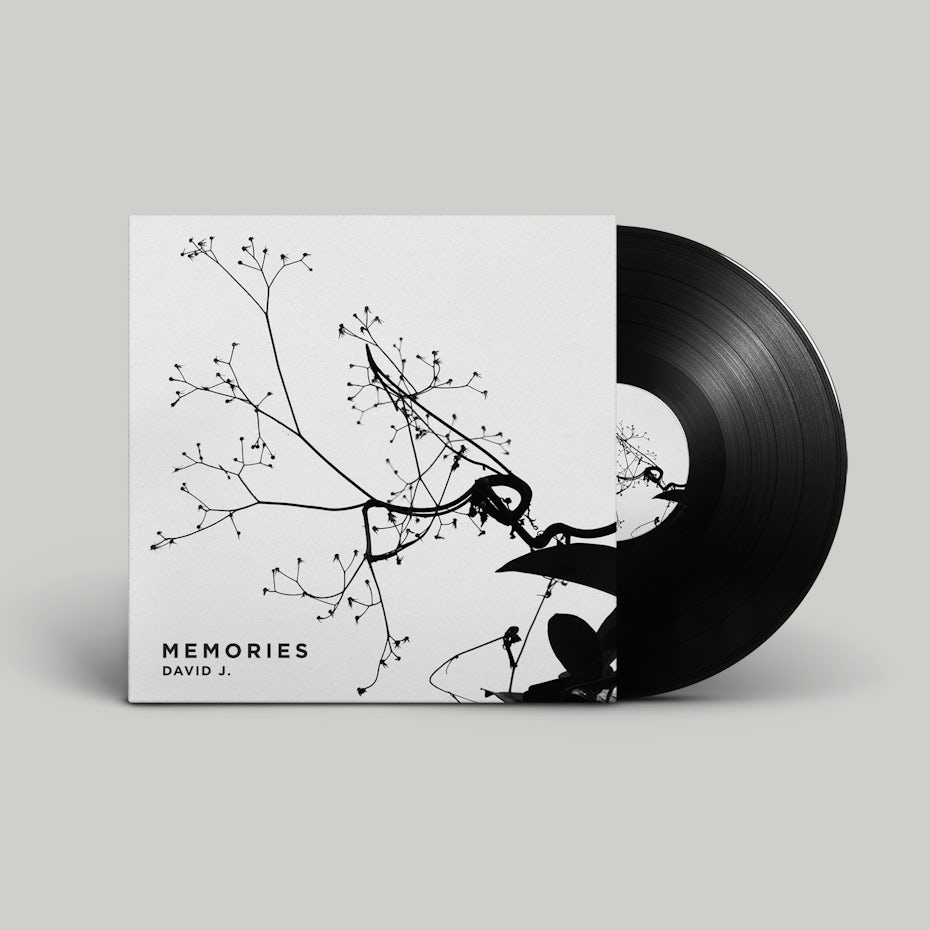
This packaging design helps create a seamless bridge between product and customer. Design by Dmitry Litvinenko
Neo-minimalism: wake ‘em up!
—
Some argue that the more bells and whistles a design has, the greater its uniqueness. But, when viewed from another perspective, the restrictions of neo-minimalism can be seen as more space for creativity in your design. That’s what Steve Jobs meant by “getting your thinking clean to make it simple.” There is a galaxy of crystal clear consciousness inside us all. For both the designer and the viewer, the breathing space offered by neo-minimalism allows your consciousness to expand into that vast galaxy, giving you room for more awareness, more understanding and more wakefulness. Wake people up with your neo-minimalist design!